 James Debono
So this morning I woke up to the following email in my inbox.
!Fix mobile usability issues found on Big Thinking Online
Now as far as I was aware this site is mobile optimised; we have a responsive theme, which means that the website layout will adjust depending on what device the user is using to interact with the site.
Therefore I wasn’t panicked, however I was keen to find out what the issue was. I followed the link in the email that took me to Google Analytics and read the report.
“1 page out of 423 is not optimised correctly.”
1 page! Oh come on, give me a break! Anyway after doing a bit of digging I found the page that was causing the problem. The page was an old landing page that was used many years ago and was bolted on to the back of the site.
Once the page was removed everything was fine again and we were compliant with the “Big G” Google once again. Phew!
Google is Ramping Up It’s Desire for Mobile Responsive Websites
Now the reason I thought I would talk about this is because last month Google announced that in their forthcoming update on April 21st they will be expanding their use of mobile-friendliness as a ranking factor.

Essentially if your website is not mobile friendly then you are likely to receive a penalty of sorts and that penalty will result in you losing position in the search engine listings. And nobody who has invested in website development and search engine optimisation wants to lose out on favour in the search engines as that could then result in fewer potential clients finding your services.
Why is having a Mobile Website Even More Important?
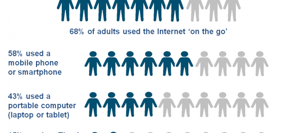
Back in 2012 we wrote about how mobile was becoming more important for website owners and the simple fact is that more and more people are using mobile devices to access the internet and in reality these numbers are only going to increase over the years to come.

“On the go” usage of portable computers (laptop or tablet) has shown an increased uptake from 32% of all adults in 2013 to 43% in 2014.
The report from the Office of National Statistics also suggests that:
Over one fifth (22%) of both 16 to 24 and 35 to 44 year olds reported using a device such as a games console or eBook reader to access the Internet away from home or work. Increases in this type of access were seen across all age groups between 2013 and 2014, however, increases were largest for those aged 35 to 44 (8 percentage points) and in the 25-34 and 55-64 age groups (5 percentage points), showing that other handheld Internet devices are being used by more than just the younger generation.
How can you tell if your site is mobile friendly?
The easy way to see how Google displays your site in mobile is to take their mobile friendly test which you can do so by clicking here: Google Mobile Friendly Site Test
Simply enter your main website url where is says enter web page url for example, http://www.bigthinkingonline.com and hit analyze. You will then get a result like the one in the image below:

On top of that you can also see if you have “mobile friendly” tag against your site in the search engine listings.
 Several months back Google started adding information to the search engine listings that showed whether they considered sites mobile friendly or not.
If you pick up your mobile and enter your company name or a website, scroll down past the Google Maps listing, if you have one, and look at the search listing for your site.
The image to the right, is the listing results for when you search for my company “Big Thinking Online” on Google. Just underneath the link to the website and before the main meta description you will see “Mobile-friendly” (I have highlighted it in red). This is giving mobile users the option of knowing if they can easily navigate the site before they click into it.
If you don’t have Mobile friendly displayed and you have a mobile optimised site then look in your Google Analytics account and find out if there are any reasons why you are being penalised.
How can You Make Sure You Attract Mobile Consumers?
In short the best thing to do is; make sure your website loads quickly, is easy to navigate and links and buttons are easy to click on. Make it so that if someone wants to call you they can simply tap the number on the screen and it automatically dials your number.
Imagine someone has just chipped her tooth and is in extreme pain. They go into Google and type in “emergency dentist”. Google knows their location and then presents them with Emergency dentists in the local area. The person clicks on one of the links, it takes forever to load and the images are too big so she has to scroll past them to get to the menu, which is all squashed together so she can’t click on the links to find out any more information.
Still in pain and having had a really bad user experience with your site this potential client backs out of the site goes to the next link.
The next dentist in the listing has a button that says emergency dentist, she clicks it, she then lands on a page that explains appointments are available and gives the prices all visible in her mobile screen. She sees the phone number clicks on it and it rings the number automatically and she books an appointment.
Think of it from a user’s point of view, what information is most important to a user of your business? Make sure that information is accessible and fast.
1. Make sure all text is in a big enough font size that it can be read easily.
2. Make sure there is space between links as not everyone has dainty fingers.
3. Content should be clear, visible and concise.
Technically there are more things that need to be addressed and Google provides developers with the following resources to help make their sites mobile friendly in their web fundamentals section. (NOTE Google calls this resource web fundamentals)
Does It Really Matter If My Site Is Mobile Optimised?
People want access to information regardless of what device they are using and where they are. If the information on your site is not accessible because it is not in format that allows people to navigate easily then Google won’t send people to it.
Google’s mission is “to organize the world’s information and make it universally accessible and useful.”
People want access to information about your products and services regardless of what device they are using and where they are. If the information on your site is not accessible because it is not in format that allows people to navigate easily and consume this, then in order for Google to follow its mission your site will be moved down in the rankings and replaced by a competitors site that does offer mobile access.
If you are concerned that you are losing clients because your site is not mobile friendly then call us so we can help you get on the right track.
(343)