— October 5, 2017
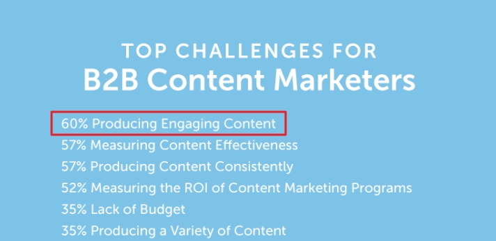
One of the biggest challenges faced by marketers today is the struggle to produce engaging content.
This has led to some wide variation in content strategies, partially influenced by the ever-changing search algorithms and their attempt to filter out low-quality content.
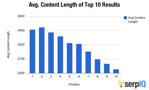
Some brands have gone the long-form content route:
(Source)
Or the type of content Brian Dean promotes with his Skyscraper technique.
The result has been an explosion of content flooding the web. Today, over 2 million blog posts alone are published every day.
This level of content saturation has caused many companies to pivot.
In recent years, many have worked to diversify their content by adding other formats like infographics. In fact, Infographics saw a huge spike in adoption during 2016, with 58% of marketers counting it among the top tactics they use to engage their audiences.
It’s no surprise when data shared by HubSpot shows that infographics are liked and shared on social media 3X more than any other type of content.

But then come the other challenges brought up in CMI’s research – marketers are also struggling with producing a variety of content as well as understanding and choosing technology to help with content marketing.
For example, some marketers think infographic creation requires a professional skillset, or a costly graphic designer. But that’s just not the case.
You don’t need a dedicated design team when you have platforms that offer a range of tools to simplify and speed up the interactive creation process.
In this post, you’ll see that not only are interactive infographics easy to create, they’re more effective than static infographics at engaging your audience, and turning readers into qualified leads.
Why Interactive Infographics Beat Their Static Counterparts
The concept behind infographics is simple: pack as much value as you can for the reader into a piece of content while providing a visual medium to better engage them.
And that approach flat out works.
Research from Nielsen Norman shows readers pay more attention to images that carry information. In fact, viewers spend more time looking at images than reading the text on the page.
Truth is: I could drop a million and one statistics about why it is important to leverage visual media in your content marketing strategy. But, I’d be stating the obvious. In fact, almost every content marketer on the planet already knows this.
There are now millions of infographics floating around the web.
Once we find something that works, we do it over and over and over again until it stops being as effective.
So:
It makes sense to level things up. And, the easiest way to break through all the noise and engage your audience is to tailor static content to each indivdiual by making the infographics interactive.
Don’t believe me? 88% of marketers say interactive content differentiates them from their competitors.
91% of buyers are looking for more visual and interactive content.
The interactive infographic does just that.
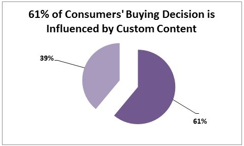
More than half of buyers are strongly influenced by custom content. An interactive infographic can reduce otherwise heavy data sets into formats that present the information most relevant to the interests of your audience based on how they click or interact.
It’s a means to provide a ton of value, answers, solutions, and information without making readers wade through a ridiculous amount of text.
After all, which would you prefer:
A) An interactive asset that delivers a valuable, personalized content experience in seconds
B) Searching through a 30+ page static whitepaper
C) Scrolling through a 20’, multi-screen “infomural” crammed with statistics.
Option A for the win!
Here’s how to do it…
How to Make an Interactive Infographic: A Simple 6-point Checklist
There are countless ways to make an interactive infographic.
No matter how the final design comes out there are elements and steps you should take to make sure the infographic attracts your audience and inspires the right type of engagement.
Start With Ideation and Data Gathering
Creating infographics isn’t difficult. The real challenge comes in making them engaging.
That’s why you start by storyboarding and identifying the data you want to include.
There are several different types of data sources you can leverage to quickly build your infographic:
- Proprietary data from internal surveys, customer profiles, buyer data, polls and other internal data sets.
- Third party reports, research and industry studies.
- Public data sets and industry research.
Important: All data should be accurately cited and the proper permissions obtained before sharing.
Now:
If all you include is data and graphics, you’re creating a snooze-worthy piece of content.
Tie it to a story and you’ve got yourself something far more engaging.
A story has segments with elements that intentionally move the reader from point to point through a logical progression toward the end. This is a great way to ensure your audience not only is interested, but continues to engage with the infographic.
This infographic from MahiFX is a great example of building a story around data:
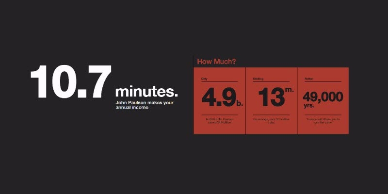
As the user enters their salary and interacts with the infographic, it leads them through a story about:
- how quickly John Paulson earns their annual salary
- how much he earns from trading
- what you could buy if you made that much trading
- how his spending compares to yours
It doesn’t just tie into John’s story, it becomes personal – so the infographic also becomes the user’s story.
Note: If it takes John Paulson more than five seconds to make your annual salary, you’re ahead of the curve 🙂
Select a Visual Theme That Fits the Story
You’re not just sharing data with an interactive infographic. You’re creating a visual asset designed specifically to capture and retain the audience’s attention. But you don’t just want them to remember the data, you also want them to remember the experience around your brand.
Like this infographic shared by CEWE Photoworld:

(Source)
The visual design of the graphic aligns perfectly with both the story and data set. The theme has you travelling at 3000km/hr as you pass the international space stations on their way to the height of the 21.9 billion Instagram photos uploaded every year.
Keep these things in mind when you choose a visual theme for your interactive infographic:
- Do the images and interactive elements help bring the data to life?
- Do the images, animations, and design elements reflect your brand as well as any other brands that may have partnered with you to create the content?
- Where will the interactive graphic live? If it will be housed on your website you may want to focus on design elements that match your site theme/templates
- Make sure the visual theme matches the audience and their interests, the industry, and the overall story. An infographic built around vacation resorts would have a very different visual style than one being designed for C-Suite trade show promotion.
Another great example is this infographic from Joho Bean:

It takes the user on an extraordinary multimedia adventure using very colorful imagery highlighting the process and journey the coffee bean takes from the field to the consumer.
User Action Should Create a Reaction
An interactive infographic should be well, interactive, but that doesn’t mean it needs to be limited to individual clickable elements.
Every action the user takes should create some kind of action within the content so everything feels like personalized engagement – right down to scrolling.
Population Healthier does a great job of this kind of interaction.

As the user scrolls through the content, headings fade in and bullet points slowly appear as the content rises.
The background also shifts to match the content as the user scrolls, including flipping a state map to a 3D facility map. This is a great way to pull the reader further into the story. The visual stimulation engages, and retains attention.
Hide Content to Inspire Action and Engagement
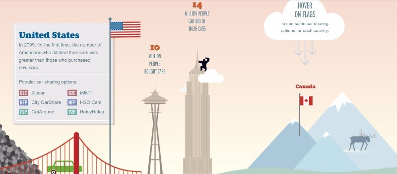
You can also inspire engagement from the audience by creating an infographic with hidden elements that require clicking. This can force the user to take action in order to get the information they’re looking for.
Like this example from the Future of Car Sharing.
(Source)
Not only does the hidden content force the reader to actively participate in the content experience, it encourages the user’s sense of curiousity, and even allows the reader to skip sections of little interest to them.
Personalize the Content by Requiring User Input
You can guarantee a lot more engagement when you serve data to the user based on the information they input. This appeals both to the desire for more interactive content and the desire for personalization.
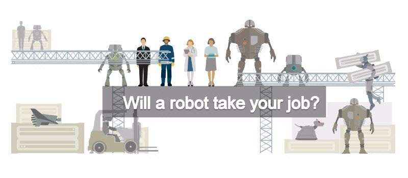
A terrific example of this is a personalized infographic that provides insight on whether or not your job is at risk of being automated by robots:
(Source)
Users have to make a selection personal to them (or whatever field they wish) in order to get back relevant data.
Include In-graphic Forms to Capture Information
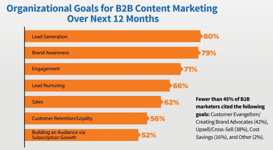
About 80% of B2B marketers list lead generation as the top organization goal for content creation in 2017:
With an infographic that offers personalized results, or any kind of data tailored to the input of the user, you have an opportunity to capture attention and create a much more compelling user experience.
Not only can you capture relevant information about your audience, you can also collect contact information by offering a personalized version of the infographic based on their input.
Either that, or offer them the option to download the full infographic by filling out the lead form.
Interactive content has been found to generate 2x more conversions than passive content.
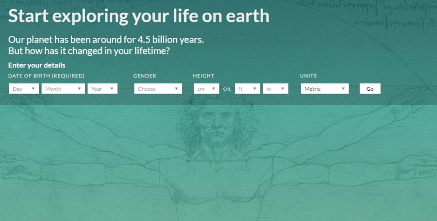
BBC does this with their infographic Your Life on Earth.
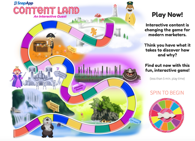
Another example of capturing leads within the infographic is Content Land, which won the Best Use of Interactive Infographic award at Content Marketing World 2017.
As the user goes through the game board layout encountering bite-sized research, they are asked a series of qualifying questions about their content marketing strategy:
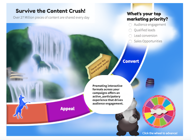
At the end of the infographic the user is asked to enter their contact information in order to get access to the final destination, which uses the answer data to personalize the page and recommend further content or a demo sign up:
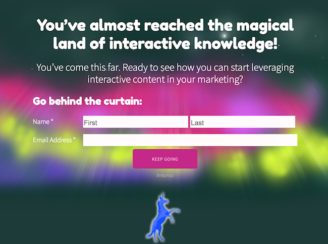
In this case, much more information is both shared with prospects but also gathered from them, so marketing teams can know more about who is actually engaging with them.
Get a Fast Start: Turn a Static Infographic Into an Interactive One in Minutes
You don’t necessarily have to build an interactive infographic from scratch. One of the smartest tactics to save resources in content marketing is to repurpose content you already have.
If you have an infographic already, look at how you can turn it into an interactive experience.
Consider these possible elements:
- Where can you add animations to place emphasis on certain data points?
- What kind of story can you add to the data to make it more engaging?
- Can certain information be hidden until called on with data entry?
- Which data can be hidden until an interaction like a click or hover place?
- Can some visual clutter be reduced by transforming callouts or tooltips into animations that appear while scrolling or taking action?
- Can you add more depth to the infographic by including audio callouts and voice snippets?
- How can an ultra-long infographic be sliced or segmented to reduce scrolling?
- How can you make the data dynamic so it stays current in real time?
- What kind of information can you collect from the audience to generate a more personalized experience?
- How can you gate content within the graphic to capture leads?
Summing It Up
While it may seem daunting, it’s just the “moving parts” of an interactive infographic that make it appear difficult. Truthfully, developing an interactive infographic is very similar to the creation of any static visual assets you’ve already created many times before.
The most complex part of the creation process is building a story around the data and understanding how you want to present it.
Any piece of static visual content can be brought to life by incorporating animation, video, illustration, animated and layered text.
Follow the 6-point checklist above to get the creative juices flowing.
Business & Finance Articles on Business 2 Community
(143)


