At times, running an online business can be tricky. It’s not as simple as attracting customers who will automatically buy your items. Many eCommerce stores have a high volume of visitors, but those visitors don’t buy anything or wind up abandoning their carts. If this happens to you, the problem could originate with your website usability. Have you ever thought about that?
The most common reason why shoppers abandon their online carts is because they are comparing product prices. Other common problems include a checkout that isn’t user-friendly, bad website navigation, and distractions such as useless links and unclear calls to action.
Today, more online users pay attention to a website’s design and navigation. People on the internet are impatient. When something doesn’t work or it’s hard to navigate through a website, visitors get frustrated and leave. Probably never to return.
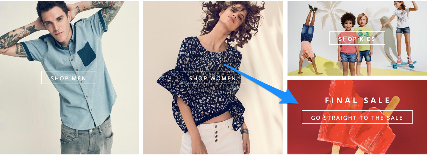
Essential Parts of a Great eCommerce Landing Page
Think of your landing page as the opportunity to attract potential customers. It’s all about making a good first impression.
The first thing you should do is make sure the landing page of your website is aesthetically appealing. It should have high-quality visuals to display what you have to offer. Too many images could affect the loading time and clutter the page. What else is important?
- Display customer reviews to improve your brand’s credibility. Opinions of others are a great way to convince new customers to make a purchase at your online store. Note that consumer reviews are 12x more trusted than product descriptions.
- Create a brilliant headline (it should match your ad copy). Use it to attract your customer’s attention and convince them to buy from your store. Also, make your copy clear. Keep in mind that less is more, so make it easy to read and concise. One way to do this is to use bullet points.
- Highlight added value on your landing page to give customers an incentive to buy from you. It could be free shipping, a gift wrapping option, customizable gift cards etc.
- Display the physical location and phone number of your company. It’s about building credibility. Putting this kind of information online helps first-time visitors trust you.
- It’s also a good idea to put security badges on your eCommerce website. It works as an ice-breaker, and again, it’s about trust. Some security/trust badges can increase conversion by up to 30%.
- You can also use some psychological tricks to optimize your pricing. For example, prices with 9s work much better, so putting $ 19.99 on your landing page instead of $ 20 would be beneficial.
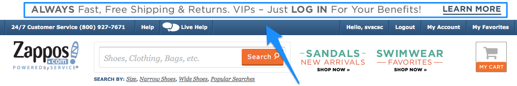
Let’s take a closer look at Zappos, the famous online shoe store’s, product page. They have high-quality product pictures, messages about free shipping, as well as information about 24/7 customer service at the top of the page. You can also switch the colors of products by clicking the thumbnail under the main photo.
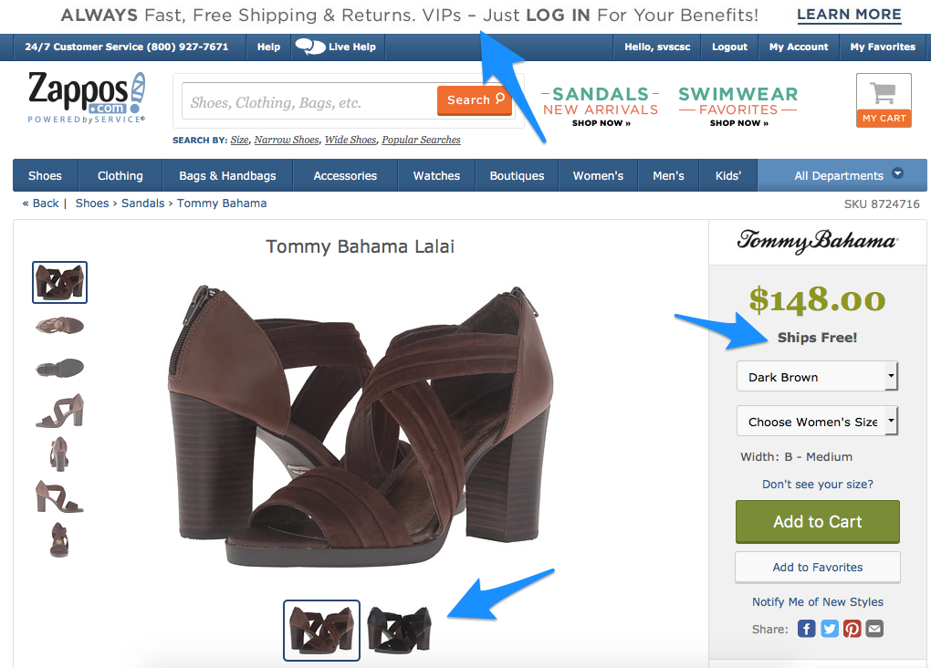
When you scroll down, you’ll see the item information, similar items, and customer reviews. There are also security badges, free shipping, and free returns details.
Focus on improving your eCommerce website to make it a customer magnet. Here’s a list of website usability improvements you can use to grow your sales.
Quick hacks to sell more
There are many factors that affect your business performance and one of them is your website’s navigation. You need to ensure your website is user-friendly when you sell online. Don’t know where to start? Here are some tips to improve your business performance.
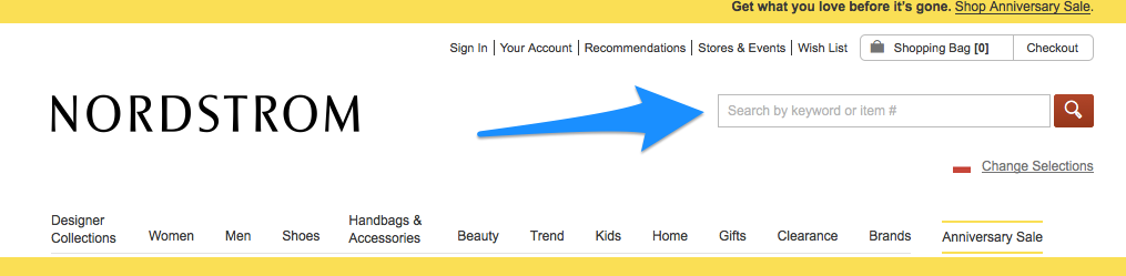
Add visible search bar
Online shoppers use a search bar when they can’t find what they are seeking on a website. If you want to keep customers on your site, it’s a good idea to have the search field visible and easily accessible.
You should also provide autocomplete suggestions for users who only know part of the brand or item’s name. Having the product name display while they type simplifies the search process. Learn from the best. Google uses auto-complete to make it easier for millions of online users every day. Convinced enough?
Give a clear filtering option
Filtering is on the “must have” list for every eCommerce business owner, especially the bigger ones. Customers like when they can easily find what they are looking for, so it can increase sales.
Think about it this way. You want to buy yellow espadrilles in size 8 so you go to the shoe store’s website and you don’t know where to find them. There is no way to filter the products or even search categories. You would probably leave the site and try to find your dream shoes somewhere else.
It’s the same thing your customers will do. Give them a simple system of filters to make it possible to find the perfect product by the color, size, name etc. or they will buy from your competitors that have better-designed websites.
Remove broken links
There’s nothing worse than having links on a website that don’t work. This is especially true for eCommerce websites where there are items that you want to buy. Check regularly to see if there are any broken links on your website. Remove or replace them with working links as soon as possible.
Provide detailed product descriptions
Buying online means relying on photos, descriptions, and buyer reviewers to make your decision. That is why it’s important to provide as much information as possible for items. Give customers product details, specifications, as well as highlight its value. Offer a concise and longer version. Also, don’t forget to create a clear call to action that achieves your goals.
Use high-quality photos for products
Visuals make a great impression and can convince visitors to buy products. Hi-resolution photos or videos are key to growing your sales. Keep in mind that low-quality images make your products look cheap. Present the product in a different way, show the details and make customers feel as they see the product for real. Think about 3D, GIFs or a short video that presents all the product’s benefits. Offering multiple product views leads to 58% more sales.
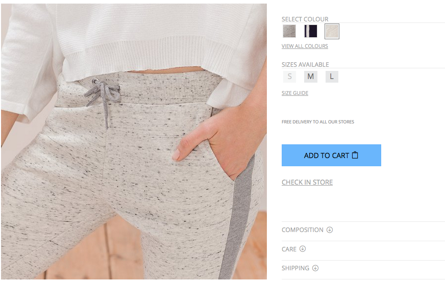
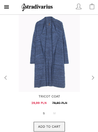
Make “Add to cart” button visible
Make it easy for customers to add items to the shopping cart. It may seem obvious, but sometimes the button is barely visible or placed in the wrong position. It should stand out from the other product page elements. To make it more visible, use contrasting colors and the proper size.
Add to cart button on Stradivarius product page
You should also make sure the shopping cart is visible during the whole purchasing process and make it easy to edit (add or delete) items.
Don’t hide the price
Display the final price on the product page as well as in the shopping cart. Don’t try to surprise customers with extra charges at the last step. If they see a higher price, they will probably move back to the product page to verify or simply leave the site. That’s not what you want, right?
Highlight value proposition
Zappo’s value proposition highlighted on their homepage
This is a proven method of increasing eCommerce conversion quickly. Choose the best location on the page to improve the proposition’s visibility. For instance, you can offer free shipping or price guarantees – it’s up to you.

Warby Parker’s promise displayed on a product page
DonorPro (a SaaS company) increased their revenue by 37% through revamped value proposition. Remember that the value proposition is the reason people buy your products. It helps them to understand what makes you different from competitors. It’s important to make clear promises rather than simply using buzzwords.
Display customer reviews and ratings
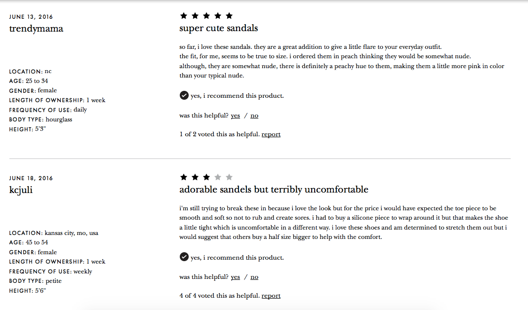
Customer reviews on Kate Spade website
Statistics show that for 67.7% of consumers online reviews are important when they want to buy something. People usually do research before they make an online purchase, which means ratings from others matter. Moreover, you need to recognize that reviews are not only helpful for online buyers but are also social proof that builds your brand awareness.
Provide a “guest checkout” option
Online shoppers are impatient. They hate the long sign-up and purchasing process. It Works’s research shows that the need to create an account before buying items is an obstacle for 23% of customers.
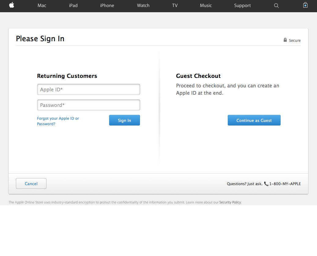
Guest checkout at Apple Store
Allowing guest users to buy your product can increase sales instantly. You can ask customers to register afterward in order to make buying easier and faster. You can also give incentives for them to create an account. For example, giving a special offer for users who complete the registration process.
Make the checkout process smooth
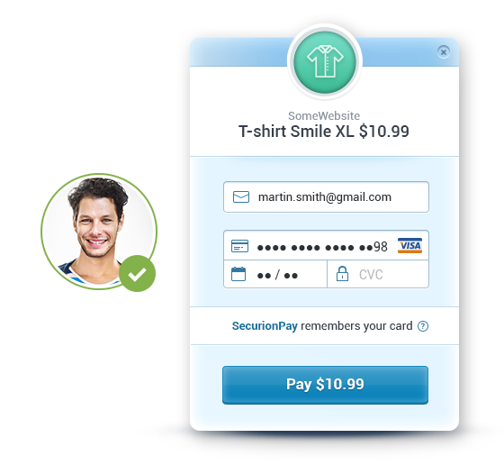
Design the checkout page to fit in your website’s layout and make it fit with the rest of your website’s overall design. Display the familiar logos for accepted payment methods so your customers know whether their cards are accepted or not. You can also show the relevant logo when the user starts typing in their card number. Security logos should also be shown to improve customer’s trust.
Relevant logo displayed at SecurionPay’s payment gateway
It’s also important to make the payment form user-friendly and only ask for essential information. This essential information includes a credit or debit card number, expiration date and CVV. You also need to use autocomplete wherever possible.
Note: If you want customers to finish a purchase, use a linear checkout process. The customer’s path should be simple, – back or forward. Remove any additional links, redirects or other distractions.
Last, but not least, don’t forget to put descriptions and error indicators next to each field in order to tell customers what’s wrong and what they should type in.
Need an example?
Add a short prompt next to the labels. You can use microcopy next to the card number field, which could be “Don’t use dashes or spaces”. You should also try to show hints in tooltips. In the following example, you can see an extra description explaining what a security code is and where you can find it.
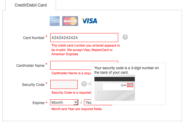
Symantec’s descriptions and error indicators
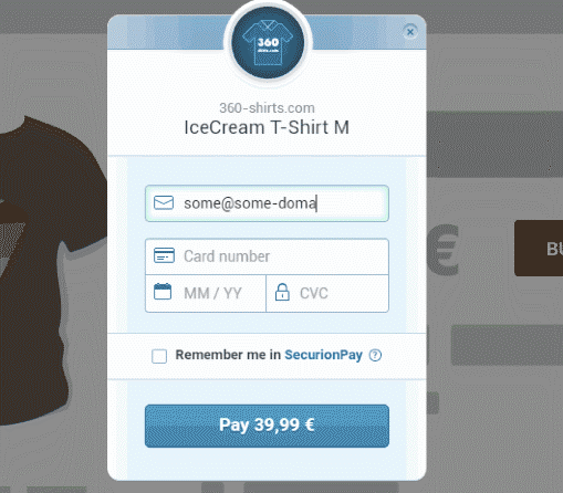
Offer payments without redirection
SecurionPay’s “Remember me” option
Make the checkout payment process easy for your customers and let them pay directly on your website, without moving them to an external page. Also, give them the option to pay with one click (payment providers offer the “remember me” option, which allows making next purchase without entering card details in a payment form).
Provide sections for sales
Believe it or not, sales are a customer magnet. People often look for the best deals and discounted products so it’s crucial to show all of your discounted products in one place. Make it easy to find by placing it in a visible part of your website or even on the main menu.
Section for sales on Esprit’s website
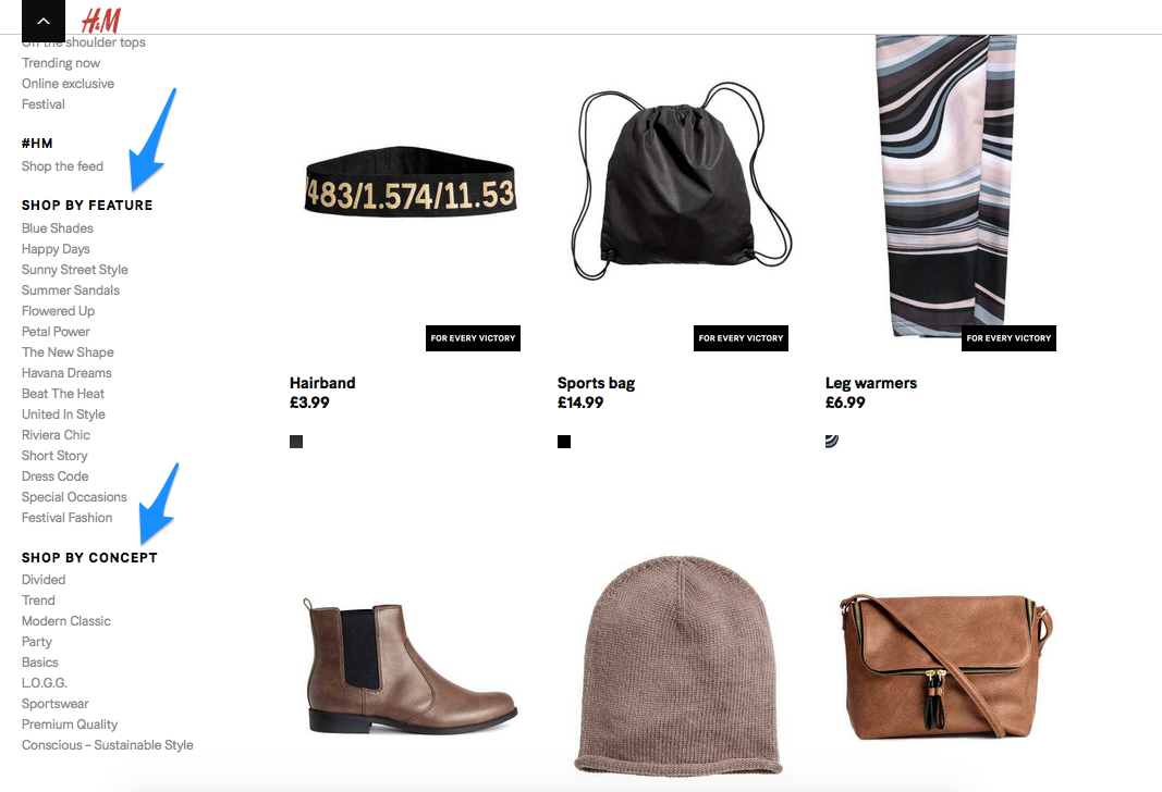
H&M also has a New Arrivals section so you can find the new items easier on their online shop. This feature is especially helpful for returning visitors.
Display low stock indicator

Teespring’s limited time offer
When customers see a product that is almost out of stock or an offer that is time-limited, they are more willing to buy it. Scarcity boosts a customer’s desire for an item and makes them act quickly.
Put contact information on the website
It may seem obvious, but there are many eCommerce sites that hide their contact details. Make yourself more accessible and easy for customers to reach out. Leave the contact information on a prominent section of your site or set up a simple contact form. Another great idea is to provide real-time support (e.g. install live chat). This becomes especially important when there is a time limit for offers. Be fast and responsive when you’re running social media profiles and prepare to answer your customers’ questions.
Simpler navigation, detailed product descriptions, and highlighted offers are just a few ways to improve your business performance. These can help you increase eCommerce conversion and grow sales. However, you should also run some A/B tests to see what works best for you and to optimize the website for better results.
Provide the mobile experience
Mobile commerce is getting more popular and is growing even faster than eCommerce. According to Cisco Visual Networking Index: Global Mobile Data Traffic Forecast Update, by 2020 there will be 11.6 billion mobile-connected devices (1.5 per head). It’s time to think about consumers and give them endless possibilities by paying on smart devices.
Stradivarius mobile website
Online shoppers are buying goods on several kinds of devices including desktops, smartphones, and tablets so it’s natural that payment behavior is connected to the devices used. Today, responsive websites or mobile apps are a must and it’s likely that all payments will become mobile in the near future.
Meet the future consumer’s needs
Consumer’s behavior and expectations are changing fast and you have to analyze the website’s traffic to anticipate their needs. It’s important to be customer focused and give them the possibility to buy fast and conveniently online.
Today’s consumers’ expectations are higher than ever before. They want more personalized offers and expect to have every purchasing step made easier. From adding an item to the cart to paying for it with one click. Don’t forget about faster shipping options such as same-day or next day delivery.
Offering the most popular payment methods when purchasing your items is a must. According to BI intelligence, 25% of U.S. online shoppers abandon their cart because their preferred payment option was not offered. Research the market and find out which methods are the most popular for your target audience. These could be credit cards, debit cards, local payment methods or alternatives. Also, pay attention to fraud prevention and authentication tools in order to guarantee customers a secure shopping experience. This will also increase your company’s credibility.
Did I miss something? If you have a usability tip, don’t hesitate to share it in the comments section.
Digital & Social Articles on Business 2 Community
(66)