What is a Landing Page?
 For the intent of this article, the landing page is the place where visitors come when they view an advertisement you publish. Your ad could be a video, magazine ad, radio spot, tweet, email, or anything else you can think of. Where that advertisement directs people is the landing page.
Unlike your website homepage, a landing page has one purpose. It might be to get people to like your Facebook page, download a free software trial, or sign up for a webinar you are hosting. A website home page is mush less specific, gives a general overview of your site, and has several options visitors can choose from.
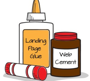
A landing page is a specific page with a specific purpose that comes from a specific source. A landing page is not the same as a homepage or any other page on your website. In fact, it doesn’t even have to be on your website. It could be on another website such as a social network or even an app.
Since a landing page is different from a home page it should be designed differently.
Make it Quick and Easy
A landing page should have a minimalistic design. Visitors should be able to land on the page, see what you want them to do, and do it quickly and easily.
Let’s say you are offering a free ebook to anyone who signs up for your mailing list. When a person clicks the link and is taken to the landing page, they should be able to start that process without a lot of extra fine print and mumbo jumbo.
You should also try to keep the information you ask for down to a minimum. A landing page with a long sign up process is overwhelming, and a huge buzz kill. Keep your sign ups short and sweet. There are some amazing software and analytics out there that can help you get the other information you want using metadata and a bunch of techy stuff I don’t understand. Talk to your web programmer and see what kind of information he can gather for you just from someone visiting your landing page. If he or she can get it for you then leave it off your sign-up forms.
One Job
Your landing page has one job. Or at least it should. Remember the days of Facebook welcome and landing pages? Companies would literally create graphics that pointed to the like button with great big text that said “like us” often for exclusive content or to enter to win a prize. That fad is long gone, but the idea behind the landing page remains.
OK, you might want to be a little more subtle than a big arrow, but not much. Your landing page should focus on that one thing you want your visitors to do. That one thing also happens to be the reason that person is on your landing page in the first place. If your ad promised them a free ebook then your landing page had better tell them how to get it and get it quickly. Your visitors don’t want to hear about your company or others ways you can help them succeed. (That can come later.) They came looking for one thing and so your landing page should only have one thing on it.
Don’t have ads on your landing page; either for your company or Google ads. These are a distraction. You don’t want people clicking on your ad, coming to your landing page, and then immediately clicking on an ad to leave your landing page. I shouldn’t have to state this, but I once landed on a company’s page that had a Google ad promoting one their competitors. #LandingPageFail
Make it Eye Catching
This should go without saying, but just in case I’ll say it. Your landing page had better look amazing. Not good, not nice, not neat. Your landing page should knock people’s socks off.
I’m not going to go into the how’s and why’s of graphic design; mostly because it can’t be taught in a few words. Graphic Designers spend years learning and perfecting their craft so go hire one to design you an awesome landing page. For help finding a Graphic Artist, you can read my previous post here.
A landing page is probably the first impression your visitor is seeing of your company. This is especially true if they discovered you through a text only ad such as Google or Twitter. With that in mind, you had better make a good first impression.
Restate What Your Advertisement Said
 When people click on a link, scan a QR code, or type in a URL they want to know they have landed in the right place. It’s a good practice to just restate what you said in the ad so they know they are where they want to be. You don’t have to copy the ad verbatim, but it should say generally the same thing.
It’s also a good idea to have they landing page look and feel like your advertisement. Your ad and your landing page should have the same color scheme, fonts, and similar artwork. This isn’t generally an issue, but if you are running a holiday special or similar ad campaign don’t forget to update your landing page to match the new look.
I think it’s smart to restate the value are you giving your visitor as well. Let’s go back to the free ebook example. They are about to give you their email address and maybe more information. I think it’s a good idea to remind them what they are getting in return. I don’t mean the ebook, but what it is your ebook is going to do for them. Whatever value you are delivering to them be it increased sales, higher profits, better memory, a list of resources, or whatever. Reinforce the idea so they are reminded what they are getting. Of course, once they do give you their information be respectful with it.
Keep these tips in mind and you should see an increase in sign-ups, downloads, or whatever it is you’re promoting with your awesome landing page. Remember to test and track your results. Play around with one variable at a time and see how your landing page performance changes as a result.
(247)