
A well-designed landing page means more conversions. If your landing pages are not getting the conversions you want, then you will need to learn exactly what a landing page is and what it is not, how to make a landing page “sticky,” and check your design components to see if they meet best practices. That’s what you’ll be learning about in this article.
What is a Landing Page – Understanding its Purpose
A landing page is not your home page. It is a page that has a singular purpose – allowing the user to get exactly what was offered, nothing more. All marketing campaigns consist of offers – a discount, a free trial, a download. Ads attract people to the offer and guide them to the landing page.
A landing page has a singular purpose – allowing the user to get exactly what was offered, nothing more.
Your landing page, of course, has a purpose for you too. You are looking to get something by influencing your visitor to complete a task:
- a purchase by using the discount
- an acceptance of a free trial
- clicking that download button
- some information from the user that will allow you to communicate at a future date
Your purpose is NOT to give a user information about your company, your products or your services; it is not to tell your story; and it is certainly not to advertise anything beyond the offer. These are all things for another time. Right now, you want to begin the building of trust by giving the visitor exactly what you offered and nothing more.
How You Make Your Landing Page “Sticky”
If you are getting a large number of bounces from your landing page without conversions, then your landing page isn’t making them stick. A “sticky” landing page is one that keeps the user there long enough to complete the task of taking whatever offer you are providing. If you’re not getting the conversion rate you want, try evaluating your landing page against these things:
- Your design must be very simple and direct. This means that you don’t have glitz, frills, distracting backgrounds, or any “busyness” that clutters the page and confuses the user.
- The conversion task must be easy. For example:
The visitor gives you a name and email address and then clicks the download button.
The visitor clicks on a “get your discount” button, provides a name and email address and then clicks a confirmation button to get a coupon code.
The visitor clicks on a button to start a free trial, provides some personal information, and submits it. The visitor is then instructed to check their email for the trial link. (The conversation about using the email option is still ongoing. It does force the user to take another step in the process, but sending the free trial link to an email ensures that the email is legitimate.)
- The page focuses only on what was advertised. If you try to present any other information beyond the offer, or if you have any links to other pages on your site, visitors may smell a trap and any chance you had at developing trust is gone – probably forever.
- No ads beyond the offer. This goes without saying.
- No info about your company. They don’t care right now, and if they see such stuff they will bounce. A logo is okay.
Just remember this above all else. The visitor wants to get in, complete the task and get what was offered, get out, and do it quickly. If you ensure that this is the experience they have, they will trust you more when you initiate contact in the future. Conversion, at this stage, means they complete the task.
Here is an example of a great landing page:

Take a look at it in terms of the points listed above. The visitor has landed to join the “Rewards Club.” Nothing else is on the page – no ads, no other information. The visitor clicks the “Join Now” or the “Sign In” if s/he is already a member and going to get more rewards. Joining involves providing an email address once the visitor has clicked the CTA button.
Tips for Landing Page Design
When a user hits your landing page, they expect to be doing one thing only – register, sign-up, get the discount or download something. Your job is to make sure they know they are at the right place, what they are getting, and how to get it quickly. Therefore, think about these elements:
- Re-state whatever it was you advertised in a large font as a headline. You can write catchy content for your page but it must be minimal.
- Make the landing page look like the place(s) from which they have just come – they need to know they have landed at the right place. This isn’t always possible (think AdWords ads), but follow it when you can.
- Re-state the benefit of the offer.
- No “busy” backgrounds.
- Never ask for deeper information than you need.
- Only one option is offered – the one you advertised.
- CTA button should be near the top of the page or directly centered above the fold.
- Colors and fonts should be consistent with the rest of your branding.
- Do not have any navigation links on your landing page. They can be confusing and a visitor may be a bit suspicious of your motives.
- Sometimes you have to have more than one landing page for a task to be completed. The obvious example is a purchase, but there are other cases too. If the visitor understands the reason for it, this should not be a problem. Consider, for example, Groupon’s sign up CTA:

It is easy for a visitor to see why two pages are needed. The first is to enter his/her city. Then, the next page asks only for an email address. Why? Because alerts of special offers in the visitor’s city are going to be emailed directly, even though the user can access the site and pull up all deals that way. The green numbers help the user to understand a step-by-step process is happening.
The Design and the Testing
Who Will Design the Page?
Because your landing page will be so simple, you may not need a designer to do it. There are great tools for landing pages out there.
How Will You Test?
A/B testing is clearly the type of testing you will use for your landing page, and this can go on for as many design elements as you want to test. And each element should be tested separately. Here are the typical things that should be tested:
- Your headline – experiment with different fonts, colors, and wording. Don’t change anything else about the design. Find which headline ultimately makes the page “sticky” and go with it.
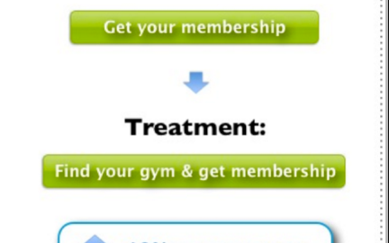
- Your CTA button: Experiment with color, the amount of whitespace around it, the text on the button, placement, and size and shape. Again, each element should be tested independently of all other elements. And all of these elements are important. One site owner realized many more conversions when he rounded the corners of the CTA button? Why? Well, psychologists tell us that curved corners draw the eye inward while squared corners draw the eye outward to content that is surround the button. Another got increased conversions just by changing the color of one word. Here is an example of an improved CTA button from jeffbullas.com:

Just by adding a bit more value (locating a gym), conversion rate increase was huge.
- Test the length and size of your registration or sign-up form. If you are trying to get more than just a name and email address, then you need to test just how far you can go with this. Test and compare the bounce rates of several different formats and then test separately for the amount of information your demographic is comfortable with. If bounce rates increase when another line is added, you know not to add that line. Neil Patel, content marketing guru and blogger, talked about the number of form fields on his landing pages. discusses the number of fields on forms. He collects contact information from individuals and companies in exchange for some free information. His original form had 4 fields:
Name:
Email:
URL:
What Can We Help You With:
When he removed the 4th line of the form, he had a 26% increase in conversion rate.
- Multivariate Testing – Don’t Settle for the First Result
You may have conducted A/B testing on a CTA button and found one color. Try other colors against the same control button and see the conversion rate you get with each one. Here is what Home Finder found:

Each color version was tested against “A.” The blue button “won” with a 17% increase in conversion rate.
Testing is an ongoing process, and you must do it every time you add something new to a landing page.
The Takeaway
- Landing pages exist for a singular purpose. Don’t try to use them for anything else – users will “smell a rat” and bounce.
- User task should be simple, direct and fast. Let them get in and get out
- Place no other information about your company on the landing page – that’s for later
- NEVER place any ads on a landing page – you are trying to build trust here
- Keep the design simple and direct. Make the CTA button large and easily found above the fold.
- Headlines should repeat the offer and be at the top of the page
- Never put navigation links on a landing page.
- Test your headlines, your CTA button and the length and size of any form.
- If your landing page by necessity has more than one task, determine whether both should occur on the same page or if it is reasonable and better to have a second page.
If you follow these simple “rules,” your landing page will be good and sticky, and conversions will increase. Next week, we’ve got a discussion about reputation management and some expert tips and tools.
Digital & Social Articles on Business 2 Community(88)