 Mike Parry
Welcome to the fourth instalment of my email analysis series!
For this weeks review, I’ve picked out an email which landed in my inbox from UK retailer Truprint.
You can see the full email here.
First Impressions
My first impressions of this email was that it was crazy! It breaks a lot of design “norms”, such as the stereotypical email layout, but still looks great. The design is progressive and fits perfectly with the product they’re selling. It’s image-heavy but manages to keep the key wording in text. It also adapts well for smaller screen devices.
Layer by layer email analysis
Now lets break the email down section by section.
Header
Nothing too out of the ordinary here, it’s just a standard header. It does include some pre-header text so props to them for that. We also have a view in browser link and a logo, which slots in nicely on mobile devices. The pre-header text is hidden on mobile

Hero

The hero section is where things start to get interesting. I absolutely love this section. It starts off with a big, bold banner announcing that it’s their birthday and that that it’s your last chance to receive this offer to create a sense of urgency.
That’s followed by a big text header announcing the offer itself. This is done in text, rather than an image, ensuring it renders with images off – important for allowing the reader to see the offer before they see the images so they don’t delete the email. This text is also using Google Fonts to render the font Open Sans, but has the appropriate fallback to cover clients not rendering it.
Under that is a nice, large CTA button with the offer code next to it.
The final element of the hero, or main offer in this case, is a big image showing the product on offer, along with a sense of urgency reminder on top of that.

This email scales perfectly at 100% width all the way down to mobile devices.
Second offer
Next up in the email is another offer section selling a second product.
This section is kicked off by a nice looking splitter to separate the content. I really like this as it helps to draw the reader down the page.

On mobile, they switch out the image so the text fits nicely on its own:

We then follow the same text pattern as above, a big header in text rather than image with web fonts that fall back. They also have a mix of font-weights here to add variety.

This is followed by another eye-catching full width image. I can’t overstate how much these images help this email. They’re fantastic, high-quality shots of the products that really show them off.

This section is finished off by the same offer code combined with CTA they used above:

And, just like above, this all scale beautifully into mobile too.

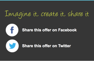
Social share
The next section of this email is a social sharing call-to-action. It’s a clean looking section using a solid grey background to pull it away from the rest of the email design and also acts as a divider.

I like this as the whole section encourages users to share the offers on Twitter or Facebook. It also scales down and stacks beautifully on mobile.

Social sites
This social section is followed by another – a little confusing as first but it makes sense as the above section is a call to share the offer on social sites and this section features links to the Truprint social media pages themselves.

The only thing I don’t like about this section is that the text “Follow us on X” is part of the image, rather than text. This seems a bit odd considering they’ve gone to such lengths to include text over images in the rest of the email.
Like the rest of the email, this falls nicely onto mobile devices. Switching from the four column layout into two.

Download the App
Following the hierarchy of the email down we have a section encouraging users to download the Trueprint app. Although right at the end, I love this little section. It looks great and stands out just enough from the rest of the email to match the call-to-action it holds.

On mobile they take the safe route of hiding the image and letting the text fall in.

Footer
At the end of the email we see the footer. One thing I adore about this section is that they split off the terms and conditions of the offers in the email away from the unsubscribe and general email footer bits. This means that the unsubscribe isn’t lost in the terms and you’re avoiding any chance of people not being able to find it. This is only a tiny little detail, but it makes a world of difference and should go some way to preventing people from using the default webmail unsubscribe option.

How it renders across email clients
Now for the big test for all emails; how it renders across different email clients.
If you would like to see how it renders across all different email clients, you can do so here. https://litmus.com/pub/1e14ca5
The good news that it renders perfectly across all devices.
It also looks great on tablets and mobile devices, even supporting older Outlooks such as 2002 and 2003, and the new Outlook beast; 2016.
This is extra-noteworthy, as making such an image heavy email render across all devices is no small feat – so well done Truprint!
Final thoughts
Although this is a very image heavy email, I love what they’ve done with it. The use of good typography, strong imagery and clear calls to action add up to make up a very nice email. It’s almost bordering on looking like a web page with the fact that it spans so wide on larger screens but still looks nice on mobile. Great email which breaks the stereotypical email design pattern.
If you have any thoughts on this email, let me know in the comments!
Digital & Social Articles on Business 2 Community(168)