
You’ve taken on the mission to increase conversions while delivering a more delightful experience to every visitor. How do you do it without breaking the rules of your design team’s style guide?
The notion that conversion and design have competing priorities is a false dichotomy. Design and A/B testing are actually kindred spirits when it comes to improving conversion rates and applying data-driven creativity to problems. Design principles are a rich source of A/B test ideas that will convert well and look good.
While strategists are good at understanding the customer, UX designers are good at turning that understanding into a better experience.
—Alhan Keser, Optimization Strategist, WiderFunnel
Design principles are excellent candidates for A/B testing hypotheses and are instruments for developing winning experiment variations based on proven design theory.
With that, let’s talk about one principle you can test right now: color contrast. To get the scoop on this design principle, we chatted with Jeff Zych, Optimizely’s Design Manager.
What is Color Contrast?
Contrast occurs when an element looks different from its surrounding elements or background. Dark text contrasts against a light background, for example. Our brains are wired to notice differences in our environment, which causes contrasting elements to jump out at us.
There are many types of contrast, such as shape, size, color, and texture. In this post, we’ll focus just on color contrast.
According to Jeff, “Contrast can range from high to low depending on the degree of difference between elements. Black and white have high contrast because they’re opposite colors, whereas dark and light gray have low contrast. The higher the contrast, the more obvious an element is.”

The black square on a white background has higher contrast than the dark gray square on a slightly lighter gray background, which draws your attention to it.
A skilled designer can use high and low contrast to focus a person’s attention on specific page elements. “There are two ways we can use contrast to generate test ideas: increase the contrast of the most important elements, such as calls to action, or decrease contrast of less important elements, thereby increasing the contrast of everything else,” Jeff recommends.
How to Test Contrast
In order to test contrast as part of a digital experience, first identify a primary goal.
It might be getting new visitors to click “sign up”, click on a homepage promotion, or submit a completed form. What is your goal for using contrast? Which element do you want visitors to look at, watch, and click?
Jeff suggests: “Use a bright color that contrasts from a muted background to highlight the element you want visitors to focus on. This might be your brand color, or a color that directly opposes your brand color on a color wheel.”

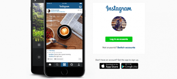
Instagram’s homepage uses color contrast to prompt visitors to log in.
Then, document your hypothesis:
If we highlight the call-to-action on our homepage by increasing the color contrast compared to the surrounding page, conversions on our primary CTA will increase because visual contrast draws the eye and makes the CTA more visually appealing.
Run your A/B test; if your results generate a conversion lift, look for ways to implement contrast on other pages and experiences across your website or mobile app. If your results don’t generate an increase, consider testing a different type of visual contrast, or look for other ways to simplify your page and reduce the number of distracting elements—it’s possible you weren’t able to create enough contrast for your visitors to notice a difference.
Exploring Contrast in Detail
As we called out earlier, color contrast is just one of many types of visual contrast that you can use to draw attention to elements where you want to increase engagement and conversion. For more reading about contrast, check out these sources:
- Design Principles: Connecting and Separating Elements Through Contrast and Similarity
- Design Principles: Dominance, Focal Points, and Hierarchy
- Fully Understanding Contrast in Design
Let us know if you’ve tried any tests based on color contrast or other design principles that we could share with other readers. Stay tuned for future Design Principles You Should Test posts!
Digital & Social Articles on Business 2 Community(203)