How many times have you arrived on a website homepage, taken one look, and wondered what the heck they were thinking?

Unfortunately, it happens more often than you probably want to admit. If I had a dollar for every time I saw a web design that makes me cringe, I would definitely have a few extra bucks in my pocket—and these are design flaws that I am seeing through the lens of a marketer.
Meaning that bad site design hits graphic and digital designers right in the feels.
The reality is that everyone (users, customer, marketers, web designers) make snap judgments about your website the millisecond they see it—literally.
“Did you know that it takes no more than 50 milliseconds (that’s 0.05 seconds) for users to form an opinion about your website? 0.05 seconds—that’s all a user needs to determine whether they like your site or not; whether they’ll stay or leave,” says Kat Kocurek.
That’s not a lot of time to establish credibility and make a first impression on your website visitors. For this reason alone, your website cannot be an afterthought, and you need to treat your website like a real store, or you risk losing users before you even have them.
The good people at kinesis offer up some very insightful stats about the important role your website plays in your brand’s overall credibility and why you should invest in it:
- 75% of users make judgments about a brand’s credibility based on the website design
- First impressions are 94% design-related
- 85% of B2B customers search the web before making a purchase decision
Web Design Flaws that Make Users Cringe (and Leave for Good)

People simply do not have the patience for mediocre web designs and sites riddled with (annoying) website usability issues.
Your website is an extension of your company and your brand. Your design can have a huge impact on how much users trust your company. Research finds that 94% of people cite design as a reason they don’t trust certain websites. This should be incentive enough to rush out and do some website usability testing – that is, once you finish reading this article!
Here are 10 cringe-worthy design flaws that drive your users and web designers crazy:
#1 – Using Flash (yes, this still happens)
It’s sad to say that Flash still exists. Just when you think you have seen the last of it, it pops up out of nowhere, much to the displeasure of almost everyone who sees it.
“I know your Flash intro looks ‘fancy,’ but the reality is that these splash pages annoy users and complicate site access on mobile devices that don’t support the animation program. Get with the times, and get rid of this unnecessary website feature!” says Taylor Hawes from HostGator.
#2 – Brutal loading time
Load times are irritating. No one has patience for anything anymore, and instant gratification is the name of the game online today. People can barely stand waiting in line to get their morning coffee, let alone wait for a website to load.

The days of dial up are well in the rear view mirror, and you need to make sure your website is up to speed, because within 3 seconds people are closing that browser window.
According to Econsultancy, 40% of people will abandon a web page if it takes more than 3 seconds to load, and “the change in a website bounce rate spikes to 100% when a page takes 4 seconds or more to load. It jumps to 150% if a page takes 8 seconds or more to load,” says Mobile Joomla.
#3 – Mobile immobility
Failure to design your site with mobile in mind is short-sighted and it will frustrate anyone who tries to access it from a mobile device. “Mobile web usage is booming, and if your website doesn’t display properly on these devices, you’re needlessly frustrating visitors and likely losing business as a result,” says Hawes.

According to Keynote, 46% of mobile users report having difficulty interacting with a web page, and 44% complain that navigation was difficult. MarginMedia found that almost half (48%) of users who view websites that are not working well on mobile take it as an indication that the business simply does not care. From an ecommerce perspective, more than 60% of companies that have site design for mobile increase sales, says Econsultancy.
#4 – A clumsy layout
Web designers are certainly sticklers about layout, and for good reason. Forget about frames and tables—we are not in the 90s anymore. Rather, you need to focus on web design and layouts that are in alignment with how users view your website.
Studies have shown that the majority of Internet users look at pages in an F-shaped pattern, and for horizontally designed websites, it’s recommended to use a Z-shaped pattern.
F Shape

Z Shape

#5 – Low quality and poorly organized content
Content is still king. Even though web designers tend to focus more on design and website usability, poorly written and formatted content can have a negative impact on the effectiveness of your web design and perception of your brand. According to Marketing Charts, 69% of marketers say dynamic and personalized content is important for their website, with only 5% saying it’s of low importance.

There is nothing more frustrating than a website with content that is filled with spelling, grammar, and formatting errors. Poorly organized content and burying information below the fold will all hurt your website’s effectiveness.
“The average new visitor only spends a few seconds deciding whether to stay on your site or to browse elsewhere. If your site’s most important information is buried beneath the fold, there’s a good chance it’s being missed,” says Hawes.
#6 – Whacky color schemes

My eyes!
Okay, sorry about that, but we’ve all seen sites that have just awful color schemes that have you wondering what in the sam-hell the designer was thinking.
Did you know that sites with dark color schemes grow at a better rate than those with light color schemes? The graphic below illustrates:

Another common color-related design flaw is not choosing colors that are in alignment with your brand and the meaning and emotions you want your brand imagery to convey. One common mistake it that your color choices don’t support your site’s goals. “Different colors evoke very different emotions in website visitors, which is why it’s important to utilize the principles of color science in your website’s design,” says Hawes.
#7 – Broken links and confusing navigation
The last thing you want your users to be thinking is, “Where am I supposed to click?” The goal of web design should be to help users find what they are looking for as quickly and efficiently as possible. But this is not always the case.
There is nothing more frustrating than finding the information you are looking for only to find out the link is broken. The same can be said for misleading navigation menus, and poorly labeled buttons and calls to action.
Website usability should be at the top of your priority list when designing site navigation and linking structures. Don’t make users have to think about where they should click next – it should be obvious.
#8 – Lack of whitespace

This is so….I’m gonna stop myself right there.
Clutter is bad (that’s more appropriate than what I really want to say). Too much going on in your web design can confuse users, making it difficult for them to know where to focus and where to click next. Plus, it just looks…pretty terrible.
#9 – No social sharing tools
If you haven’t jumped on the social train yet, by providing social sharing buttons on your website, you’re missing out. Users want to share your content, especially if it’s something of value. But you will frustrate them if you don’t make sharing quick and easy by having those buttons readily available for users to share your content with others on social media.

Social sharing buttons are now a standard website feature, and without them, you are missing out on word of mouth recommendations and making it difficult for your brand advocates to spread the word about your company.
#10 – Auto-playing videos or music
Have you ever been scared or caught off guard by music or a video that starts playing the second you visit a website? Ever had the speakers turned up on your office computer and have music suddenly start blasting when you landed on a website?
Embarrassing, right? It’s just not cool.
Users do not like when you use auto-playing audio or video clips. “Nothing pisses off website visitors quite like audio or video clips that start playing unexpectedly. While clips without autoplay run the risk of not being viewed, sites that use automated multimedia stand a much greater chance of having visitors click away before engaging in their content,” says Hawes.
Conclusion
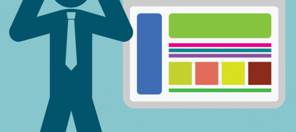
Avoid common design flaws and do not create a website that looks like this:

Do you have any other cringeworthy web design mistakes you’d like to share? Leave your comment below!

(235)