Behind every great digital ad is a great landing page.
Well, not so fast. Your great digital ad may have gotten the click through, but that doesn’t mean your landing page will convert.
The harmony – or lack thereof – flowing from your ad to the landing page behind it impacts your conversion rate. Sometimes called ad/landing page ‘symmetry’ or ‘alignment;’ I prefer ‘harmony.’ Think of a string of notes carrying you through a favorite song. The harmony of the notes holds our attention and moves us forward. What happens when we hear that off-key note? That dissonance jars us and throws us off the path.

The same effect is in play if your landing page doesn’t meet the expectations set by your ad. The elements of your ad inspired a click. Why would you not carry them through and develop those same elements to get the click on your landing page? You already know they can get a ‘Yes’.
Impact of a Harmonious Ad/Landing Page Pair
The folks at Optimizely wanted to find out just what kind of impact a harmonious ad/landing page pair could have compared to one that lacked such symmetry. They saw a 39.1% increase in conversions in the ad/landing page pairs where they harmonized the copy over the conversion rate of their control, which didn’t have the harmonized copy.
They also found that the reduced bounce rate improved their AdWords’ Quality Score, resulting in a discount on a CPA basis.
Overall, not too shabby.
Harmony Checklist
You want to create harmony across five areas:
- referral source
- ad
- landing page
- CTA/ form
- thank you/ exit page
Referral Source
- Use search keywords and related terms in the ad and landing page copy; but remember to still write for the humans
- Consult the segmentation criteria you’ve used when designing and writing the campaign content. If you have different ads based on different segmentation criteria, then you need different landing pages that reflect the same segmentation. An ad capturing clicks because its copy hits the main pain point of one segment of your marketing should lead to a landing page that builds off that same pain point.
Design Harmony Across the Ad, Landing Page, and Thank You Page
- Font: Use the same (or very similar) font across all three pieces of content. You can use additional fonts in the landing page to highlight specific copy or a CTA, but make sure the choice fits in the design and tone already created by the primary font.
- Color scheme: Use the same exact color palette – period. Color is the first visual your visitors will process and if the landing page looks entirely unrelated to the ad, you’ll experience a high bounce rate. All those statistics showing you have between three and eight seconds to keep your visitor from bouncing? Visual dissonance between what’s expected and what’s experienced is a big part of that.
 Color is the first visual element your visitors will process
- Image: Either use the same exact image, or one that’s clearly related or relevant to the image that attracted them to the ad.
Copy Harmony Across the Ad, Landing Page, CTA/Form and Thank You Page
- The headline on the landing page must align with the ad copy. A web hosting service that claims “one-click installs” on its ad copy shouldn’t lead with “free email” on its landing page.
- Continue with the ad copy/headline in the CTA on the sign-up form.
- Use the landing page copy as a source for different ad copy options to ensure harmony.
Content Harmony Across the Ad, Landing Page, and Thank You Page
Take advantage of your Thank You page to move the prospect further along their customer journey. So you want your Thank You page suggestions of additional content to make sense in the context of the content they’ve just requested.
Actually, the issue of offering the right content in your ad/landing page pair, and then following up with new content offers that align with the original offer are each topics in themselves. Those articles are coming! Check back to the Pagewiz blog over the next few weeks to see those.
Alright, back to our topic today…
Special Points About CTAs and the Sign-up Form
- The design of the sign-up form should stand out from the landing page, while staying consistent with the page’s branding and visually pleasing within it.
- The CTA copy in and around the sign-up form should align with the ad copy.
- Use the CTA copy in the button to answer the promise of the ad copy and landing page headline.
Let’s Take a Look at Some Examples:
Here’s a digital ad and landing page pair that do a great job at maintaining harmony.


What They Do Well:
- Both the ad and the landing page are clearly making the same offer
- Use clearly similar images
- Consistent visual style
Here’s another ad (this time from YouTube) and landing page:

What They Do Well:
- Spot on consistency in visual branding; there’s no question the click on the ad brought me to the right place
- Page headline repeats the copy from the ad

But this isn’t a clear landing page. The button I clicked was to “Access the Guide” – where’s more about the guide?
How do I get that? Let’s look at the CTAs.
This page had two CTAs. A pop-up form that hovered in front of the page, and a second CTA at the very bottom of the page.
Unfortunately, neither CTA made any mention to the Access Guide, the inducement on the ad button.
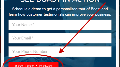
Here’s the pop-up form:

“Request a Demo”?
Slow down!
Someone who wants a guide is at a very different step in the buyer’s journey than someone ready for a demo.
And here’s the CTA at the bottom of the web page:

The irony is that they do such a good job focusing my attention on the button, I first thought “Sign Up” meant signing up for their software because all I saw was the button. That’s a total mismatch from the intention of a visitor who got to this page clicking an “Access the Guide” button.
Now with a closer look, I see signing up here is for a free course and their newsletter. A little better, but is this the guide they mentioned in their digital ad? If so, the button copy might better read “Access Guide Here.” At the very least, they should use the same “guide” language in the supporting text instead of “course.”
Now for a banner ad and landing page for a conference:

What They Do Well:
Despite the stark color contrast, the ad and landing page are clearly a pair pass. I can see instantly that my click brought me to the right place:
- prominent logo and conference name are quickly recognizable
- continuation of the same copy from ad to landing page headline confirms the conference details
- feature image on both is of the same speaker
- same CTA copy on the button

Does Your Ad/Landing Page Pair Pass the Blink Test?
The worst sin of ad/landing page dissonance is making your visitor feel like they’ve landed in the wrong place. Nothing will knock your visitor off the path to conversion faster than unmet expectations. Every ad sets up expectations regarding visuals, copy, and substance. Run through this checklist to ensure your campaign content provides a consistent experience.
Last checkpoint: Would someone know with only a glance that your ad and landing page go together? If not, you have some work to do.
What’s the biggest ad/ landing page mismatch you’ve seen? Where the page opened after you clicked the ad and you had no idea why you were there… Share in the comments below.
Digital & Social Articles on Business 2 Community(141)