
Conversion rate optimization relies on case studies – proof that our hypotheses have merit and are worth testing. After all, if someone else has found success with a strategy or design, why shouldn’t we?
This article showcases five high-performing landing pages, gives you their conversion rates, and breaks down exactly why they’re performing so well.
1. Photographer’s Ebook Landing Page

![]()
What I Like:
- This landing page is designed with its target market in mind – photographers. The large, prominent background image might not appeal to all markets but it does to the visual crowd (who may even recognize the camera).
- Colors matter in CRO, and ensuring your copy stands out from your landing page colors is crucial if you want to convince your landing page visitors your offer is valuable.
- The social share toolbar is doing an excellent job of encouraging engagement. People like to have evidence that your offer/service is trustworthy. Social shares give them that endorsement before they convert.
- The CTA copy is written in terms of “giving” the lead something, rather than telling them something to do. Tailor your CTA copy to communicate what your visitors stand to gain, rather than how they need to act (avoid “submit”, for instance).
2. Outdoor Company Online Sweepstakes

![]()
What I Like:
- The image of the Olympic Peninsula mountain range is large and at the forefront of this landing page design. This appeals to the outdoorsy prospective leads and provides all the color and energy this landing page would otherwise lack.
- The countdown timer creates a bit of urgency (it’s always important to create urgency on your landing pages and encourages people to engage now (as they could miss out if they don’t)
- The form fields are asking the information this company (an adventure vacation business) needs to know. They could have easily only asked for name and email address, but they’ll be better able to sell/encourage returning business if they know where their leads are located.
3. Real-Estate Ebook Landing Page

![]()
What I Like:
- The benefit list, or list of subjects this ebook covers, is intriguing and comprehensive. Though the ad or CTA banner would have already talked about the point of this ebook, it’s always good to include more description and value (just not too much, which is why I like that it’s in bullet-point form, rather than a paragraph).
- It’s all above the fold – This landing page is short and doesn’t require visitors to scroll at all. I like this, as it keeps the message concise and doesn’t ask anything of the visitor: what you see on this landing page is what you get.
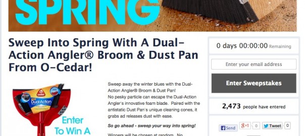
4. Spring Sweepstakes Landing Page


What I Like:
- I like that this brand has used the seasons to promote their product. Spring cleaning was on everyone’s brain when this promotion came out. Seasonal, themed contests always out-perform untimely contests.
- I like the massive headline, bright colors, and images. This page does an excellent job of grabbing your attention.
- Including the Facebook comment section (at the bottom) is a good idea, provided you actually have people commenting. Be careful with this, though, as it’s even more powerful than social shares if you get it right, but also more obvious (and detrimental to your conversion rates) if no one engages.
5. Blog Popup for Email-Gated Content
While not actually a landing page, I thought I’d include this case study from one of our most successful exit popups.


What I Like:
- You might not think that a 2.59% conversion rate is all that amazing, but look at it this way: Without this exit popup, that traffic was lost. They were leaving, moving their cursor to the back or new tab button, or that little “x” on the side of their tab.
- I also like that creating a popup like this one takes about 10 minutes from beginning to end. The ebook image is already in the Wishpond image library, the destination URL is already copied, and the headline is ready to go.
I’m happy with 2.59%.
Conclusion
Hopefully, these case studies have given you a better idea of how you can use landing pages. Keep in mind that a few of these examples were so successful because they’re focused on a niche market (and designed for that niche market).
Also, don’t worry about popups. The negative connotation was gone as soon as the majority of respectable marketing websites and blogs started using them constantly. They work. Naysayers are missing out.
Have any questions? Get the conversation started in the comment section below.

(125)