Are you looking for a way to streamline your on-site forms? If so, you’re in the right place.
All businesses use forms in one way or another. Contact forms, payment pages, and reviews are all possible when you use a form builder. Many companies use forms to grow their email list too! The thing is, if you don’t optimize this part of your website, you could be missing out on hundreds of potential customers every month.
People have many reasons for abandoning contact forms or ignoring them entirely. Despite what you’ve been told, it’s possible to convert skeptical visitors into customers by streamlining the way forms work on your website.
Let’s look at several things you can try if you’re seeing lackluster form results or just want to generate new leads for your business.
Tweak Form Placement
First, let’s talk about placement. We have all visited a website with the intent to find a contact form or sales page. Have you ever attempted this task, only to have trouble finding what you were looking for? Most people have experienced this scenario, and it’s not a good look, especially if it’s someone’s first experience with a business.
You can get more people to engage with your forms if you put them in the right place. Users should be able to quickly and easily find whatever type of form they are looking for once they land on your site. Don’t hide essential elements like your contact form behind multiple pages.
Instead, consider putting your forms above the fold. When someone lands on your website for the first time, they can see exactly where everything is, which makes them more comfortable when browsing your online store.
If you don’t want to interrupt your content in-line, you can always add a form to your sidebar. Sidebar space is prime real estate for forms because they are easily accessible, regardless of what users are doing on your site.
Experiment with different placement options and see if you can improve your conversions by stacking your form above your content or positioning it strategically on each page.
Focus on Mobile Users
Did you know that 58% of all website traffic comes from smartphones? This startling number should send a clear message to business owners and web designers.
Users need forms to be mobile-friendly; otherwise, many people won’t bother entering their information. Focus on mobile users by creating simple forms that are single-step optin. You don’t want people clicking submit from their phone, only to back out before they realize that there’s a second step to the process.
On that note, we suggest only including essential fields on your forms, especially your mobile forms. Despite 5.13 billion people owning smartphones, many people don’t have the patience to sit down and answer unnecessary questions. In most cases, users want to fill out the necessary information and get on with their day.
It’s hard to stress the importance of making your forms mobile-friendly. Button placement and verbiage all play a significant role in how users interact with your various forms. You can also boost your conversion rate by making small shortcuts in the buying process, such as allowing for guest checkout to reduce form fatigue.
Test Your Copy and Call-to-Action
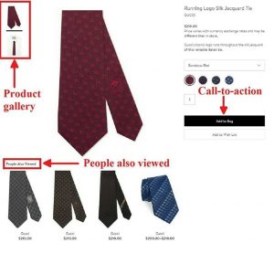
While we are on the topic of verbiage, let’s talk about your form copy and call-to-action (CTA). Both elements play a role in how many users will click-through. If your call-to-action lacks a direct action word, you may see a significant dropoff among users that go through the process of completing a form.
Instead of saying something like, “Submit,” you may want to switch to “Get my FREE Ebook” for consumers filling out a form for a lead magnet. The second call-to-action is more direct, which means more people are likely to take you up on your offer. But creating a killer call-to-action isn’t always enough.
You need to let users know why they should fill out your form in a couple of sentences. Your form copy will determine how many people convert on your offer. Present a compelling argument gets users curious about your products or services, which will undoubtedly lead to more conversions.
Test different ways of saying the same thing across all of your forms. You may be surprised to learn that small changes in the way you say something can lead to significant results. After you tweak the form verbiage, monitor your Google Analytics to see if the difference positively impacted signups or sales.
Experiment with Design Options
Experimenting with design options is just as crucial as tweaking your copy and placement. Depending on the form builder you’re using, there are hundreds of different options at your disposal.
Changing elements like the color of your background and CTA box can have a significant impact on conversions. Research shows that users are more likely to click on a red button over one that’s green. You’ll have to keep your website design in mind when making design changes.
The goal is to make your form stand out from the rest of the page. So, if your website uses red throughout the theme, you may be better off with a green CTA because it sticks out from the rest of your website.
There’s no one-size-fits-all solution when experimenting with design options. You have to experiment with the options available until you find a layout that gets results.
Let People Know what Happens Next
Finally, if you want to see more success with your on-site forms, we suggest letting consumers know what to expect next after filling in their information. You can choose whether you show a pop-up, redirect to a new page, or send a welcome email.
If you want users to continue engaging with your brand after completing the signup process, they need to know what happens next. It doesn’t matter why they filled out the form; a response will encourage them to continue interacting with your brand.
We know this is the case because welcome emails tend to get 86% more engagement than other types of emails. The reason for this trend is linked to users wanting to find out what happens next, so they open the first email you send out.
When you decide to let consumers know what happens next, don’t delay. Many people expect immediate information, and failure to send out the proper documentation can damage your reputation.
Back to You
There you have it! Now you know what actions you can take to streamline your forms and see more business growth. It’s important to note that you likely won’t see a dramatic shift in sales and engagement overnight. Instead, this process is about slowly fine-tuning your forms so you can get more responses over time.
Business & Finance Articles on Business 2 Community
(6)