— December 8, 2017


There’s a way we’re supposed to do things, with ecommerce marketing. We’re supposed to create visual ads which show people how awesome our products are why they’re worth the price. Then we’re supposed to take the people who click on those ads and send them to a website optimized to receive them.
Once they’re there, of course, it’s up to them. We can design for user experience and try to optimize the buying flow as much as possible but, really, it’s down to them.
But what if it wasn’t? What if you didn’t have to leave your website visitors to their own devices?
This article will break down five high-impact strategies you can implement to influence your visitor’s buying behavior and improve the chance of a purchase.
Entry Popup
When it comes to high-impact strategies to influence your visitor’s website experience, first and foremost has to be a discount for your buyers, communicated through an entry popup or welcome mat.
This is the most frequently-used strategy to influence prospective ecommerce customers, and you’ll see it on the majority of ecommerce websites (particularly if you’re a first-time visitor).
Here’s an example from Dodocase:

Another one, from Everlane:

And a last example from Greats shoes:

The first and second examples there are entry popups and the third a welcome mat (which shows over your whole browser window).
Why to Add an Entry Popup or Welcome Mat to your Ecommerce Website:
- Firstly, showing your visitors the discount as soon as they arrive frames their entire experience of your products. Every dollar sign they see, they can take 10% from. This changes their whole mindset as they navigate your site.
- Both the examples above have a second step (multi-step conversion funnels, if you’re into the marketing lingo) which requires visitors to subscribe to get the 10% off. This means that, even if people don’t convert today, the business has a chance to encourage a purchase down the line via email.
- Both these examples use the “negative messaging” button strategy you may have seen before. This requires people to click “I reject this offer” or “Decline 10% Credit” which is psychologically more challenging. It’s one thing to simply not say yes (non-action is literally the easiest thing in the world). It’s far harder to say no.
For further reference, check out Shopify’s guide to creating discount codes.
Scrolling Header or Footer
The entry popup or welcome mat strategy is the most common way to frame your buyer’s experience of your website, but is also quite invasive. It’s the first thing people see when they come to your website and not every business is comfortable putting a promotion right in the face of their visitors, no matter that it drives more customers.
A header or footer is far more subtle.
First, here’s an example of a “Today’s Deals” footer from RW & Co:

And a “Free Shipping” promotion header from Everlane:

Why to Add a Header or Footer to your Ecommerce Website:
- Headers and Footers showcase your promotions or opt-in without interrupting your visitor’s experience of your site.
- They frame the buying experience by literally framing it. As someone navigates your website they can constantly see the 10% discount or free shipping you offer.
- The expand options (the RW & Co image is a screenshot of an expanded footer) enable your business to feature a promotion and then include more information or navigation options once people click/show their interest.
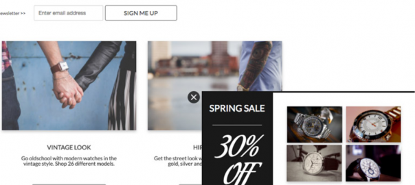
Scrolling Sidebar Popup
Similar to the header and footer, a scrolling sidebar popup still allows your website visitors to interact with the page they’re on, but also drives awareness of a promotion or opt-in option.
The difference, of course, is that a scrolling sidebar popup “pops up” only once your visitor has scrolled down the page a bit – showing their interest in your products.
It also doesn’t have an expand option, so all the information is right there for the viewing. This means it takes up a bit more of your visitor’s browser window (making it less subtle than the header or footer).
Here’s an example, which would show on your business’ homepage:

Why to Add a Sidebar Scroll Popup to your Ecommerce Website:
- You need to make your website visitors aware of your promotions, or they’ll be left to their own devices (which usually end with a “bounce,” by the way). A sidebar scroll popup is a great way to do this while not annoying them with a required interaction. They can still click on whatever they’re interested in, but now (at least) you can be confident they’ll have seen your promotion.
- Adding a sidebar scroll popup for a specific promotion to a specific page (for instance, adding a men’s watch promotion exclusively on your “Men’s Department” page) is a powerful way to focus attention on a single conversion goal. In this way, a website popup can be a powerful site optimization tool.
Campaign-Specific Landing Page
When we frame your website visitor’s buying experience, it’s all about making them aware of reasons to buy, and driving attention to where they can.
Landing pages (pages which focus your visitors on a single conversion goal and limit distractions away from that goal) are an excellent way to not just “frame” the buying experience, but dictate it.
If I send people everyone who clicked on an ad promoting 20% off men’s socks to a page dedicated to that promotion (rather than my homepage or general product directory), I’ve dictated how my site visitor’s experience my site. Limiting their options to “explore” (i.e. get distracted and leave) increases my site’s conversion rates.
Here’s an example of a promotion-specific landing page:

Why to Add a Promotion-Specific Landing Page to your Ecommerce Website:
- Especially if I’m sending people from Google or Facebook Ads, my landing page reiterates the same messaging, image, and value proposition. Consistency is a key in site optimization.
- Value is communicated clearly (there’s no confusion about what you stand to get). Remember to feature your discount amount front and center (in the example above it’s in a different color).
- The real reason to add a landing page to your site is to limit external links. You have a single conversion objective for this campaign. Don’t muddy the waters by giving your visitors a dozen options for other ways to navigate your site.
Exit Popup
On average, 69% of those visitors who do add a product to their shopping cart will leave without completing their purchase.
That’s a serious amount of money left on the table.
Luckily, there’s something we can do (beyond the standard “abandoned cart email” which only works if they’ve given you their email address).
An exit-intent popup.
Here’s an example:

This popup shows only when someone tries to leave your checkout page before completing their purchase.
Very simply, create your popup then set it to appear when people attempt to exit (be sure you’ve disabled your popup on mobile browsers, as you’ll get punished by Google if you do):

Set it to appear only on pages which contain “/checkout” (or whatever word you use to signify a checkout page):

Simple as that!
Why to Add an Exit Popup to your Ecommerce Website:
Well, let’s do a little math.
Let’s say the average purchase value on your website is $ 20. If you have 100 people put something in their shopping cart, that’s a potential revenue of $ 2000. If 69% of those people leave before making their purchase, you only make $ 420.
Let’s say, realistically, that your exit popup results in 2 out of 100 prospective “leavers” turning around and completing their purchase. That’s an extra $ 40.
You might think, “$ 40 is nothing special.” But then again, guess how much this awesome R2D2 coffee press is?
Exactly. And all for the cost of five minutes.
Final Thoughts
Your website visitors don’t have to be left to their own devices. You don’t have to focus exclusively on site redesign, UX or optimizing the billing process. Sometimes it’s just about framing the conversation – making them aware of something they weren’t – focusing their attention on a reason to buy, or making it slightly more difficult for them to say no to your awesome products.
Try Building Your Own Popups For Free
Have you tried any of the strategies in this article to frame your own buyer’s experience? Get the conversation started in the comment section below.
Digital & Social Articles on Business 2 Community
(86)