Visual content has always been relevant in marketing, but it’s quickly begun gaining more steam. This is probably because the average human’s attention span is now less than a goldfish’s, and visual content can catch a viewer’s attention quicker—and keep it longer—than written content. Naturally, images, videos, and infographics have invaded every section of the business world—including webpages.
A web page is a key part in any business’s marketing plan, and it perfectly lends itself to visual marketing—the site’s design itself, after all, has a visual base. However, it’s important to use visuals in such a way that it attracts and engages potential consumers instead of driving them away.
Here are some ways to maximize your website’s potential.
1. Design
The most obvious place to start is with your website’s design. This is not only the first thing viewers are likely to see on a website, but it’s the thing that they’ll be the most exposed to while exploring your page. According to Peep Laja, while usability is important, a good design is actually what makes or breaks a site.
Laja notes the six areas where users are likely to spend the most time on sites, those being: the logo, the navigation menu, the search box, the header, the page’s actual text, and the bottom of the page, in that order. Of those, four explicitly relate to visuals, and the remaining two (the search box and the text) can still be arranged in visually appealing ways.
Spritz Web Solutions has several helpful suggestions on how to best maximize web design. For one, keep everything simple and clean—use visuals to aid your content, but don’t use so much that it actually takes away from it.
Color scheme plays a similarly important role, and the author suggests using only two or three colors overall for you main scheme. The colors themselves should relate to your company’s personal voice without straining a viewer’s eye; brushing up on color theory can help when choosing a scheme.
2. Use Photography

[Image source: here.]
It should come as little surprise that using stock photos gets old fast. Taking pictures yourself—or finding a professional—is a great way to enhance a website.
Spritz Web Solutions (mentioned above) notes that photographs are extremely important for online retailers, and can be a great way to create a custom header or welcome image. Celine Roque adds that, since we’re naturally more attracted to human faces, adding such images can snap our attention much quicker. Pamella Neely further expands on the use of personal photos, as they attract far more interest than stock photos.
What are some great ways to use photographs, then? Try taking pictures of your product in action. Show what it’s doing in a real-life setting to help highlight its usefulness and attract attention, all in one. Keep in mind web layout; putting it alongside text can help enforce what you’re saying, and using it as a header can constantly remind your viewers of how effective your product can be.
3. Alt Text
Alt text—text written beside an image to describe it—is not only useful in helping to explain an image or organize a page, but also to help get found.
Pamella Neely states that alt text is one of the few bits on an image a given search engine can read, meaning creating alt text is in any creator’s favor. Writing an accurate description can both help more people find your sight and help people quickly understand what your image is trying to show.
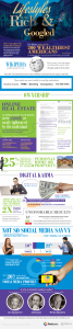
4. Quotes and Infographics
Image source: here.
Combining text and data with images can take out two birds with one stone, and is a great way to quickly catch your audience’s attention (and keep it).
Putting quotes in an image can quickly snag people’s attention, and can be used strategically, to help highlight specific parts of an article or to explain a corporation’s main goal. Infographics, similarly, can replace otherwise boring data with colorful images that explain the same concept, allowing you to show why your product’s so great with statistics without losing the reader’s attention.
There are a lot of online options for creating these visuals. Ann Smarty lists several options for creating “quote graphics,” and sites like Visme let you make beautiful infographics and presentations for your web page.
5. Animated GIFs
Movement tends to attract our attention pretty quickly, so what better way to get someone to stop and look at a section than by adding some animation?
GIFs can be used in a variety of ways. As Pamella Neely suggests, they can illustrate a step-by-step guide to using a product. They can also be used, much like infographics, to give life to otherwise boring data.
GIFs can also be potentially used to highlight specific sections of the page, drawing a user’s attention to an article or point along in the text.
A common way to use GIFs is as the header or welcome image, as they can show multiple aspects of a product over time, rather than relying on a static image to show its worth.
6. Use Visual Cues
If you want to make sure certain sections of your website attract enough attention, sometimes it’s a good idea to use visual cues to help draw focus.
Celine Roque comments that using lines or arrows can help catch a viewer’s attention and point them in the right direction.
A key point to remember is that these cues shouldn’t be obstructive; use them sparingly, so as not to clutter the page, and point them only to a few key areas, such as to certain places in the text or links in the navigation menu.
A simple way to use these arrows would be to include them only at the bottom of the page. After a viewer’s done scrolling through text, they are then directed to a specific area of the sight—perhaps one where they might learn more information or buy the product.
These visual cues don’t have to be the typical arrows and lines, either, and can actually be rather subtle. For example, try using an image related to your product to point out certain areas.
7. Avoid Bright, Eye-Burning Colors
While bright, neon colors may catch attention and are okay in small doses, when used frequently, they’re more likely just to cause headaches.
This states exactly why these can be problems: they quickly go from “surprising” to “annoying,” and can drive an individual away. Such bright colors can be obnoxious and, to some eyes, potentially childish.
Using bright colors sparingly can help alleviate the problem. If you want to use them, incorporate them with muted or darker colors, or use them in images that don’t rely on them solely.
8. Visual Storytelling
Everybody loves a good story, and using images or infographics to tell a story related to your product can quickly increase engagement.
Some methods of visual storytelling (such as showing your product in action) are already listed above. Justin Lafferty posts an infographic that gives several more great ideas to expand upon—for example, having the product in question turn users into superheroes.
You can similarly use visual storytelling to tell your product’s story from conception to release in an engaging way, or an idea of what goes on “behind the scenes” in your company.
9. Make Sure Your Graphics Relate to (and Enhance) Your Message
Using visuals are great, but using them just to use them isn’t. You might want to include that cute picture of a kitten you found, but if it bears no relation to your product, it’s likely going to be more distracting—and seem less professional—in the long run.
The ultimate goal of using visuals on a site is to engage a user and make them more interested in your product or service; thus, using images that don’t add anything are counterproductive. Think long and hard about what sort of images would be best to use in what places, and how they can improve and enhance an experience before including them.
Bonus Reason #11:
Include a Call to Action
As visual content is most often used to engage, it’s important to not only use it to enhance your message and catch attention, but also to encourage users to share your message and actively explore the site. Including this call to action in an image, rather than text, can help draw attention to it and, in turn, make it more likely users will listen.
Joydeep Bhattacharya goes over some of the best ways to implement this call to action in a visual format: easy-to-understand language that’s short, snappy, and instills a sense of urgency in the audience. This helps the reader remember (and understand) exactly what it is you want them to do.
Relatedly, if using visuals in a format where they can be shared, make sure your images are attractive enough to be shared, and include links back to your page—or, conversely, have them suggest sharing an article’s text instead.
Despite the importance of a call to action, you shouldn’t inundate a page with them; link one on the side, or put one at the bottom of the page, so as to make sure it’s there, but not constantly in a viewer’s face.
There are tons of options for creating amazing and engaging visuals for your website. Try playing around with these suggestions and see what works best for you.
Digital & Social Articles on Business 2 Community(103)