We all know that blogging is the new “must have” for any company looking to increase their presence online. We also know that mobile is surpassing desktop for content consumption and has no plans on slowing down any time soon. This means that mobile blog design is critical to SMB growth, especially with Google’s mobile updates a few months back.
We’ve compiled a list of 10 perfectly designed mobile blogs for you to draw inspiration from and get ideas to test on your own mobile blog.
Here’s the list:
1.) GetResponse

Why we love this design: The blog at GetResponse certainly gets users what they want and fast. Visitors can easily scroll through all recent blog posts, find one that’s of interest to them, and then click to open the article. The focus is 100% on the content, as users don’t see any sign-up forms, secondary links to other offerings or anything else…except for the blog articles.
2.) Bigcommerce

Why we love this design: With clickable buttons to filter content and easy to scroll article introductions, the blog at Bigcommerce is user friendly and looks great. In addition to blog articles, the blog is comprised of helpful related links and additional content offering like Ebooks.
3.) Food52

Why we love this design: Imagery, imagery, imagery. The team at Food52 knows about the power of food imagery and they’re putting their best foot forward by enticing users to learn more about images they find compelling. With a smaller screen on mobile, imagery is a great way to generate clicks instead of relying on headlines.
4.) Sidengo

Why we love this design: Sidengo’s blog is a perfect blend of headlines + mobile content + video + imagery. Article makes users forget what device they’re on, as elements of desktop blog best practices are put forth in Sidengo’s mobile offering.
5.) Startup Vitamins

Why we love this design: For those who don’t like to read long pieces of content on mobile, the Startup Vitamins blog is perfect. Instead of publishing in-depth articles, the team releases little snippets of inspiration, like “work like there is someone working twenty-four hours a day to to take it all away from you” – Mark Cuban.
6.) Hinge.co

Why we love this design: Social media sharing buttons. Too many mobile blogs worry about including desired design features on mobile because of the small screen, but not Hinge.co. The team here knows that their content is likely to be shared if users can easily share it, and hence, have included social media sharing buttons after each article and throughout the blog.
7.) Greenhouse

Why we love this design: Long article display introductions. As users scroll through all of the articles featured on the Greenhouse Blog, they’re offered full paragraphs of what’s included in each blog post, not just a few words tying to entice people to click.
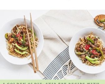
8.) The Fresh Times

Why we love this design: The team at The Fresh Times makes users feel like their blog is the place to be. The entire feel of the blog is fun, light and inspires users to read on and learn more. They’ve also mastered mobile imagery with their inclusion of food imagery.
9.) Couch Commerce

Why we love this design: Couch Commerce’s mobile blog isn’t afraid of mobile, and that’s why we love it. Their articles go in-depth and even include charts. They’re fully embracing mobile blog content and producing content with mobile first in mind.
10.) Recruitifi

Why we love this design: Attention to detail. Every blog post includes full publishing information about the author, time and date. In addition, social media sharing buttons are include after every blog title for easy sharing.
That’s it! If you like what you see, check out the original post on the Crayon site.
Digital & Social Articles on Business 2 Community(139)