
How is it possible that we are in the year 2015, and the same usability mistakes from 2007 are being seen? We are in a whole new age of the Internet, and yet even huge companies are launching websites that are barely usable thanks to very obvious issues.
These are some that are alarmingly common, and that you might be missing yourself.
 I Regularly Take Care of Broken Links
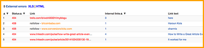
Just a couple of minutes ago I was following a link on Smashing Magazine and got a 404 error. The page no longer existed, but it was linked straight from a still heavily trafficked article that was getting engagement in both comments are social.
Any time a page is moved or removed, it needs to be double checked across the website. You should search out any mention that might exist, not just on the homepage. When a site misses these links it looks amateurish and unprofessional, and can actually hurt your authority.
Tools!
- Broken Link Checker (WordPress plugin)
- Website Crawler and XML Sitemap Generator (web-based tool)
My Site Is Fast and Smooth
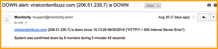
One of the most common sins: So many websites are painfully slow and / or go down to often. This is such an obvious mistake, yet so often overlooked that it’s almost unbelievable!
Your great content and awesome website won’t have any chances unless your users can load the page.
Tools!
- Use Sitegeek and their monthly uptime stats to find a reliable hosting provider
- Use this free page speed tool to diagnose what slows your page down
- Use Pingdom or Monitority to get instantly updated as soon as your site is down
My Site is Usable on Mobile
Luckily Google has encouraged many website owners to think about their site mobile friendliness threatening them with an update. But apart from search engine visibility concern, your sites need to be mobile-friendly in order to serve the users well.
Tools!
- Haris Bacic did a great job listing mobile friendliness testing tools here at SEP.
- If redesigning your website for it to be mobile friendly is way over your head, WHH is the only package I can recommend…
My Copy and Call-to-Actions Are Clear
I once heard a great bit of advice from a web designer: if a guy from another planet can’t tell what your website does within a couple of seconds, it isn’t doing its job.
This is the reason many sites are putting images of their product in use right on the front page. People get an idea of the product without having to read a single thing, and only have to use the rest of the text for more details. DirJournal is a good example of what I am talking about: You can see what the site does at a glance!
Tools!
- Try Five Second Test to evaluate your design and see if people can tell what it is about
- Use these tools to create minimal and clear graphs visualizing your site purpose
- Use these tools to create visual interactive content
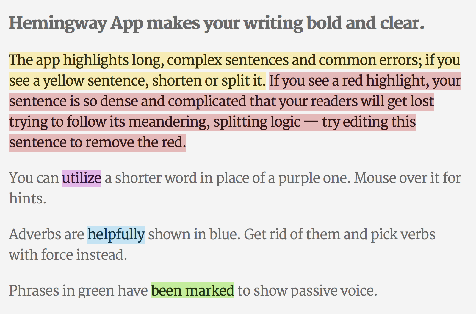
- Use Hemingway Editor and Atomic Reach Audience Engager (it also exists as a WordPress plugin and Google Chrome extension) to check how clear, readable and engaging your copy is.
My Design Isn’t Overriding Function
That fancy design you came up with might look awesome. But does it work well for the user? Going onto a website and having to wait through a loading animation is very stylish. For the user, however, it is also very annoying.
The same can be said for slow loading menus, anything that doesn’t properly scroll (such as scrolling through pop-ups menus), or hidden links that you have to find.
Don’t let your desire to be creative override the function of the final product. I’m looking at you, portfolio makers!
Tools!
Use Chalkmark to get a quick feedback about your mockup.
I Offer Various Ways to Contact Me
You should have multiple means of contacting you, right there from the front page. If you don’t, you are making one of the most egregious mistakes it is possible to make. Especially if you are a business.
Having a phone number listed is fine, but most users won’t be satisfied with just that. The same can be said of having a contact form built into your site.
Create a chat option, if possible, a set email, and a phone number. Make it easy to see and use.
Tools!
Here are varied apps giving you lots of option to add a contact form, online support chat or other customer services apps.
I Don’t Confuse My Customers with Suggestion Overload
Have you ever been on a blog, and there seems to be ten different rows of suggestions for other posts both on and off site? Or a store checkout that throws a dozen other products you might want to try at you?
There is nothing wrong with suggestions, and in fact they can improve both time spent on site, and conversions. But having too many makes the site slower to load, distracts the user, can impede mobile functionality, and comes off as aggressive.
When using suggestions, less is more.
I Offer My Users Various Ways to Opt-in (or Login)
Why in this day and age would any website that has accounts not provide a social login option? Facebook, Twitter and Google logins should be standard, especially given how easy they are to implement. All it takes is a single plugin, and you are good to go.
You may be wondering why this is so important. It comes down to ease of use, which is what makes it a usability issue. People would rather click a button than have to fill in all their details, and then go to their email to confirm.
Lazy? Maybe, but all that matters is that you give them what they want.
Tools!
- GetResponse offers a really robust social media integration with their opt-in forms
- Here are several WordPress plugins allowing to enable social media login option
Usability Tester Feedback… That Is Followed
Every one of these issues can be solved by getting plenty of usability testers, and then listening to what they have to say. Too many people will downplay these complaints, and instead only fix bugs. As though bugs are the reason you do usability testing in the first place… that is only a tiny part of it.
Don’t fall into that trap. The above design sins might seem obvious, but if you go through your site you are almost certainly committing one of them. Even if you haven’t noticed, your site visitors will have. You could be missing out on valuable conversions as a result.
Have I missed any important items from this checklist? Let us know in the comments.
Your Actionable Usability Checklist: Usability Mistakes to Fix
The post Your Actionable Usability Checklist: Usability Mistakes to Fix appeared first on Search Engine People Blog.
(189)


