
Starting a B2B web design project can be overwhelming. There is a lot to consider and often a lot of stakeholders need to sign off.
So, where do you begin?
In this post, we take a high-level look at what your B2B website MUST include.
Professional Design
Professional B2B website design is at the very top of the list. Why? Because if a potential client arrives on your website and it looks unpolished or outdated, they will assume your company and products/services are also unpolished and outdated.
Your website is often the first interaction a prospect has with your firm and is therefore the first impression you get to make. Would you show up to meet a new client wearing baggy sweats or an old Rolling Stones shirt from 1995? No. The same goes for your B2B web design.
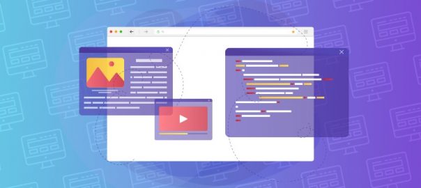
Draw or Interest
You’ve got your ideal prospect on your website. But there is nothing enticing them to stick around or even scroll down the page. Your B2B website design absolutely MUST have draw or interest to keep your visitor engaged. Now, we aren’t talking about flashing lights and neon signs pointing here and there. We are talking about things like engaging copy that strikes a nerve, speaks to a prospect’s pain points, or a video or animation that draws the visitor’s eye down the page.
Take a moment and look at your favorite B2C and B2B websites. Don’t most of them have interesting imagery, moving visuals, or engaging copy that resonates with you? Your website should have the same.
Brief Overview of Products/Services
A visitor is often arriving on your website with a specific need. They are looking for either a particular product or service, or more information about the product or service.
A B2B website is not the time to be kitschy or enigmatic. It’s time to let them know what services and products you offer. Be direct, be clear. Avoid things that are nebulous like “innovative solutions” or “full suite of services” and focus on what you actually offer. Be obvious! Things like “finance software,” or “human resources outsourcing,” or “msp for banks” say exactly what you offer and to whom.
If your website isn’t clear about what you offer, your website visitor will likely go elsewhere.
Benefits or Use Cases
What is the main benefit or use case of your products/services? Not to your firm, but to your end-users? Don’t take it for granted that they will know or understand a. what you offer or b. how it benefits them. Make it easy for them and spell it out.
Benefits that resonate with B2B buyers are things like increased revenue, cost savings, improved performance, streamlined processes, etc. The best B2B websites carefully and thoughtfully walk the potential buyer through the benefits of their products and services.
It’s crucial to remember that your potential buyer likely has stakeholders in various departments and seniorities. Speak to all relevant parties. Think of the direct buyer and all key influencers. Include use cases or applications on your website. Many people won’t connect the dots or assume that your product or service will work for them. Take them through how your product or service has benefited your existing customers and their businesses. Make it relatable so they say “Oh, that’s me or my company!”
Easy Navigation
Getting around a website by using the navigation should be designed to accommodate the website visitor, not your company. Designing user-friendly navigation is actually very tricky. We have website clients who come to us yelling “HELP” because their website is difficult to navigate and website visitors leave without getting in touch.
Easy navigation does not mean only two or three pages. It means a clearly organized navigation that accommodates what users expect. It’s also important to name your navigation according to what the end-user will understand.
Clear Next Steps
“Ok, I’m here and I like these products/services, what should I do next?” is not something you want your website visitor thinking. Also called a CTA (call-to-action), the next step guides the visitor into the next action, how to get in touch, what to do to learn more. Never assume that a user will simply complete a contact form for a quote or sign up for a newsletter to learn more.
Clear next steps in a B2B web design are both visual and copy cues. It can be a combination of things like “Learn More” and a button linking to a form. Or copy that invites them to get a quote for their project and a form with a “Get Quote” button.
If a website visitor needs to hunt or guess at what’s next, they often won’t get in touch. Just as you want customers to feel that doing business with your company is easy, you want prospects to feel that getting in touch with your business is easy.
Digital & Social Articles on Business 2 Community
(33)