After working in the inbound marketing world for two years, the amount of newsletters and blog notifications that I get every day has become understandably overwhelming. And I’m not one to mindlessly sign up for every newsletter I see.
I appreciate great content and learning new things, but let’s be honest: I don’t allow myself nearly enough time to read every email and article that passes through my inbox. So what do I do? I skim subject lines and delete the ones that I don’t have any interest in opening.
But the InVision newsletter is unique to me. I get a new one every week, and each time I do, I honestly groan a little. Why? Because, without fail, I’m going to get sucked in by at least five of the nine pieces of content that they are promoting. I know I’m going to lose some of my work time, but I also know I will love what I read, so I struggle internally a bit, trying to plan out when I know I’ll have a long enough break to dive into it and really absorb the great knowledge they’re presenting.
As a designer, their content is addicting. And compared to the three to five other newsletters that I may have deleted without much thought, I held onto this particular newsletter because I know it’s content worth keeping.
What is the breakdown to this newsletter that makes it so captivating and effective? Even if you’re not a designer, you can still learn from what they’re doing.

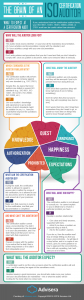
Newsletter Anatomy 101
Each InVision newsletter has roughly 11 to 14 sections or blocks, broken down as follows:
- Six to nine pieces of content, usually blogs or videos
- One webinar or tool, something more promotional
- One Marketplace promo
- One “On the Grid” city highlight
- One weekly Dribbble shot
- One favorite design links section
It’s a lot, but it’s also consistent and each type of content block serves a purpose. These blocks can be broken down into the following three divisions, each with their own functions:
1. Varied Content Offers
Not everyone comprehends or digests information in the same way. We all have our own, unique content appetites. That means if we – as marketers – want to give our audience what they are looking for, we must be able to present a wider array of content types.
Now remember, you diligent students of inbound marketing, don’t offer content that is outside of what your audience is looking for. Just because you could write a great blog on why corgis are the superstars of the internet, doesn’t mean it’s beneficial to your audience or your organization to do so.
Serve up what your audience is searching for, and then give them options for how to digest it.
The bulk of the content in the InVision newsletter is information that educates and informs their audience. It directly correlates to reader pain points, and it provides answers to questions that readers are asking InVision – or asking Google.
I spend most of my time reading through these blogs because of how helpful and insightful they are. Plus – wow factor here – they are all completely relevant to my interests. They aren’t just cute lists and abstract thoughts on best practices and top ten tips. They are solid, digestible information bites that I can rely on to help me improve the work that I do – and thereby improve my lifestyle.
But best of all, I – the reader – get to choose how I learn best – whether blog, video, demo or webinar – and learn to my heart’s content. Give your newsletter readers the power of choice.
2. Self-Promotional
Okay, we all know the secret to inbound is not throwing your business or product in your audience’s face constantly. But at some point, you’ve got to have the discussion of what you’re selling and what you have to offer.
At the very least, you’ve got to offer them some kind of gated content that they can convert on. And webinars are perfect for this. They aren’t so bottom-of-the-funnel that you’re going to scare away prospective customers, but people do still have to fill out a form and give you personal information of some kind in order to join in on the fun.
InVision also uses the Dribbble Shot block to show off how they have been working to make even better experiences for their users. To me, the key here is that they are celebrating the wins. Too often, we get caught up in doing the work for our customers and clients but not actually celebrating it. It’s good to celebrate the wins, and it’s great to share those wins with the people you’d like to do business with one day. (Hint: that’s often your newsletter’s audience.)
Of course, InVision has their own Marketplace they like to promote, because who doesn’t like a well-designed t-shirt? Sometimes they are promoting a cool new design. Other times, it’s a contest to win new swag! They switch it up, but always keeping the focus on their ever-changing, always-awesome shop inventory.
3. Fun and Social
Lastly, the newsletter has two blocks just for cool social things.
One block showcases an On the Grid city. On the Grid is a fun social site where designers can become “ambassadors” for their hometowns and neighborhoods and curate content on some of the coolest and more interesting hot spots and hideaways in their beloved cities. It’s collaborative and engaging.
The second block is simply the weekly Favorite Design Links. It’s a straightforward way for InVision to provide that extra bit of value to the people who read through their newsletters. Links like these aren’t promotional. They are just fun, educational, interesting, and always something the InVision writers believe will connect with their readers.
These things don’t have to be in your newsletters, but they are great ways to connect with your audience and share things with them that they are interested in. Twitter, Pinterest and other social outlets are great ways to put this kind of simple and fun content in front of your followers. Sometimes, it’s not just about you promoting yourself or your content you worked hard on. Sometimes you need to take a step back and send your followers the fun things they might like to browse for in their down time.
Cons
Okay, I can’t say all those great things without critiquing some of the things I believe InVision could improve upon. It wouldn’t be fair. To be honest, the newsletter can be a lot to look at. Like I mentioned in my intro, I groan when I get an InVision email. I know it’s going to take some time to work through it and really digest the content they’ve sent me. It’s all great content, but the downside is that some of the content and calls-to-action toward the bottom of the newsletter get a little lost.
For example, in a recent newsletter, the second to last content block was a CTA for a poll they are running, asking their audience to provide info on the size of their team. It’s so tiny, and the CTA is a total of seven words. If gathering this info is a big goal for InVision, I hope they are placing this CTA in more relevant places – maybe in a blog post on how team size affects productivity, for example – so that there is more of a correlation between the content and the CTA.
It’s the Little Things
There is a lot that can go into a great newsletter, especially when no two newsletters are exactly the same.
Be sure to offer a wide variety of content that is specifically targeted toward helping your target audience, and give them options when it comes to how they digest that content. Don’t be afraid to promote your own business, always keeping in mind how you ultimately help your customers. And remember to have fun! We’re all human beings and promoting content that is fun and social will help you relate to your audience better.
Sometimes it’s just in the details that only a few will notice. When you are reading the InVision blog from a desktop browser, the little browser tab for the blog will change to say “Don’t forget to read this…” as soon as you switch to another tab or window. All of this works to make the InVision content captivating. It’s a tiny detail, but it’s clever and makes me enjoy my experience on the InVision site.
Likewise, all of their buttons and calls-to-action are much more engaging and – often – hilarious than your usual, “Download Now” or “Read More” buttons.
So, with all of that in mind, how can you start to make small changes to your own newsletters so that they have just a little more personality and captivate your audience a little more?
Business & Finance Articles on Business 2 Community
(58)