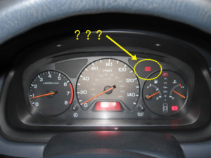
 Last week, the emergency brake light on my car’s dashboard would not turn off.
I checked the brake itself. Whether it was up or down, the light remained on. It didn’t feel like it was engaged when I was driving. My gas mileage stayed the same. The car is fifteen years old; I started to have fantasies about a new car, but they were overshadowed by a suspicion that this light was clearly not illuminated for the right reasons. I channeled my inner Inigo Montoya: “I don’t think that light means what you think it means.”
Sure enough, when it finally dawned on me to search online for “emergency brake light won’t turn off,” I learned that sometimes that light stays on as an indication that the car’s brake fluid is low. I checked the brake fluid, and that was EXACTLY what the problem turned out to be. I filled the brake fluid and clapped gleefully when the emergency brake light on my dashboard dimmed.
Hooray! I troubleshooted my own car!
After the glow of success wore off, I got to thinking: that is a really TERRIBLE way to warn a driver that the brake fluid is low. After years of driving, I was conditioned to interpret that BRAKE light to mean that I had engaged the parking brake. The car’s operating system set an expectation for me that was hard to let go.
That’s poor design, and I see it every day on websites too. Users of websites have expectations just like drivers of cars. Challenging those expectations isn’t always a great idea. Today I want to write about some ways that language and even typeface can mess with a user’s expectations around how websites work, and why those challenges aren’t a great idea if your goal is a truly usable site.
Say What You Mean
We are all familiar with the conventions of website menus/navigation, especially for the kinds of websites we visit most. An online store will have menu items for all the kinds of products they sell (Books, CDs, Electronics, etc.). A restaurant’s website will have menu items for their actual restaurant menu, a map or directions, and a history of their eatery. If you sat down right now and thought about the kind of content you expect to see on different types of websites, the chances are good that you’d be able to invent the navigational structure for an imaginary website pretty easily.
When website owners try to get creative with their menus, it adds a step for their users that interrupts the flow of usability. Sometimes, a truly visionary business may want to do that — it may be just the effect they want. Most of the time, that kind of creativity doesn’t serve your business at all. Here’s an example of a typical menu for a service provider like an accountant, attorney, or physical therapist:
Home | About Us | Our Services | Testimonials | Contact
There are variations, of course, but that seems pretty standard. If I asked you to find information on the history of this company, you’d probably guess that you’d find it in the About Us section. If I asked you to send this company a message, you’d probably click on Contact to figure out how to do that. Now, let’s reimagine this menu the way my car’s operating system might write it:
Start | Information | Operations | Previous | Attention
Would you know where to find the company history? I might look in “Previous,” but that’s where I’d find the previous clients’ testimonials. I might look in “Start,” but that would just take me back to the home page. It could take me three clicks to get where I wanted to go, by which time I am feeling a little bit irritated and also a little bit dense – not at all what the web site owner wants me to associate with their company.
Creativity is great – as long as it’s also crystal clear.
Use More Words If You Need More Words
Space is at a premium on a web page, as we know that people’s attention spans are getting shorter, and that may tempt a website owner to use as few words as possible to get their point across. However, there are times you need to use more words. Clarity is far more important than white space.
My car’s dashboard is the perfect example of this. A light that said “Check fluids” would have been far more likely to help me out than using the emergency brake indicator. Sure, I’d have had to check all the fluids until I got to the right one, but I wouldn’t have been concerned that it had anything to do with the emergency brake lever inside the cabin of my car.
The same thing goes for error messages on your web site. Some of the most frustrating exchanges I’ve seen happen between a user and a web site owner have been over the error messages in forms the user is trying to complete. They fill in all the blanks that apply to them, they hit submit, and they arrive at a blank page that says something really unhelpful like “ERROR. PLEASE RETURN TO THE FORM” or, slightly more helpful, “PLEASE COMPLETE ALL OF THE REQUIRED FIELDS.”
But which required fields? Are they marked?
Is that error message even accurate? Perhaps the required fields are all completed, but one of them is supposed to be an email address and the user has filled it in with “refuse to answer,” and your web site is not configured to explain that it requires the email address field to contain an accurate email address. All of those things matter a lot to users. You know this if you’ve ever spent twenty minutes filling out a form only to receive an error message you don’t understand.
Fonts Matter
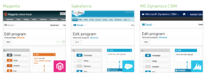
While the specific font you choose matters a lot – just look at some of the images here if you don’t believe me — the weight and size of your font also matters. Users are looking for ways to organize your pages in their heads quickly. Headings and text stylings like italics and boldface help them chunk your content in a glance. Here’s an example of great styling from Northwestern University’s undergraduate admissions page:

The headings in bold and uppercase font let my eyes scan the page easily. Short titles, color-coded audience-directed links, and lower-case article titles make a hierarchy easy to follow. There’s a lot of information here, but it’s so cleanly laid out that I don’t feel overwhelmed with my choices. This is how it should work!
As a contrast, the university admissions page below (which I’ve smudged out in the photo so you can’t see the name of the school) has gone in a different direction:

On this page, I count four font colors (white, black, teal, and orange), three background colors behind text (orange, white, and grey) and seven font styles (large mixed-case serif font, small mixed-case serif font, medium italic serif font, small upper-case serif font, medium mixed-case sans-serif font, small mixed-case sans-serif font, and medium lower-case sans serif font). And that’s not even counting all the images and icons on this page.
If I were a prospective student, I know which page would make me feel calm and which would make me feel confused. I’ll bet you know, too.
In The Name Of All Things Intuitive, MAKE LIFE EASY FOR YOUR USERS!
You want your users to buy your product or hire you to do something or read your writing or attend your event. Don’t put up barriers to that. Don’t make them jump through hoops, translate jargon, or read your mind. Remember your goals. Be kind to your customers. After all, you want them to stay.
(283)