— July 20, 2017

geralt / Pixabay
Have you ever stopped to think about why infographics are so wildly popular in marketing? Basically, it’s because humans are not computers. Our brains need help translating raw data into meaningful insights, which we can then use to make informed decisions. And visualizing data in this way makes that easier.
For agencies or service providers that depend on marketing data, this idea is doubly important. Your role as an agency often requires processing the mounds of data you pull in – engagement stats, visitor behaviors, heat maps, lead gen, sales results, etc. – into actionable advice for your clients. It’s not enough to report the data; our role often includes translating it.
What if we could take the kind of information we now get – through Google Analytics, for example – and get better at telling the visual story? The next wave of data visualization just might help us do that…and think of what that could mean to your agency. Let’s take a quick look at the fascinating history of infographics, the science behind the next wave of data visualization, and some new tools available that help agencies use data to build more meaningful relationships with their clients.
A Brief History of Infographics
Infographics, although they are a thoroughly modern marketing concept, aren’t new by any means. One good definition of infographic comes from Visually; they say that an infographic is “a visual representation of information, data or knowledge.”
Using that definition, we can consider ancient cave paintings, runes, and hieroglyphics all forms of infographics, in the way they help visualize a concept or story.
In more modern times, the eminent statistician Edward Tufte is often cited as being the progenitor of modern data visualization, especially his groundbreaking work “The Visual Display of Quantitation Information.” He is often credited with helping designers turn data into understandable visuals in ways that instantly make us see things differently.
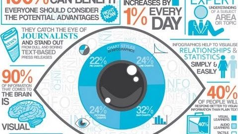
As we live and work now in the age of Big Data, this kind of visualization is more important than ever. According to marketing expert Jeff Bullas, the fervor over using infographics in marketing is based on sound principles.
“Infographics are a visually compelling communication medium that done well can communicate complex data in a visual format that is potentially viral,” Bullas writes. “They take deep data and present it in a visual shorthand.”

Image source: Jeff Bullas.
This kind of visual representation isn’t just applicable to your marketing; it’s just as important when sharing information internally, and can significantly improve how you communicate with your clients.
Why Data Visualization Works
A human brain is a magnificent machine with some amazing capabilities. But what it lacks, according to behavior research psychologist Robert Epstein, handicaps us when it comes to interpreting data.
“Senses, reflexes and learning mechanisms – this is what we start with, and it is quite a lot, when you think about it. If we lacked any of these capabilities at birth, we would probably have trouble surviving,” Epstein writes. “But here is what we are not born with: information, data, rules, software, knowledge, lexicons, representations, algorithms, programs, models, memories, images, processors, subroutines, encoders, decoders, symbols, or buffers – design elements that allow digital computers to behave somewhat intelligently. Not only are we not born with such things, we also don’t develop them – ever.”
Enter the art and science of data visualization, and its impact on your business.
“Clients demand to see the results, backed by real numbers,” explains WhatAGraph CEO Justas Malinauskas. “But if you send them a spreadsheet or a table with data, they don’t get it. The truth is, numbers in your analytics reports for clients are hard to digest and to understand.”
“Our job,” Malinauskas continues, “is to humanize the data. The next wave of data visualization is all about making data more digestible, more engaging, so real humans can make real decisions based on the numbers.”
Humanizing Data for Your Clients
Can the sample principles work in your day to day work with clients? Isn’t it enough to send those Google Analytics reports or share your KPI dashboards? Not anymore. While GA was cutting age for its time, but doesn’t help the average client understand what they’re seeing, and translate that understanding into inspired action. Data without these actionable insights is meaningless. Let’s look at three tools that are making this kind of visualization possible for any size agency budget.
- WhatAGraph is a customizable, fully automated performance reporting platform that takes loads of marketing data from across your client’s channels, compiles it, humanizes it, and gives you a chance to add comments. Each of your clients and team members gets the info that’s most important to them, in a way they can understand and actually use. It looks and feels like custom infographics – which your clients are already used to using – without the hassle of building them yourself.

Image source: WhatAGraph
- If you are into building your own infographics for your clients, Piktochart might be a good tool. You’ll be able to create professional looking infographics without a designer. While it doesn’t automatically tie in any data (i.e. it’s not a reporting tool), it can help you manually make your more accessible data accessible and sharable. Features include drag-and-drop editing, templates and designs, an image and icon library, and a map feature to help you share data information in a digestible way.

Image source: Piktochart
- As Dana Zuber, VP of Strategic Planning for Tableau explains, data visualization can be both truly useful and beautiful. “A well-crafted, thoughtful visualization makes the light bulb go off. You just don’t get that with a spreadsheet,” he notes.
Their product helps make that happen by helping you translate your business intelligence data into a range of image types, with a few clicks. It works great for including images in annual reports, white papers and other marketing resources. For content creation agencies, this can be a big boon in providing images that truly tell your client’s story.

Image source: Tableau
The truth is, while our brains are amazing, the average human brain is simply not designed to process the stream of raw data you’re delivering to it. For the rare few who live for this stuff, you’re in the right field. But your clients have hired you to interpret all of this data for them, and get them the information they really need, in a way they can really use it. By using these tools to create more humane visualizations, you have an opportunity to make a real impact on their results and your relationships. The human brain is amazing – and the way the field of data visualization is evolving will make us even more powerful decision-makers.
Digital & Social Articles on Business 2 Community
(98)