

We all are being pushed towards a mobile first consumer marketplace and SMB’s are still lagging behind in terms of a mobile optimized website. With lightning fast internet connections and 4G standards already in place, the time has never been better for the growth of mobile audiences. According to ComScores recent Global Mobile Report, just under half (49%) of the traffic and visitors to the top 100 digital media properties are mobile only. This is a remarkable statistic that argues websites not adapted for mobile devices may risk losing half their audience.
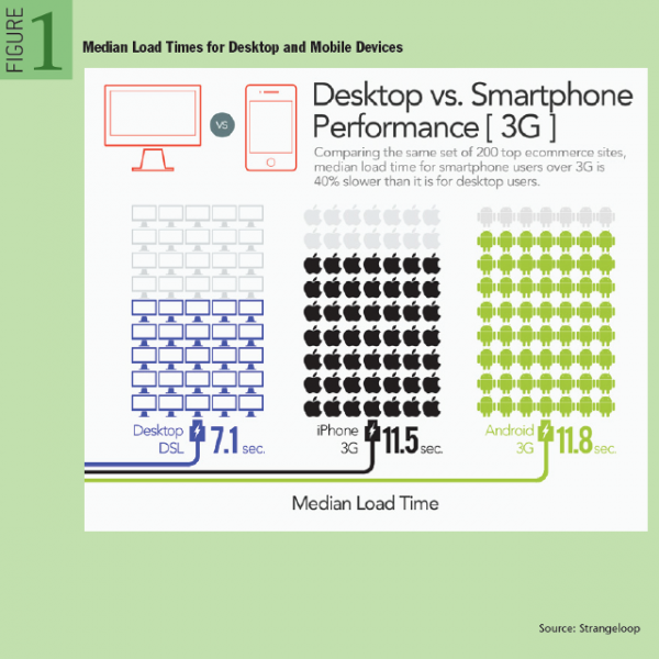
The only thing that matters the most for mobile audience is the speed (the below fig. provides the median load times for desktop and mobile devices).
The steps and methods discussed in this mobile site speed optimization guide will list all the necessary fixes that are needed to optimize the speed of your site on all types of mobile devices.
How to Check Your Site Performance on Mobile Devices?
One of the first things you need to do in order to make your website mobile friendly is to check its performance on mobile devices. There are several tools that you can use for this task:
Google Mobile Friendly Test – This tool analyzes the URL and reports if the page has a mobile friendly design. It provides documentation of how Googlebot can view the webpage correctly on mobile devices and provides step by step suggestion on how to make the page mobile friendly.
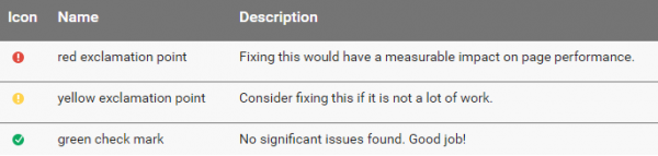
Google Page Speed Insights – This tool analyzes your web page and provides suggestions for making it faster. This tool provides 3 priority indicators namely red (needs fixing), yellow (consider fixing) and green (no issues detected) as provided in the below screenshot.
GTMetrix – This tool provides a performance report by obtaining data from Google Page Speed Insights and Yahoo Slow both. It also provides a Waterfall Chart which can be used to discover simple issues such as 404’s or more complex issues such as external resources blocking page rendering.
Once you have identified the issues and have made the initial fixes, now it is time to further speed up the website by implementing the below suggestions.
How to Speed Up Your Website on Mobile Devices – 8 Ways to Reduce Load Time and Increase Performance
The below tips have been tried and tested in order toincrease the speed of your website on mobile devices. Let’s understand each one of these, one by one.
1- Have a Properly Configured CDN
Speed and accessibility are among the foremost concerns in optimizing for search. Leveraging global content caching through a content delivery network (CDN) is a great way to boost up the SEO efforts. Basically, a CDN is a collection of servers spread across different locations in the world, which cache website content dynamically. It is an additional service that can be used above and beyond existing cloud hosting services. It is compatible with a wide range of services including WordPress sites.
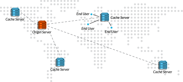
CDN caching helps to deliver cached content via a server closest to a client. These, in turn, minimize latency and therefore load time through the advantage of shorter distances (Please refer to the below fig. to have an idea as to how having a CDN drastically reduces the loading time). A capable CDN also comes with infrastructure optimizations, such as DDoS attack protection and a web app firewall, among others.
How to Configure CDN?
- Sign up with your preferred CDN provider and add your website.
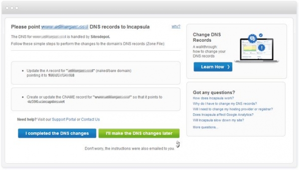
- Change the DNS settings in order to route traffic through the CDNs network. Update the A record and create or update the CNAME record. (A screenshot from Incapsula has been provided below. You may choose any of your preferred CDN provider and make the required changes in the DNS settings).
- That’s it! Once the record updation is done, the CDN will start to route traffic to your website.
Having a CDN in place will help to improve the site loading time and work towards improving the user experience.
2- Make Use of Accelerated Mobile Pages
In October, Google introduced Accelerated Mobile Pages for a faster and open mobile web. Accelerated Mobile Pages are specially formatted web pages that enable search engines to display the content extremely fast, while ensuring that publishers control the way their content looks and feels. It is estimated that mobile websites can load much faster with the use of Open Source AMP HTML codes, and minimize their bounce rates by effectively curbing search engine load times.
How to Implement AMP on Your Site?
For implementing AMP on your site, please follow the below steps:
A- Create a separate version of your main page by using AMP HTML (also known as the AMP version of your main page). Basic code for designing your first AMP HTML page is provided below:
- <!doctype html>
- <html amp lang=”en”>
- <head>
- <meta charset=”utf-8″>
- <title>The title of your AMP page will go here </title>
- <link rel=”canonical” href=”URL of the non AMP version will go here” />
- <meta name=”viewport” content=”width=device-width,minimum-scale=1,initial-scale=1″>
- <script type=”application/ld+json”>
- {
- “@context”: “http://schema.org”,
- “@type”: “NewsArticle”,
- “headline”: “Open-source framework for publishing content”,
- “datePublished”: “2015-10-07T12:02:41Z”,
- “image”: [
- “logo.jpg”
- ]
- }
- </script>
- <style amp-boilerplate>body{-webkit-animation:-amp-start 8s steps(1,end) 0s 1 normal both;-moz-animation:-amp-start 8s steps(1,end) 0s 1 normal both;-ms-animation:-amp-start 8s steps(1,end) 0s 1 normal both;animation:-amp-start 8s steps(1,end) 0s 1 normal both}@-webkit-keyframes -amp-start{from{visibility:hidden}to{visibility:visible}}@-moz-keyframes -amp-start{from{visibility:hidden}to{visibility:visible}}@-ms-keyframes -amp-start{from{visibility:hidden}to{visibility:visible}}@-o-keyframes -amp-start{from{visibility:hidden}to{visibility:visible}}@keyframes -amp-start{from{visibility:hidden}to{visibility:visible}}</style><noscript><style amp-boilerplate>body{-webkit-animation:none;-moz-animation:none;-ms-animation:none;animation:none}</style></noscript>
- <script async src=”https://cdn.ampproject.org/v0.js”></script>
- </head>
- <body>
- <h1>Welcome to AMP</h1>
- </body>
- </html>
B- In order to insert images, use the following code:
<amp-img src=”welcome.jpg” alt=”Welcome” height=”400″ width=”800″></amp-img>
C- Modify the presentation and layout of the page by using common CSS properties. An example styling code is provided below:
<style amp-custom> /* any custom style goes here */ body { background-color: white; } amp-img { background-color: gray; border: 1px solid black; }</style>
D- Preview, validate and publish the AMP page.
E- Add the amphtmltag in the non-AMP version of the page in order to help search engine bots to identify the AMP version of your webpage:
<link rel=”amphtml” href=”AMP version of your webpage goes here” />
Live Example of AMP Page
Here is a live example of an AMP page in actionandhere is the normal page. You can simply view the source codes for each page and notice the difference in speeds and coding.
AMP Learning Resources
For finding codes for learning AMP HTML, please refer to the below resources for more details:
3- Improve the Site Structure, Content and Enhance the User Experience
Site architecture is an oft-neglected area when it comes to site designing, but it shouldnt be. Googles algorithm uses information from searchers so a good user experience means higher rankings. If your site structure is not proper then the page will take more time to load and the user will leave the site. This provides a bad user experience.
How to Improve Site Structure?
One of the most crucial aspects of a good search experience is having a good site structure because it helps to optimize the site for better crawling.
Here are 8 steps that you must follow in order to enhance your site structure:
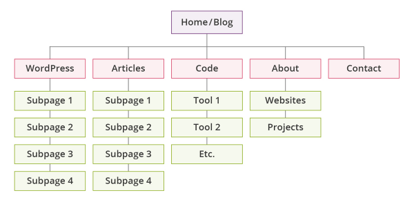
- Plan your site hierarchy and keep it logical. Also, balance the number of categories and subcategories. An example of a refined site structure is provided below:
- Use searchable keywords while naming your categories and subcategories. Picking the right names will go a long way in optimizing your site.
- Have a user friendly URL structure and ensure that the user takes just three or fewer clicks to reach every page.
- Add sitelinks as many as possible. Apart from increasing the navigability of the site, sitelinks help to increase brand reputation, increase CTR and shorten the conversion funnel.
- Add as many internal links as possible but make sure they are all relevant. Follow Wikipedia if you are looking for a great example on how to create solid internal links. An enhanced and SEO friendly internal linking structure will allow the link juice to pass equally across all the inner pages and allow every page to rank well on Google thereby increasing traffic and conversions.
- Avoid the problem of redundant categories and tags. The Yoast Tag Optimization tool is a great way to fix the problem of redundant tags on your WordPress site.
- Link to your most important pages more often and above the fold. It is very important that you pass on the maximum link juice to your main revenue generating pages in order to increase profits.
- Follow the 2 click rule which says that it should take only 2 clicks to reach to your revenue generating page from your home page.
How to Improve Site Content?
The ranking algorithm of Google lays a great emphasis on content quality. The panda update specifically aims to reduce rankings of sites that have low or less user friendly content on their website. The way you present the content on your site has a lot to do with site speed.
Here are 5 ways you can increase site speed by improving the quality and presentation of site content:
- Have a blog. Search engines love unique and fresh content and having a blog just serves that purpose. I recommend having your blog on WordPress as it provides some really useful plugins that aims to reduce the overall loading time. Creating a blog in WordPress is super easy. For a step by step instructions, you candownload the free beginners guide on how to start a blog. Some plugins that you can use to optimize images and cache are:EWWW Image Optimizer,Google Libraries,WP OptimizeandWP SuperCache.
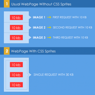
- Use CSS Sprites for optimizing images as it helps to combine your images into 1 large image that loads at once.
- Make use of responsive themes because responsive themes take the speed into account and load faster.
- Install Google Page Speed and MemeCached on your server. This will improve web page latency and bandwidth usage by changing the resources on that web page to implement web performance best practices.
- Allow the users to leave their reviews on your site. Genuine positive reviews and comments are a great factor in increasing the trustworthiness of the site. Getreviwed.orgis a great platform to join hands with hundreds of potential bloggers who are looking to share their honest insights about your products and services. Disquss and Facebook Comments plugins load fast and helps the users to add genuine reviews and comments that optimizes the overall content quality of your site because the comments are indexable. Hence, without compromising on the speed, you can add some valuable content on your site.
- Use browser caching and implement the HTML5 web storage API.
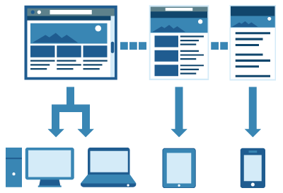
4- Make Use of Responsive Design
As per the mobile SEO guide from Google,responsive design is Google’s recommended design pattern.Google has also stated that it ranks sites optimized for mobile higher in mobile searches. Moreover, having a responsive design offers the following main benefits:
- Links are directed to a single domain, leading to better search engine rankings.
- Controls high bounce rates, which are often otherwise used by Google to lower rankings.
- Enhancements in terms of user experience, which is a plus especially with real audiences and not just bots.
Ways to Speed up Your Responsive Site
In order to speed up your responsive site, use the following strategies:
- Use conditional loading which is used to stop all kinds of content from loading, including social widgets, images, maps, etc and loads only that content that matches a specific condition.
- Use frameworks like Bootstrap and Foundation that provide rapid mobile functionality and speed.
- Use adaptive images that resize itself automatically as per the available screen size. This reduces the necessity to load the full image file. Instead, reduced and embedded HTML images can be loaded without any alteration in the markup.
- Reduce m-dot redirection and prefer a single URL for your web pages.
- Use plugins like FitText which makes the font size flexible so that it fits in the width provided by the parent element.
5- Use Sitemaps and GWT for Better Crawlability
Your site rankings often depend upon tiny bots working continuously and crawling through your site, ranking and analyzing your content based on search engine optimization factors. The following steps can help to speed up your website by allowing crawlers to effectively crawl your site and minimize downtime:
- Create sitemaps and be sure to avoid duplicate content. Sitemaps are really useful as they provide Google with metadata about specific types of content on your pages, including video, image, and mobile content. For example, a sitemap video entry can specify the video running time, category, and age appropriateness rating whereas a sitemap image entry can include the image subject matter, type, and license.
- Optimize Google crawl rate through the Google WebMasters tools. For more help, please refer to:Google guide on how to change the crawl rate.
- Keep updating content as Google bots have a fascination for fresh new content.
- Use reliable servers and always provide HTTPS secured sites wherever required.
6- Use Ajax and Touch Events in Place of Click Events
Mobile users hate to click on a resource and then wait for another resource to load. Instead, an easier solution is to make use of TouchEvents that supports simultaneous touches at different locations of the touch surface. Such touch events when applied on the buttons can drastically reduce the load time and increase the user experience.
The figure below provides a series of touch events that the users might generate while interacting with the mobile device.

Also,it is recommended to use AJAX as it allows data to be fetched from a web server without having to refresh the page where the code is running.
7- Optimize Client Side Processing
In the case of mobile devices, client side processing is greatly reduced due to slower CPU’s and less memory. In order to increase the efficiency of page processing, it is recommended to defer the loading of below the fold content like images and scripts. Downloading and parsing these scripts can safely be deferred until after the onload event. Some scripts needs to be called only after the user initiates any action like drag and drop so, such scripts should not be loaded unless the user reaches the screen so that he is ready to take any action.
With these guidelines and change in website infrastructure, you can speed up your website and achieve higher rankings. Have you implemented any other technique that has helped you to greatly reduce the loading time of your website? Please let me know in your comments below.
Hand-Picked Related Articles:
- 5 Tools To Test If Your Website Is Really Mobile Friendly
- Increase Web Page Speed: Optimize Your JavaScript
- Q: What URL Should I Use For My Mobile Website? A: Responsive Design
* Lead image adapted from Éole. Some rights reserved.
The Ultimate Guide To Mobile Site Speed Optimization
The post The Ultimate Guide To Mobile Site Speed Optimization appeared first on Search Engine People Blog.
Search Engine People Blog(78)


