— September 4, 2018

kreatikar / Pixabay
AI… squirrel! Augmented reality…squirrel! Voice tech…squirr—Chat bots…SQUIRREL!
What can I say? I’m a marketer. Being promiscuous with my attention is in my blood. New technology emerges, older tech is ever-evolving. While gravitating to what’s shiny and new, we’ve thoughtlessly pushed aside our first love, the landing page.
Today I’m digging into the forgotten art of landing page construction and letting those pages know, it was you all along.
Shiny new objects aside, I think marketers are generally guilty of spending more time optimizing customer touchpoints that come earlier in the buyer journey. Afterall, a campaign’s effectiveness is first dependent on getting people to the landing page. A shitty landing page might convert, but a landing page without visitors definitely won’t.
I suspect us Stryve’rs are guilty of this too. In the past 3 months, we’ve blogged about lead gen tactics, but only once ever about landing page optimization. So what goes into creating the workhorse responsible for filling your funnel?
Think through its purpose. Then think it through again.
Thinking about your target audience and what you want them to do is an obvious step. You probably went through this exercise during campaign planning, ad creation, and copywriting. But using those answers to ignite your prospect’s excitement about taking the next step requires a second attack.
Simply specifying that your eBook is for retailers isn’t enough. Go one inch deeper and speak directly to them. Anticipate their pain points and present how your eBook can help. That retailer should self-identify immediately and feel something. Something along the lines of: ah, *relief*… this is exactly what I’ve been looking for. Get at me, eBook!
Keep them focused.
You already know to pick one and only one action to suggest, but I need to be clear. This means no other links. No other call to actions. Whether it be a download, signup, or opt-in, you’re asking for one action. ONE!
Strip away all navigations. Your main nav, your eyebrow nav, your footer. Remove all opportunities to click on something that takes users elsewhere. The one exception? Leave your logo linked back to your main site in case they need to poke around (especially if they aren’t familiar with your brand yet).
Once you’ve limited user navigation, make sure your copy is scannable. Super scannable. People don’t read these days. They skim. This applies to content site-wide, but is most important for landing page content. Be concise to encourage, but not to detract from your CTA.
Leverage your biggest fans.
Although we like to keep landing pages lean, one of the most important nuggets of content is a piece of social proof. Pick a glowing, short and sweet testimonial from your best-known customer. Bonus points if the testimonial mentions the promoted resource (“This eBook did this for me”), but a more general product/service testimonial works too (“This organization did this for me”).
Include testable elements. But for the love of tacos, test one at a time!
Iterating and optimizing is an important part of filling your funnel quicker each time. A true A-B test isolates one variable at a time while everything else remains consistent. Build your landing page with testable elements in mind. May I suggest…
Forms
The best practice here is to make the form as short as possible. What fields are absolutely critical? Include only those. But you might also try progressive profiling if you have software that permits it. Or what about a two-step form?
Copy
Test a couple different headlines. Experiment with different positioning. See if shorter, more concise copy is more effective than your original draft. Work towards establishing that perfect balance between context and scannability.
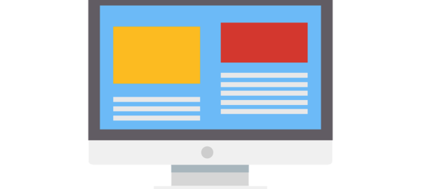
Images
Try out different images and compare the effectiveness of styled product shots vs. product-in-action. You could even try different placements on the page.
Social proof
Is one raving testimonial from a smaller fish more impactful than a collection of big-name logos? Only testing will tell.
So what are you waiting for?
Pump the breaks on your virtual reality and AI-powered chatbots and take a good hard look at your landing pages. Even if you’re happy with their conversions, consider this your kick in the butt to make them even better.
Digital & Social Articles on Business 2 Community
(71)