
Mobile commerce is exploding. No hyperbole there. It just is what it is.
Beyond that, mobile commerce sales increased approximately 39% to the tune of $104+ Billion in 2015. That’s a lot of decimal places, and of course, it shows a greater need and higher consume demand for high quality in terms of mobile shopping carts.
Today we’ll examine the different do’s and don’ts of mobile shopping cart optimization, and we’ll even throw in some food for thought about the future of the medium at the end.
Let’s jump right in with a few of the most important features you can include to minimize abandonment and maximize conversions.
Mobile Shopping Cart Optimization Do’s
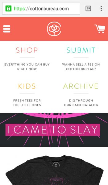
Constantly Visible Shopping Carts
Would you rather have your customers checkout or keep shopping? It’s a difficult choice sometimes. One in the hand is often worth two in the bush after all. The longer the customer browses the higher the likelihood that they forget about their shopping cart. Why not keep it in front of their eyes then, just to remind them of all the goodies they’ve already collected?
A persistent cart icon in your header is a wonderful weapon with which to achieve this end. You can number the items in the car and always have it a single click away. This is so the customer can always be assured of quick access to the checkout page whenever they’re ready to open their wallet. This is a pretty common tactic which can be observed on ecommerce sites big and small.

Guest checkouts
Beyond always making sure your cart is only a click away, make sure you don’t require a registration in order to shop from your online store.
Most people are pretty hesitant to give up personal data. It’s also a barrier to potential purchasers. They want to get on with the shipping/billing info rather than sign up for a free account before they’ve checked out.
Therefore, make it a point not to require membership for a sale to take place. You, of course, need certain bits of data to make the sale in the first place (credit/debit card info for one) and collecting data about your buyers is certainly advantageous as well. However, you can do all of that without getting your buyers to subscribe to your newsletter.
Membership has to be an attractive option, and if it’s not that attractive (and it won’t be to everyone, no matter what you offer with it) then it can’t be mandatory or else you’ll lose the sale.
That’s why you should always allow for guest checkouts. You end up collecting the same info anyway, but you don’t require a commitment from your buyers. You’ll just have to woo them into registration some other way. Like with a discount or free content.
Alternatively, you can just ask users if they want to save their details at the end of the checkout. That way you can tailor their experience while avoiding the negative associations that go along with registration.
Another interesting approach I’ve seen to this issue is to create an account upon checkout either way, but if the guest decides they don’t want to register… Well, you don’t have to mention it, do you? Then the next time they login from their specific device (which you’ve tracked), you have all their info stored and ready for use.
And if they do decide to start an account at a later date, you can offer them an easier signup because you’ve already collected their data. The key here is to make sure your users never have to think or work too hard for anything you’re offering.
Autofill where possible
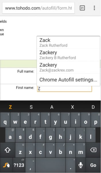 Filling out form data based on previously collected consumer data is always a wise decision. Remembering preferences tailors experience and makes for a force multiplier on customer loyalty.
Honestly, this falls under the “obvious optimization” umbrella. You’re lubricating your sales funnel so return customers are flying through it like a waterslide. Less friction equals more conversions every time. This goes double for mobile checkouts because tapping text is harder than typing it. In fact, we’ll have another section later on that will examine the ways in which you can make webforms less tedious and more experiential. For now though, here are a few resources to help you enable autofill or autocomplete in your webforms:
It’s important to note that most mobile browsers have autofill turned off by default, but savvy users will have it enabled so you should adjust your markup to accommodate whenever possible.
Security Signals
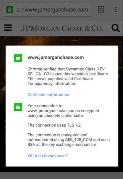 Show users that they can trust you. Standard SSL certificates can go a long way in this regard, but even better is the Extended Validation Certificate which carries a much higher degree of reliability and more extensive vetting process.
Though to be perfectly honest they look much the same on a mobile device, especially to the layman’s eye. Even so, these certs can make a difference to the educated shopper. It’s important to do everything you can to display credibility, even if it’s only the outliers who are going to scrutinize your efforts.
That’s enough of the best practices section. Let’s take a look at some of the biggest mistakes that people make when optimizing their checkouts for mobile.
Mobile Shopping Cart Optimization Dont’s
Long forms
Piggybacking off of the ideas we introduced in item number 3, less is definitely more when it comes to web forms. You need to ask yourself how much info you really need to make a sale. Shipping and billing addresses, sure. Name and email? Most definitely. Anything else? Hmmmm.
Try to make these forms as easy to fill out as possible. It’s all about putting water on the slide remember? That means fewer steps, fewer pages, and larger, brighter graphical elements throughout to break up the monotony. One of my favorite examples of the latter concept comes from Virgin Airlines.
Sometimes an online sale is a complex process; such is the case when purchasing airline tickets. However, Virgin’s responsively designed webform is not only easy, but it’s actually quite visually pleasing to fill out:


Note: this is a webform. But where are the text inputs? There aren’t any by default. On the city screen you can bring them up if need be, but it’s not necessary. You can scroll to find what you need if that’s easier. And that’s the beautiful thing here. Virgin has designed an experiential webform that allows you to flow from field to field without agonizing over your mobile keyboard.
You tap rather than type.
Distracting Checkout Pages
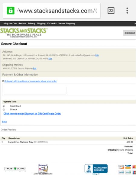 If this screen seems like it might be tedious to work with, well then congratulate yourself for being perceptive. This is a clear example of responsive gone wrong.
The website was clearly built for desktops first and mobile optimization was an afterthought.
On a big screen the security badges and small text based form fields aren’t too difficult to look at or work with. On my smartphone? Different story entirely.
This is a cardinal sin and an easy mistake to make. Checkout pages need to be focused.
They have to be minimalist, and clear of any distracting images or content. This example has a ton of text, a bunch of unnecessary security badges at the bottom, and really no clear focus to it whatsoever.
The checkout page is the home stretch—the final hurdle—and you don’t want your visitor’s mind to be on anything other than the task at hand, namely: making a purchase.
However, many ecommerce sites make the usability mistake of trying to cross or upsell on their checkout pages. By doing this, they might be able to get an add-on item but they risk having a user abandon the cart at the very last hurdle. These are extra painful abandonment stats.
Go with a clear and focused checkout process, as few pages and as few steps as possible. The primary visual element should be the Make a Purchase button. Leave the cross selling and any other concerns for the thank you page.
Forgetting To Collect Data
This one is a much easier mistake to make because it requires some technical acumen to pull off its inverse. Collecting user data should be a no brainer at this point, but it’s surprising how many people forget to add it on to their to do list.
When you collect personal data you can use it to personalize content and your offers to individual customers and we’ll cover that some more in our next point.
However the main thing you can do is learn where and when your customers are abandoning their carts. Nothing is more important to optimization than the observation of your user’s browsing behavior.
So again, analyze your data, interpret it, and apply it by adjusting the spots in your sales funnel that have spikes in cart abandonment.
One Size Fits All
Because we now know that collecting data is important, we shouldn’t be surprised that forgetting to make use of it is a foolish mistake as well.
Tailored experiences increase conversions, improve experiences, and establish brand loyalty. Making a one size fits all mobile checkout cheats the customer and you.
Use the account info or stored guest data to autofill those forms, use geolocation to autofill shipping addresses, most importantly: make relevant offers to your customers.
This can be applied after checkout is completed for the upsell, or while they’re still shopping through a recommended items feature. However you want to handle it. Just remember that knowledge is power, but experience is knowing how to apply your knowledge.
Conclusion
Thus concludes your education in mobile checkout optimizing. Hopefully you’ve learned something useful that you can implement in your own ecommerce projects. Let us know what you thought of the list in the comment section.
* Adapted lead image: Public Domain, pixabay.com via getstencil.com
About the Author: Kyle Sanders
The post Mobile Shopping Cart Optimization: Do’s & Don’ts appeared first on Search Engine People Blog.
Search Engine People Blog(58)


