— August 26, 2018
I love infographics. They appeal to both the designer and nerdy analyst sides of me. They satisfy my obsession with efficiency by telling a story in a single image, faster than text ever could. Stylistically, you can make them your own and incorporate your personal branding into their design. All this, plus they’re pretty. What’s not to love?
I promise this isn’t just a blog about my geeky obsession. This is about why you should love infographics as much as I do. We’ve talked about how to construct the perfect infographic, but we’ve yet to dive into their purpose and usability.
THE HUMAN BRAIN IS WIRED FOR VISUALS
As satisfying as it is to write that catchy piece of copy, visuals do a better job of grabbing attention and leaving an impression. Science is on their side, with people generally remembering 10% of what they hear, 30% of what they read, and 80% of what they see (Syntactic Theory of Visual Communication Paul Martin Lester, Ph.D.). We’re wired to process text sequentially, one word at a time, whereas we process visual data simultaneously and at a much higher speed—around 60,000 times faster. According to a study done by MIT, our brains can identify the meaning of an image within 13 milliseconds. How long did it take you to read that sentence?
Here are some numbers. It’s estimated that the average person is exposed to up to 10,000 marketing impressions per day. If you’re good enough to grab your consumer’s attention, you have on average of 8 seconds to get your message across. If those were Tinder stats you’re probably dying alone. A well-executed infographic simplifies complexity and communicates an idea immediately. That’s a big-time tactic in this day and age of depleting attention spans and crowded markets.

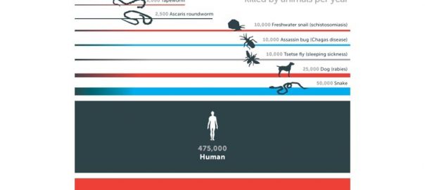
Imagine how long it would take to communicate this information with only text?
STORYTELLING EVOKES EMOTION
A great infographic isn’t just a collection of icons and numbers. Nor is it simply a pretty picture. It should tell a story with a beginning, middle, and end.
Storytelling is at the core of being human. It engages our imagination and evokes genuine emotion. In a study that analyzed the virality of New York Times articles, researchers concluded that content evoking a high-arousal emotion (no, not that kind of arousal; think outrage or awe) was significantly more likely to be shared, even when controlling for other positive influences like surprise, interest, or usefulness. An infographic that tells a story is more likely to be shared. According to Backlinko.com, visual content and original research data are two of the most shared types of content. An effective infographic marries the two into one SUPER shareable asset.

SHARING IS CARING
It’s a fact that infographics are one of the most shared types of content. But don’t take our word for it, here are some stats that back that statement up:
- Visual content is 40X more likely to get shared on social media than any other type of content.
- High-quality infographics are 30X more likely to be read than text articles.
- Infographics are liked and shared on social media 3X more than any other type of content.
- When asked which types of visuals had the highest engagement, 42% of marketers reported that infographics and other original graphics were the most engaging. This was higher than any other form of visual content.
INFOGRAPHICS ARE ON THE RISE
Infographics aren’t going away anytime soon. Over the past 10 years, Google image searches for the term ‘infographics’ has continued to grow. People are buying in, and with more and more brands opting to tell their story through infographics, the more companies will need to up their game to stay competitive.
Digital & Social Articles on Business 2 Community
(101)