
For most of you, it’s difficult to edit your website at your every whim. Most likely, you’ll have to track down your designer and pay them to make your desired changes (which can be annoying and costly). Between the burden of recurring design fees and lack of lead conversion, keeping your site current will become a lot like chasing your tail.
So how do you make your website work for you?
Having a website that nurtures visitors and helps to convert leads to sales can drive the return on your website investment. Once your site has been properly optimized, it stops being a burden and starts being another member of your marketing team. Here are a few pointers for redesigning your website with these inbound marketing principles in mind:
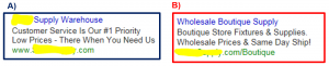
- Incorporate a cohesive style – Ideally, your site’s color scheme shouldn’t stray too far from the palette that appears within your logo or company’s branding. Having high contrasting colors is not only going to distract your visitors, but hurt their eyes. Maintaining a consistent style will help visitors recognize you on other platforms (like Social Media) as well.
- Design with your personas in mind – Who are your top personas, and who are you targeting? Make sure that there is content ready and waiting for them when they come to your site. For example, if you are a staffing agency, include buttons or paths for both job seekers and companies on the home page. This allows them to easily find content that is relevant to them.
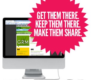
- Real Estate – Once they find you, what are they going to do? Your calls-to-action (“Contact Us”, “Learn How You Can Increase Profit”, “Visit Our Widget Page”) should be easy to find and intriguing in nature. If they have to search for access to the rest of your content, your bounce rates (the rate at which your visitors take one look at the page they land on and decide it’s not for them) will become astronomical.
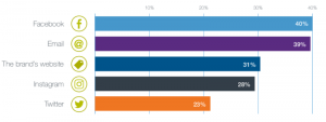
- Pictures vs. Text: The Balancing Act – Yes… a picture is worth a thousand words. No… your site shouldn’t be all text. The tug-of-war that is picture vs. image is a constant one. However, balance is necessary in all aspects of life. Your picture(s) shouldn’t recant what your text says (and vice-versa). Using charts, graphs and meaningful images will compliment strong, inviting and informational text. Use your words and images wisely.
- Forms and Landing Pages: The Portals of Communication – Tracking lead conversion (when a visitor shows tangible interest in working with your company) isn’t that difficult if you provide your visitors with valuable information and ways to learn more. Through landing pages (those pages in which your inbound visitors reach your site), social media and forms, you can give your viewers useful knowledge that will entice them to want more. Have at least one easy-to-find form they can fill out which allows you to qualify the interested prospect into a lead.
Once your website is optimized to better serve the people who will be visiting it, it can become a sales machine in full support of both your marketing and sales teams.
Leave us a comment below – do you plan on redesigning your website this year? In what ways have you experienced success in optimizing your website?
Digital & Social Articles on Business 2 Community(45)