
Want to boost your website conversions? The obvious revisions would include your call to action, coming up with something more enticing and engaging. Or, perhaps the marketing and promotional materials themselves. After all, if you get people interested before they land on your site, they’re sure to convert, right?
Actually, you may be surprised to know that it all starts with the design. No doubt, you understand the basics as a marketing manager or small business owner. You deal with the same concept when choosing your logo, colors and theme and when outfitting your brick-and-mortar store. It all boils down to presentation and the experience you provide to your visitors.
Nearly half of consumers (46.1%) feel design is the best way to decide whether or not a company or brand is credible. Outside of that, people will simply abandon your site if it’s ugly – a total of 38% of all visitors, to be exact.
What’s the best way, then, to make sure your site is attractive while also increasing conversion potential? The answer is through honoring the basic tenets of design: color, size, space, line, shape, texture, value.
1. Color
Fundamentally, color is used to elicit emotions, boost visual appeal and highlight crucial elements. The colors you choose have an effect on a more visceral level. Sure, choosing two colors for a theme that don’t mesh is jarring, but it’s the feelings and emotions it draws out for your visitors that will hinder their overall experience.
Warm, active colors like orange and red tend to elicit more vibrant responses. Cool and passive colors like blue and purple are much more pleasant, which is why so many studies show blue is the color of happiness.
You’ll want to pay attention to this when choosing colors for your background, additional visual elements and accents, typography and much more. Consider the tone of your site, products, services and what you would like to achieve. If you want to deliver a more relaxing, soothing impression, chill colors like a variety of deep blues will work great. If you want to capture attention, brighter colors are the clear choice, but again, which you use will depend on the attention you generate.
You can read more about using color psychology to increase conversion rate in this detailed article by Neil Patel. I like this emotion wheel by Conversioner to describe the different emotional triggers of colors:

2. Size
Size, as you know, is how small or large an item or element is. When it comes to the elements of design, size is often about a relationship of one item to the others around it. The larger an element is, the more it will stand out visually. Therefore, you can use size to define importance, generate visual interest, attract attention, guide focus almost like a storyline and much more.
If you want to be sure a headline or product title captures a visitor’s attention instantly, use a large, attractive font that stands out compared to everything else on the page. This is also a great way to increase conversions without altering your entire design. Your call to action, for instance, can be boosted in size so it stands out from your regular content.
If you aren’t familiar with code, it can be intimidating to make changes like these on your own. Fortunately, if your site is running on WordPress, there are plugins that will make changing your heading size a breeze. Try the free plugin Customify.
3. Space
Space is the blank areas around various elements including typography, margins around text and much more. Minimal design strategies favor using more space and putting emphasis on the visual components that do exist. In a way, it keeps a clean interface that helps everything stand out and look, well, beautiful.
Space can be used to separate elements or groups. It can break up text — as is the case with line breaks and new paragraphs — and it can even add visual appeal. More importantly, space gives the viewer’s eyes a rest, so to speak. Since it does not include anything important or encompassing to look at, it can also be used to guide the eyes or focus of your audience.
Put enough space around a particular object, image or element, and you’ve truly defined its importance. It is so crucial, in fact, that it stands on its own among the sea of text and content on your site.
If you use WordPress, look for a theme that includes a page builder. Page builders give you much more control over the sizing and spacing of elements on your landing page. One of my favorites is the theme Salient.
4. Line
Strictly speaking, a line is the mark between two opposite points. As you already know, there are many types of lines, and they come in varying sizes and shapes. You have straight lines, squiggly lines, curved lines, bold lines, thin lines, etc.
Lines — similar to space — are a universal component of modern design. You can use them for a variety of things, ranging from simple to advanced. You can use accent lines to stress a word, phrase or image. You can connect elements together using a single traced line. Of course, it doesn’t end there.
The best strategy for boosting conversions with lines is to use them to draw the eye to your CTA or a lead form. In one case study published by ConversionXL, a law firm split tested a number of visual cues to see which one performed best in eye-tracking studies. An arrow pointing to the lead generation form was the clear winner.

5. Shape
Shape is essentially, the combination of height and width when you break it down. In grade school, and usually even earlier, you started working with these basic building blocks. There are triangles, squares, circles and spheres, hexagons and much more. The odd or less common shapes can be used to attract attention — hence why stop signs are shaped the way they are, in combination with bright red color, of course.
Shapes can be broken down into three essential types: geometric, natural and abstracted.
- Geometric: Triangles, squares, rectangles, circles, etc.
- Natural: Leaves, animals, trees, people, objects, etc.
- Abstracted: Icons, stylizations, graphic representations, symbols, outlines, etc.
You can use shapes to extend the visual appeal of a section, element or area. For example, enclosing a call to action within a button or another container — which is itself a shape — is a great way to capture attention. I like this example from Visual Website Optimizer:

6. Texture
In reality, we know texture as the feel of an item or surface. Is it rough like concrete, or smooth like polished wood? In design, this doesn’t quite translate as you cannot actually feel elements of a page or on a screen. However, you can show texture through the look of an item.
The well-known pattern of laid brick, for instance, can be used to add visual depth and interest to a bland, solid color. Sure, it’s implied texture, but it works just as effectively, especially when you choose an appropriate style.
You can use textures like brick, concrete and stone to imply strength or reliance. You could use a wood grain style to embellish appearance or elegance. It all comes back to how and where you use the visual textures, and what kind of emotional response that elicits when you view the design.
In one case study, a charity that collected used cell phones applied a texture-rich background to their lead generation form, and it increased donations by 53%. This is a simple trick that can be accomplished with CSS.

7. Value
In marketing, we define value as something that gives back, in a way. What is the inherent value of a product or component?
In design, value is indicated through the lightness or darkness of an area. A gradient — popular in modern design — is one of the most common ways to present value. It usually progresses from dark to light, or solid to transparent.
Like many of the other components here, you can use value or gradients to lead the eye. More importantly, they can be used to emphasize the importance of a particular body or concept. You could place your CTA in the most vibrant section of a gradient, or surround your CTA button in a colored glow to make it stand out.
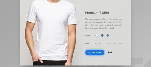
In the example below, from a concept design by Denis Absullin on Dribbble, you can see a subtle glow around a CTA button to add the product to the cart.

Putting The Elements Of Design To Work For You
Design is a critical component in the success of a website, but it doesn’t have to be complicated. Simply keeping the elements of design in mind can provide the foundation for a standout site that can effectively promote your brand.
About the Author: Adrienne Erin
The post How To Use The Elements Of Design To Increase Conversions appeared first on Search Engine People Blog.
(90)