Beneath improving deliverability and behavioral targeting, you have the skeleton of an email marketing program. No matter where you are in the building process, whether you’re just starting out or well on your way, the fundamentals are always crucial to building a sustainable email strategy. This is why we’ve put together an Email Marketing 101 series, a crash course on all that you need to have in place to build winning campaigns. Over the next few weeks, we will be releasing these posts on a weekly basis, starting with today’s lesson on newsletter design.
There are 5 main things to consider when designing an email:
Content Is King: Think about content before anything else
The first and main thing to consider when putting a newsletter template together is content. Is it relevant to your audience? Is it engaging enough? Does it follow your brand guidelines? Keep your content brief and to the point as you only have the reader’s attention for a small amount of time.
How: Use images on top of your email to capture the reader’s attention, followed by brief text and a clear call to action.

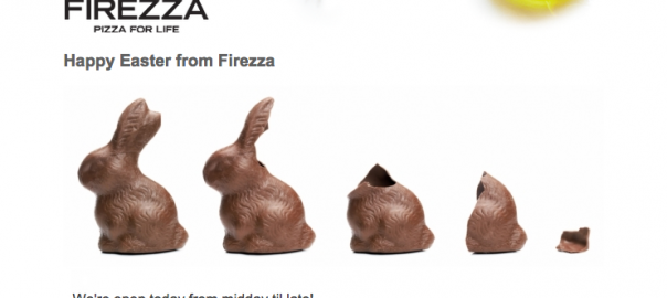
[Here’s an example of this in practice by ‘Firezza’, an amazing pizza delivery company]
First Impressions Matter: Decide on your Subject Line and From Name
We recently talked about how just as the saying goes, first impressions really do matter when it comes to the subject line. 35% of recipients open emails based on subject line alone. So firstly start thinking about your ‘From Name’. Don’t necessarily just use your company name or your department name. If your email is the vault and the content inside is the treasure, your subject line is the key to that vault.
How: Know your audience, personalize and A/B test to find the best subject lines for your users.
Keep It Simple: You don’t want to over do it
Give your newsletters a set structure, for example one feature area and 2 smaller columns below. Don’t cram your email with too much information as it won’t be appealing to the reader. Provide plenty of white space and keep your newsletter simple and neat. Try and keep a similar format your newsletters as users come to expect the same look and feel over time.
How: To have your email render on various devices, be mindful of your email size. Ideal width is between 500 – 680 px. Smart Insight’s handy infographic sums up a range of email design best practices to follow.
Think About Your Colors: Different genders respond differently to colours
As we discovered in a previous post, each gender responds uniquely to different colors. Be mindful of which hues you choose for your images, background color, font and call to action buttons. After making sure that you’re keeping true to your brand identity, think about your audience. Using specific colours based on your demographic, you can improve your results and ultimately ROI.
How: The more you know your customers, the better you can tailor your emails. To gather information from your existing customers, try running surveys as part of a raffle or competition. You’ll find most users are willing to spend two minutes to tell you about themselves for a chance to win something they want.
Don’t Be Pushy: Be modest when it comes to your call-to-action buttons
If you want your users to take action through your emails, don’t be too pushy with your call-to-action buttons. Imagine your call-to-action button is a sales assistant in a shop. Are you likely to trust one that’s being pushy, trying to get you to try on a pair shoes or buy a specific blouse? Or do you trust the one where they’re informational, subtle, yet suggestive? Same applies here.
First start with a main call-to-action and modestly place it after the main content of your email or as a link within your textual content. If you have to add more than one call to action button, place this to the right or lower than the main call to action and make it slightly less obvious.
How: Think about the placement of your CTA (call-to-action). Through studies we can see that CTAs placed at the bottom of the email ramp up higher click rates than on the right or left of the email. Also make sure it has relevant text. For example you may find emails sent to a certain demographic may prefer ‘Purchase Now’ to ‘Buy Now’. Research, test and compare your campaigns to improve your call-to-actions.

For me, this email design ticks all the boxes. It uses personalization in the subject line to get me to open it and uses a catchy image on top of the email to get me hooked. The content is based on Netflix knowing I’m interested in anything ‘Breaking Bad’ related and follows the same color scheme as the Netflix dashboard. Finally has effective and not too pushy call-to-action buttons.
Use the five points mentioned in this post as a check-list when designing your newsletter template. Then try sending out your emails and noting the results. Tweak your design and repeat before settling on the ideal design for your customers.
What are some newsletter designs that you admire as a consumer? Which of the above tips will you be trying out first?
(281)