Sleek, minimal, and clean are words that describe the trends in website design today. Have you ever wondered why web design is leaning this way? Think about social media or visit a big news website filled with advertisements. They’re examples of our incredibly busy and overwhelming world. That’s why minimalism is so popular. In our lifestyle choices and through design, we feel the need to declutter. Smart marketers and designers are delivering just that.
We took this approach when designing our new website. Smart, simple, and easy were the core objectives. Here are a few minimal design principals that inspired our design:
Less is more
Minimalism has impact because it provides fewer options. More isn’t always better. When faced with a million choices, people have to use a lot more mental energy to make a decision. This often means making the wrong decision or none at all. It’s the same reason we say we never have anything to watch on Netflix. There’s so much you could binge on, so how do you choose?
When it comes to a website, that means visitors aren’t finding what they’re looking for or they’re leaving. Minimalism requires restraint. Produce less copy, build fewer pages, include less in your navigation, and limit your calls-to-action. It’s the hardest part. There’s so much you want to say and show your visitors.
So you have to act like the people who build the Netflix algorithm. You have to know what they’re looking for better than they know themselves. Use Google Analytics and Hotjar to gather data from your current visitors. Interview sales to find out what they most often talk to prospects about. Then distill it all into its simplest form.
Give your content (white) space
White space is a way to provide fewer options and ensure focus. Have you ever been in a situation where several people are talking to you at once about different topics? It can be hard to prioritise the conversation and can become an overwhelming experience, ending in a miscommunication. In the case of a website, that means a bounce.
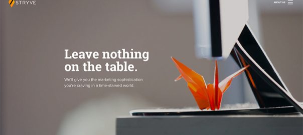
When you give website elements room to breath it allows visitors to focus on what they came for: the content. White space doesn’t necessarily need to be white just empty space between visual elements. On our website, the banners have large images but the text is positioned to the empty or ‘negative space’ to the left. This gives our visitors a focal point and clear direction to keep scrolling.

When attempting to add white space to your website, consider what your main message is and how you visually want to represent it. Once you know what you want people to focus on, take away elements that don’t contribute to your goal and go from there.
Highlight content with strong typography in a grid
Since minimal design aims to do more with less, you’ll have fewer elements to work with. So how do you create visual interest? The answer is with the message itself. Generally, typography used in minimal designs are typefaces with clean lines and simple strokes. When typefaces are stripped to their simplest form it puts emphasis on the content, not the visual.
When this idea is applied to a website, it allows users to easily digest the content. Since the message is the only thing on the screen, it holds more value when other elements aren’t taking away from it. This approach, combined with the philosophy of white space, can create a sense of hierarchy. It can be used to direct viewers to a call-to-action or the next page.
It can be challenging to design a harmonious layout with only white space and typography to play with. That’s why grids and minimalism are best friends. Grids help create a strong sense of alignment with body copy and headings. They ensure a clean, simple, and consistent design.

Be mindful with your color palette
If something doesn’t provide purpose to your design, it doesn’t make the cut! Colour is no exception. Most minimal designs are made up of one or two colors. You typically see black and white because they naturally hold the most contrast between each other. But minimal design doesn’t always need to be monochromatic.
Our website uses a limited palette of black and white. We use our brand color purely for our call-to-actions and navigation. Other colors are introduced through our imagery or interactions. These small pops of color communicate our culture’s energy without being distracting.

When applying this to your own designs, consider what color will be used for and why. Will it be used as an accent or a call-to-action? Will this add or distract from content? Whatever the answer may be, keep it consistent, subtle, and simple.
Minimalism isn’t going anywhere
Minimal design is one of those trends that will never go out of style. The most timeless websites practice these principles. Just look at Google in 2007 and compare it to what you see on today’s homepage (below). The style may be updated, but the content and layout remain. They limited the clickable options on the page and emphasized content with white space. That’s why the user interface doesn’t need to be drastically updated when design trends change.

Minimalism is a way of thinking about your design. You could even call it designing smarter. Try interjecting some of its philosophy into your next project or current website. What could you condense, remove, or simplify until all that’s left is what’s necessary?
Digital & Social Articles on Business 2 Community(76)