September 18, 2016

For most inbound marketers, conversion rate optimization is a stumbling block. They tick all the optimization checklists for a better SEO, but fail to apply optimization tactics to the form, which can result in a higher conversion rate.
Conversion rate optimization may be difficult, but not impossible. A lot depends on the signup form. If the signup form looks appealing, assures privacy and informative, then visitors will be prompted to fill it out. Hence, optimizing the signup form means optimizing the conversion rate.
Here are some tips to optimize the forms and make them more presentable:
Keep the forms short
When conversion is your goal, keep forms short. Users tend to find long forms intrusive. The less you ask up front, the more likely you are to get the initial submission. Remember, visitors also lack patience, so the longer a form is, the more chance for them to disengage and more on without completing it.
The question becomes, how do you keep it short, still obtaining relevant information, and get the submission? In other words, how do move visitors into giving away their personal information with as few steps and questions as possible?
Well, you need to encourage and assure them. Start be eliminating unnecessary information. Primary phone number, alternative phone number, and extra address lines are all unnecessary information. Don’t include these items in the form. Keep it short and succinct.
The Call To Action elements
Web form optimization depends on CTA elements. By CTA elements, I mean:
- CTA button texts
- CTA button design
Both are important for an attractive lead capture form. The credit of composing polished CTA button texts goes to a copywriter. It’s his/her writing skills that could turn someone from a visitor into a customer. The text on CTA buttons should be concise, direct yet non-pushy. A company called Provident Resorts saw a 9% increase in their conversion rate after changing their CTA button copy.
The design matters as much as the texts matter. There are some rules of thumb to follow. For example, don’t use ghost buttons because the opaque format will distract visitors from the texts on the button. Make the buttons considerably large, so visitors can easily notice them, and add different colors to them.
Placement of the buttons is crucial. Placing them at the optimal location on the site increases the CTR. Track the eye-movements of visitors to know where they are most likely to look at.
Don’t use captcha
Captchas are notorious for throwing a wrench into your conversion efforts. Many online marketers put captchas at the end of a lead capture form. They do that because they don’t want robots to fill the form.
Fair enough. But what many of them don’t know is visitors abhor captchas. Adding captchas is among the avoidable mistakes when designing a web form. If visitors encounter obstacles the conversion rate can never increase, infact it will go down. Captchas, according to studies, can cause a site to lose out on 3.2% conversions. Hence, adding captchas will drag down conversion rate. Get rid of them.
But then how could you prevent robots from filling out lead capture forms on your site?
Simple. Use automated form filling script. Smart scripts can identify whether it’s a robot or a human being.
Add privacy note
Earning customer’s trust helps a business go forward.
What could be the better way to earn customer’s trust than adding privacy note to the form?
A short line can do the trick. See below:

You can spice up the privacy note to attract visitors. Instead of adding a formal “We respect your privacy”, you can add something like “Feel free to share your details with us” or “We assure you that your privacy information won’t be shared.”
Personalization is the new mantra in marketing. Keep that in mind when you add a privacy note. Assuring visitors about privacy becomes easy when the message conveyed to them is personalized.
Secondary form positioning
You can and should add more than one lead capture form to the site. As I mentioned already, the primary form should be put on the most opportune place on the site. The secondary form can be placed elsewhere, preferably in a location that can drive a high CTR.
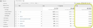
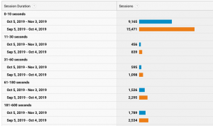
See the two images below:

Figure 1

Figure 2
The A/B testing was done by Arenaturist.com. The result was fascinating. The second form field display type contributed to 52% higher conversion than the first form field display type.
It’s better to put all the “Rates & Availability” info as form field. Visitors are more likely to give away their info when they come across a form.
Do thank visitors
Brands should never sound rude to customers. But they do sound condescending sometimes without even realizing, especially when they don’t thank visitors after they fill out a web form.
You should always thank whoever fills out the form on your website. Some of them will end up becoming your customer and give you business. Not thanking them is rude.
Rudeness apart, thanking visitors can be a great way to make headway into the sales process. To make headway, offer them incentives while you thank them. The incentive can be a reward or a discount – something that can attract visitors.
Brands nowadays encourage impulse buys. Research has shown impulse purchases are not fully impulsive. Customers purchase out of impulse, but only from brands who value them as customers and look after their needs. Thanking visitors may very well be the first step showing you value your customers.
Mobile optimization
Some web forms load on desktop devices, but when the site is accessed via mobile devices, they don’t load properly. It happens because such sites are not optimized for handheld devices.
If your site is not optimized for Smart devices, then lead capture forms will appear distorted. The CSS elements will not adequately load and that’d amount to a poor user-experience. Akin to desktop traffic, mobile traffic can also be converted to loyal customers. Hence, not optimizing your site for handheld devices could hurt your conversion rate optimization efforts.
So make sure you have a responsive site that loads equally well regardless of the device being used.
Summing up
Optimizing the lead capturing form(s) on your website is not rocket science. Its fairly simple really. Follow the tips above and enjoy the increase in your CTR.
Image Courtesy: pixabay.com
Digital & Social Articles on Business 2 Community(83)