If you’ve got an abominably low conversion rate on one of your pages, you might be surprised at how easy it is to improve it.
Sometimes, webmasters see low conversions because of an obvious oversight. Truth be told, even the most experienced digital marketers are known to forget about the basics every now and then.
Fortunately, those kinds of errors are easy to correct.
Here are some simple mistakes that are mostly costly for conversions.
Poor Calls to Action That Don’t Stand out on the Page
This is the easiest one to spot.
It’s often the case that visitors aren’t clicking your button or link because it just doesn’t stand out.
For starters, look at the aesthetics. Is the call to action presented as a contrast to the text and other elements on the page? If not, then you could lose conversions because people just aren’t seeing it or they’re glossing over it.
Your call to action shouldn’t be camouflaged.
Also, is the CTA text packed with words that move people to action?
Keep in mind, words can stand out on a page almost as well as colors. If you’re CTA text is the basic “Submit” or “Click Here,” then you might be losing conversions because you really aren’t giving people a good reason to click.
Instead, opt for action-packed verbs that promise something in return. Good examples are “Try Our Free Trial”, “Reserve Your Seat”, and “Act Now While Supplies Last.”
Pages That Load Too Slowly
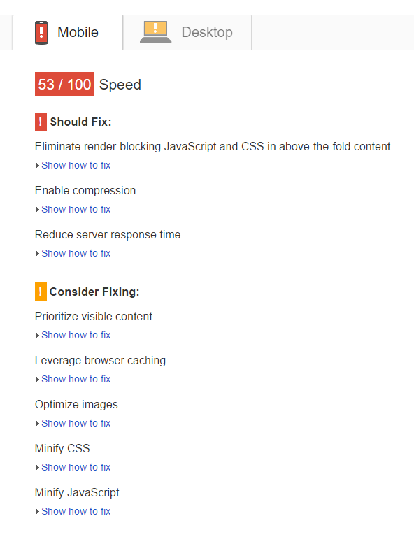
You probably already know that page speed is a ranking factor. It can also affect conversions.
According to KISSMetrics, almost half (47%) of web users expect a page to load in under two seconds. Also, 40% of visitors abandon a site that takes more than three seconds to load. And every one second delay in site load time can result in a 7% decrease in conversions.
That means that you should go out of your way to ensure that your site loads lightning fast.
Start by visiting Google’s new site speed tool. Just plug in the URL of your website and click the “Test Now” button. Google will give your site numerical scores about its speed and also offer actionable advice about how you can resolve problems.
Contact your development team and tell them to follow Google’s advice.
Complicated Forms and Checkout Processes
There’s nothing that makes a visitor want to peace-out from your site more than a user-hostile checkout process.
For starters, use checkout forms that ask only for information that’s absolutely necessary.
For example, if you’re not shipping a product to your visitors, there’s no reason to ask for their address. If you have no need to call them, there’s no reason to ask for a phone number.
Along those lines, make the whole checkout process as simple as possible. Here are a few ways you can do that:
- Don’t force people to create an account just to check out
- Let them pay with a variety of methods (credit card, PayPal, etc.)
- Limit the number of checkout screens to as few as possible
- Use cookies to “remember” information so they don’t have to fill it in again
Ignoring Mobile
You’re still in the medieval era of the Information Age if your site isn’t mobile-ready.
Not only is mobile-friendliness a ranking signal, but customers will visit your site using a smartphone, tablet, or phablet.
If you can’t support those customers, you’re going to lose market share to competitors.
And, obviously, you’re also going to lose conversions.
Make sure that your whole site is not only mobile-friendly, but that it’s also easy to convert on a mobile device. If your ad copy is too tiny to read on a smartphone or your CTA button is easy to miss because it’s right next to some other touchable elements, you could lose conversions.
Not A/B Testing Your Most Important Pages
You’re wrong.
That has to be your attitude when you think you know what’s best.
In fact, it should be your attitude even when you’re absolutely, positively certain that you know what’s best.
Why? Because you don’t know what’s best until you’ve tested it.
If you think you’ve got a winning CTA text but somebody else on your team has another idea for CTA text, don’t argue.
Test.
Run a split test to see which option has a better conversion rate. Then, go with the winner.
In fact, it’s a best-practice to split-test all your options so that you can see which gives you the highest number of conversions.
Not Using Third-Party Login Options Like Facebook and Google
Are you tired of remembering a whole bunch of different names and passwords for all of your accounts?
Yes, you probably are.
And guess what? So are your customers.
Why not make it easy on people who visit your site by allowing them to login with Facebook, Twitter, or Google?
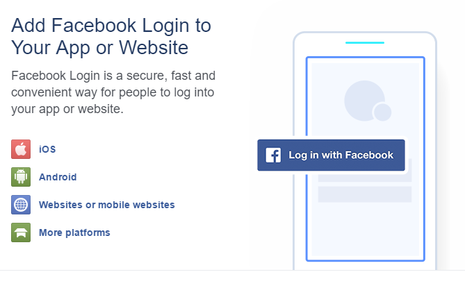
And for those people who don’t want to login with one of those options, let them do so the old-fashioned way: with an email address.
It’s just good customer service to make it as simple as possible for people to create an account on your site.
Not Selling on Other Sites Like Amazon
This last reason isn’t really part of the main course. Consider it the gravy.
You can increase your sales by selling on other sites, like eBay and Amazon.
After all, why should you limit yourself to your own platform? There are plenty of other sales channels that you can use to reach people in your target market.
And by using those other channels, you’ll also build brand-name recognition. That’s why it’s an easy decision.
Digital & Social Articles on Business 2 Community(72)