
Why do we buy stuff?
The psychology of selling hasn’t changed – it is embedded in human behavior and our habits.
We buy stuff because it relieves a pain in our life, it appeals to our sense of belonging and it makes us excited. We make that final purchase decision because for some reason we can’t wait anymore – it is an urgent and important matter that needs to be attended to right away.
These elements of human behavior contribute to the verbal and visual makeup of our websites.
Another layer has been added to these traditional concepts, however, based on findings of neuroscience and the fact that selling is no longer face-to-face. It relies, instead, on stimulation of the viewers senses and the parts of the brain that are activated.
Effective calls-to-action (CTA’s) will combine both traditional selling strategies and the information that neuroscience provides.
So let’s take a look at 5 practical ways that psychology and selling combine to increase conversions on your website.
Placement psychology
Your CTA button(s) must have a prominent place on the page – they have to stand out to a visitor.
What will happen when the visitor pushes that button and what are the benefits?
This text does not all have to be on the button, but it should be close by.
Take a look at the CTA used by Spotify:

The benefit is clear – “music for everyone,” and “it’s all the music you’ll ever need.”
When the visitor pushes the button, they will “play songs instantly.” And the “Free” button gets the consumer a free trial.
The buttons are simple, but the text around them explains what will happen when one of them is pushed.
Color psychology
Here’s where some neuroscience comes in.
MRI’s have shown which parts of our brain are stimulated by which colors, and different colors have very specific appeals – to men and to women.
Women, for example, prefer green, blue, purple and pink; men prefer blue, green, and black. And each color also represents certain appeals.
While this may not be a “deal breaker,” why not use button colors that speak to the people you are targeting?
Here’s a simple chart you can use as you decide on the color of your CTA button.

Emotional psychology
This is where traditional sales psychology comes into play – where pain must be relieved, where a sense of belonging can be established, where emotional appeals can be made, and where a sense of urgency can be instilled.
Your buttons and the simple text around your buttons, for example, will have such statements as, “Only 18 hours left to take advantage of this special price,” “Only a limited supply remaining,” “Join thousands of otherwise shoppers,” or “Get your free trial now.”
Look how well Twitter appeals to the emotion of excitement:

There’s a huge crowd of excited people. Now, there excitement has come from a concert, not from joining Twitter, but that doesn’t matter!
Really good CTA’s can appeal to lots of emotions at the same time, and Basecamp is a prime example:

So simple and sleek, and yet look what they have done!
The pain is chaos, and they are going to relieve that pain; there’s a free trial, and notice how they portray the “feeling” that they are giving something to the consumer with the “It’s on us” phrase.
And here’s the sense of belonging – “4869 companies signed up in just a week” – there is a desire to do what other companies are doing.
And, finally, the sense of urgency is established with, “You need to get a project done.” All of those emotional appeals in a very compact CTA.
Visual psychology
There are three facets of visual psychology:
- Use buttons with curved rather than square corners. Neuroscientists tell us that curved corners take our eyes and our attention inward, while square corners take them outward.
- Viewers attach more importance to buttons that are larger, so if you have a CTA that is most important, make that button the largest.
- Put your “benefit” on the button and make it “front and center” on our page.
Take a look at the results of the A/B testing on two CTA’s:

Here two elements were changed – the curved button and the color, but the result was pretty great, in terms of increased conversions.
SmartCustomWriting.com, an online custom writing service has done a couple of things:

First, while they have square corners, they have covered them with an animated figure and an “X” to close the CTA.
Second the “draw” is the discount and so it is much bigger than the “order now” button in the upper right corner.
And, unless the viewer closes it out, the two discount buttons stay front and center even as the viewer scrolls down the page.
Once a visitor clicks on either of those buttons, here is what appears:

The two discount buttons still appear, but now the bigger button is rounded, in bright orange (a good color for action) and the visitor is directed to place their order and get the discount!
Verbal psychology
The CTA button MUST be specific and get the message across – people are not into long text.
Use a command to get the user to do what you want. “Buy now,” “Watch,” and “Download” are typical commands, but they are very general and common.
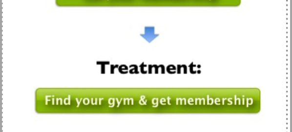
Take a look at the A/B testing in the following:

Source: conversionXL.com
The change was to get more specific, still keeping the message simple, and the viewer now is asked to find their gym location.
The CTA command is unique and has resulted in 68% more conversions – not bad!
Well, there you have it – 5 very easy and very practical things you can do right now to increase your own conversion rates!
Digital & Social Articles on Business 2 Community(149)