— May 30, 2018
A good popup not only helps you to build your email list quickly, it’s also a powerful tool for presenting relevant offers at crucial moments when your customers will respond to it.
Sadly, most people hate website popups because they can be annoying at times. If the popup doesn’t show up at the right time, you might end up losing a customer who’s ready to buy your product or service.
In this in-depth article, we look at the 5 popup mistakes website owners are making and how to quickly fix them. We’ll also share examples in each part so you know exactly what not to do.
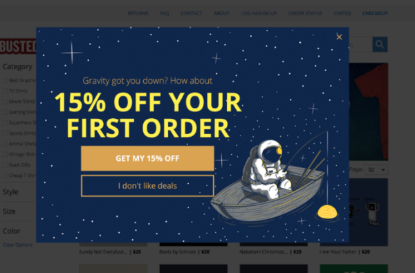
Mistake #1: Requesting Too Much Information in the Popup
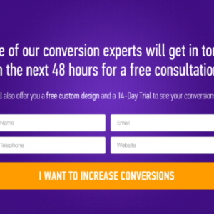
Due to privacy issues that are now rife online, users are reluctant to share too much information about themselves. Apart from that, no one needs to fill 4 fields before they can subscribe to your popup form.
It’s too stressful and wastes time. Remember that your visitor didn’t come to that page to fill the popup form. They came either to read your content or to buy a product on your website.
Your popup is only an extension of their experience, you don’t have to make it the main experience. Your popup should have at most two form fields — one for collecting an email address and the other for first name (optional)so that your visitor can fill and get back to what you interrupted.
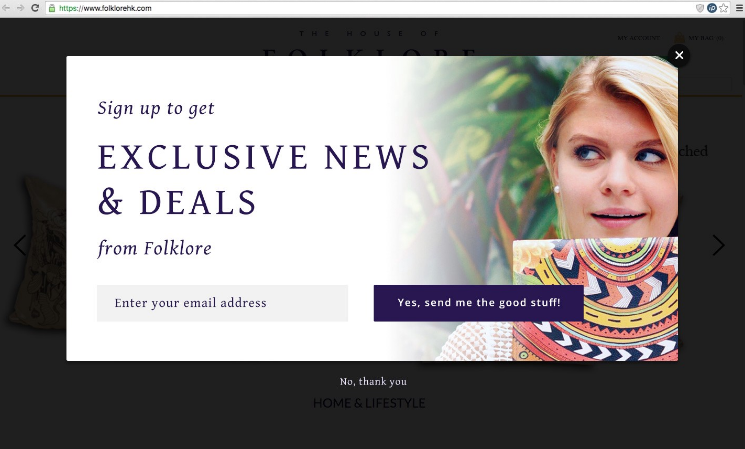
Even if your form is aimed at improving the experience on their current page, it is easier for your potential customers to fill a form with one field rather than four.
There is an exception to this rule though. If your visitor clicks a button on your website to activate the popup, you can have 2 to 4 fields on the form. This is because the visitor activated it and is, therefore, less of a disturbance. Here’s an example.
In the end, having fewer form fields not only saves user’s time, it also boosts conversion rate. Formstack conducted series of research and found that simply reducing the number of fields from 4 to 3 increased conversions by 160%.
Mistake #2: There’s No Clear Way to Exit Your Popup
To most visitors, popups are annoying and a disturbance. And no matter how good it may be, they’re just not interested. They want to exit your popup!
But they can’t find the exit button. Are you trying to force visitors to sign up at all costs? That’s a bad strategy. Because it only shows how desperate you are and this will lead to distrust.
In many cases, if you don’t give them an option to exit the popup, then they’ll exit your page. And may never come back.
The most common way of allowing users to exit a popup page is through an ‘X’ button at the upper right corner of the page.
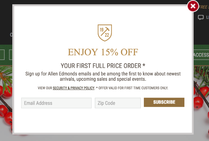
Another option you can use is to exit the popup when a visitor clicks on another part of the page apart from the popup.
Mistake #3: You Have an Irrelevant Offer on the Popup
When you set up a popup page, you’re trying to capture more leads for your business and probably convert them in the future. But your visitors don’t care about how many leads you capture.
What they care about is what benefit they can gain from your popup. You have to appeal to the WIIFM (What’s in it for me?) concept.
As an example, here’s a relevant popup offer from SocialTriggers.com. When you’re reading one of Derek’s post on how to grow your email list, this offer pops up:
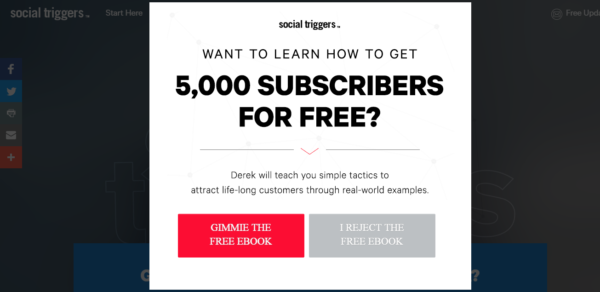
Derek Halpern has been able to grow his email lists by well over 200k in the past 2 years by simply presenting relevant offers to site visitors in his popup tool.
As a business that wants to constantly increase the number of potential leads you generate, you have to present a relevant offer to your visitor. If you do that, even if they find pop-ups annoying, they’ll want to opt-in just to download/access the lead magnet.
If someone is trying to buy men’s shoes on your website, for example, but you present a popup with ‘15% off women’s clothes’ or ‘download an ebook’, how do you think your readers will feel? They’ll lose trust in you.
LawnStarter wrote a post about where the residents of Birmingham are coming from but there is a popup to get a guide on how to fix your lawn. Irrelevant.
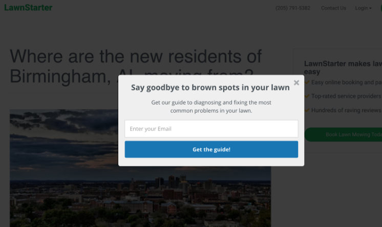
Any popup your visitors see must be relevant to the content they’re reading on the page. If they’re reading an article on content marketing, then a popup that offers a ‘content marketing cheat sheet’ ebook is more likely to capture the user.
When you prepare your popup page, make sure your submit button has a call to action related to your offer and show urgency. For example ‘Get My Free Ebook Now’ for an ebook and ‘Claim My 15% Discount Now’ for discount offer.
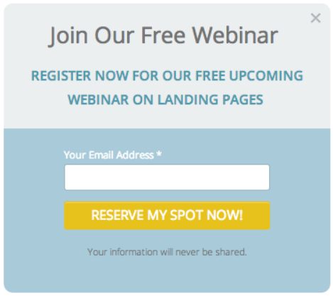
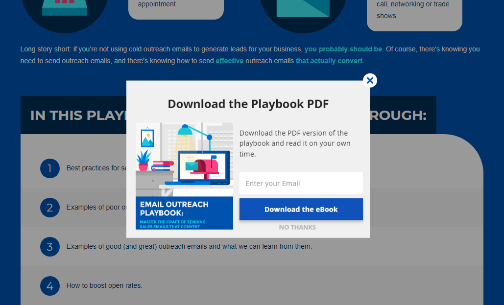
MailShake writes an email outreach playbook and there is a popup to download the PDF version of the post. Relevant!
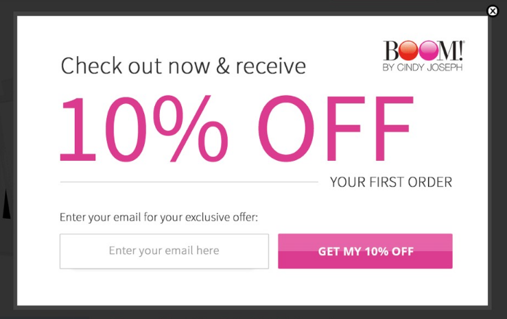
Smart Marketer showed different BOOM!’s popups to different users which they believed were relevant to each user based on their engagement levels. With this, they boosted BOOM!’s revenue by $ 148,297 and captured an additional 8,997 leads in a month.
Mistake #4: Triggering Your Popup Too Soon or Too Late
When your popup has everything to please your readers, you can still lose if you present it too early or too late to your visitors. There is no set rule on the specific time you should trigger a popup on your page. It depends mostly on what you offer on your website.
If a visitor is reading a post on your website and in less than 5 seconds, they see ‘if you like this content, subscribe to get the full package in our ebook!’
How can they decide if they like it when they’re not even halfway through your post? Of course, such a reader especially if they’re a first-time reader will not subscribe.
However, in some cases, your popup has to be early to get the best out of it. If you run an e-commerce website, you don’t want to show them a popup after they have left your site because the women’s clothes are too expensive.
If someone is looking at women’s clothing selections on your website, you can offer them a discount or free shipping on what they’re buying. Remember they’re looking for a good deal in the first place? So they won’t mind at all.
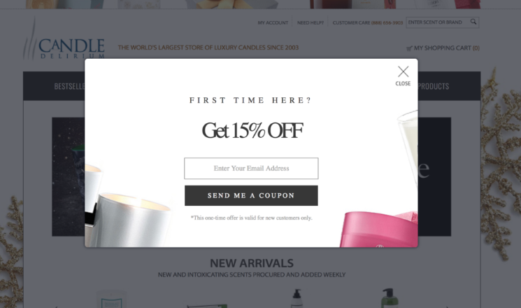
For instance, e-commerce retail brand, Candle Delirium shows you a popup few seconds after entering the website.
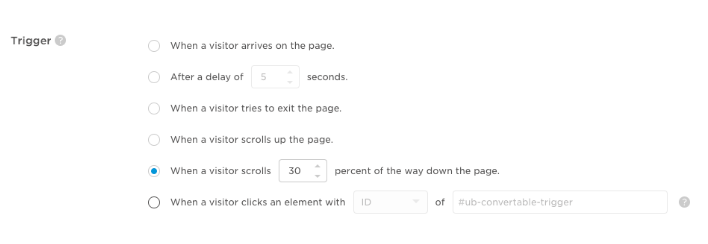
Unbounce recommends that a popup should trigger about 60 seconds after a visitor lands on a page as they feel they would have gained the necessary level of engagement. This may be more applicable to written content.
You can also trigger your popup based on the percentage of content that the visitor has read. For instance, the popup could trigger when visitors have read 70% of the page. There are other ways to time your popups based on user’s engagement.
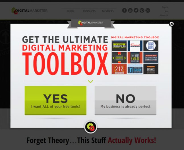
Digitalmarketer.com judged that the best time to trigger their popup was 15 seconds after a visitor lands on the page.

With this, they captured 2,689 leads in 2 weeks and increased time on site by 35%.
Mistake #5: Presenting an Awful Popup
Great content is the key and your design doesn’t matter to your audience, right?
Wrong.
The overall design of your website and your popup says a lot about your service, and brand in general.
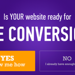
Below is an example of a poorly designed popup.

A crappy design will repel your audience before they even have the chance to see your ‘great’ content. You need to understand that I’m not trying to trash great content here. But great content will only be able to achieve its aim when you back it up with great design.
In a study by Google, participants were asked about their first impression of sites they saw. 94% of factors mentioned for distrusting a website were design related.
When visitors see your awfully designed popup, it’s an indication you don’t care about them — it’s just about the email address for you. This approach will only hurt your business.
To design a popup for your website, the popup shouldn’t look totally different from your website. It should have the same color schemes or at least colors that complement each other.
If you can, include an image of a person on it as this tends to capture emails than those without a human image.
Conclusion
In the online marketing environment, there are mixed thoughts about pop-ups. There are website owners who use them because they can generate more leads for their business.
For instance, Darren Rowse increased the subscriber’s count on his Digital Photography School website from 40 new daily subscribers to 350 daily using relevant and high-converting pop-ups.
Sadly, there is still a percentage of website visitors who don’t want to see pop-ups. And it’s understandable — because most of them can be truly annoying!
However, when it’s relevant, non-intrusive, and appears at the right time, targeted users would be glad to act on it.
If you’re going to use pop-ups on your website, you have to tread that thin line to make sure your popup is improving the user experience.
Digital & Social Articles on Business 2 Community
(150)

