
Whether you’re preparing to send an email blast or running a paid search campaign, your calls to action can make or break the success of any digital marketing initiative.
A persuasive, compelling call to action (CTA) can convince even the most hesitant prospect to convert, but there’s more to it than just a tempting offer — you have to speak your customers’ language.
In today’s post, we’ll be looking at four best practices for effective call-to-action buttons. By the end of this post, you’ll have several actionable tips for creating more tempting CTAs that you can start using immediately in your campaigns.
1. Use the ‘I want to…’ principle
When creating your CTAs, the “I want to…” principle makes them strongly actionable. Simply put, this principle involves writing CTAs that can be prefaced by the words “I want to…” Let’s take a look at an example of how this works:

Both of these CTA examples actually feature the words “I want to…” but this isn’t necessary — it just illustrates the principle behind creating compelling CTAs.
There are hundreds of other applications of this principle that you’ve probably seen on landing pages and emails. The “I want to…” principle could be applied to any of the following examples:
- Get My Report
- Secure My Reservation
- Get My Free Copy
- Increase My Sales
Notice how all of the examples above use language that speaks from the perspective of the visitor? The inclusion of the word “my” directly appeals to the prospect and can make even the most bland CTA more compelling.
2. Keep CTAs short, punchy, and clear
Some businesses favor longer CTAs because they can offset risk aversion and make an offer more appealing due to reduced perceived risk. However, for best results, your CTA should be short and punchy, and make it abundantly clear what prospects are getting into by clicking.

There are no “rules” when it comes to the length of the copy for your CTAs, but the fewer, the better. Many of the best CTA buttons I’ve seen have three or four words. You might be able to get away with a couple more, but you’re probably going to be pushing your luck with anything longer than that.
Your CTAs should leave no doubt whatsoever in the prospect’s mind as to what they’re getting into. If there is any room for confusion or ambiguity, the prospect is significantly less likely to convert. Of course, your email and landing page copy can (and should) reinforce whatever you’re offering before the visitor is presented with an opportunity to convert, but that doesn’t mean you can cut corners with the CTA button itself.
3. A/B test everything
WordStream’s Larry Kim likes to say that small changes yield small results, and to an extent he’s right, but that doesn’t mean you should overlook or ignore the small stuff. Even subtle changes can have an impact on your conversion rates.

Changes such as the position of your CTA button, its color, and even its shape can all affect click-through rates. However, just as you wouldn’t build a house without a blueprint, you shouldn’t make changes without a plan — and this is why A/B testing is so important.
Every decision you make about a campaign, including CTA buttons, should be based on hard data, not assumptions (we all know what they say about those). A/B testing is the most reliable way to determine how your visitors are actually interacting with your materials, not how you think they’re interacting with them.
There are two main schools of thought when it comes to A/B testing — making dozens of small, incremental adjustments over time, or going for grand, show-stopping changes that completely change the look, feel, or even flow of your marketing materials. No one approach is “better” than the other, but it may be worthwhile experimenting with smaller tests first before diving right into complete redesigns.
However you decide to approach your A/B tests, be sure to give them sufficient time to accrue enough data to make actionable decisions. In the field of conversion rate optimization, this is known as statistical significance — the point at which you have enough data to make informed, scientific decisions about how your visitors are interacting with your marketing materials.
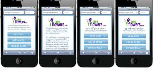
4. Make CTA buttons mobile friendly
This might seem obvious, but the number of businesses that haven’t optimized their sites (and their campaigns) for mobile is amazing.

People are increasingly accessing the web and interacting with sites via mobile device. Many people have forgone using desktop clients to access the web altogether. As such, if visitors cannot interact with your website and landing pages easily from their mobile device, you’re going to lose them.
Make sure that you test separate versions of your landing pages designed specifically for mobile (or use responsive design) that allow users to convert effortlessly. CTA buttons should be easily clickable, and should not interfere with any other elements on the page. Conversions from mobile tend to be lower than desktop as it is, so don’t make it any harder for mobile visitors to convert.
Put these tips to work today
Whether you’re looking to generate more clicks on your email marketing campaigns, or get a higher response from your paid advertising efforts — investing in your call to action can make a world of difference.
Apply these tips to your existing marketing efforts and see how small improvements can result in a higher return on your investment.
Do you have any tips for effective CTAs? Let us know in the comments below.
Digital & Social Articles on Business 2 Community(140)