 Amie Levasseur — January 16, 2018
 — January 16, 2018

Personalizing a site or app is a great way to create a relevant and engaging experience for a visitor or user. In many cases, a personalized experience is so subtle that visitors will not even realize that they are experiencing personalization. Instead, it just feels like the site is relevant and easy to use. At least, that’s the idea. But your personalized experience can feel a bit disjointed if you are using different colors or layouts from what already exists on your website. Your web design team likely took the time to design beautiful layouts, select the best sizes for titles and body text, and make the buttons stand out in just the right way, so why not take advantage of this work they’ve already done?
When it comes to personalized experiences, consistency with the rest of your website is one of the most critical design principles to keep in mind. A personalized experience must absolutely look and feel like it’s an integral part of the rest of your site or app experience, not only in design, but in more subtle ways like text size and corner rounding on buttons, or it will look out of place.
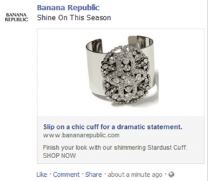
For example, check out the image below. Each of these personalization campaigns are beautifully on-brand, but there are no obvious standards for sizes, layouts, placements of buttons, color choices and so on. Some of them use left-aligned text, some of them use centered text. Some feature badging at the top of product images, while others below. Some product images have text, while some do not. Some callouts go to the side of an element, while others go above. The list goes on. In addition, each experience likely took longer to design than necessary because the team had to recreate the wheel for each one.

In this post, I’ll provide tips to help make your personalization campaigns as successful and consistent as possible, while streamlining the process for your team. At the end of this article, I also describe and link to a helpful worksheet to use when planning designs for your personalized experiences.
Step 1: Get on the Grid
The key to establishing consistency across your personalization campaigns is to create standards for everyone in your organization to follow. Understanding your grid system is the first step in creating those standards. Your site or app might be using a popular system, such as the 960 Grid System or the 1200px Grid System, or possibly no grid system at all. Either way, if you check with your web or app development team and do some testing on your own with Developer Tools, you can see how your site or app works at popular browser sizes. As you’re doing this, take note of some key widths you are seeing at a common browser size, such as 1280 x 1024 (I use a Chrome extension called Window Resizer* for this) including full width, half width, thirds and quarters.

Below is an example of a quarter grid on the Evergage site.

The Evergage site is responsive, so the widths of different sections are calculated using percentages, in this case 25% for quarters, which is a width of 235px. If you get a weird number with decimals, just round up or down to the nearest whole number. What you’re looking for is approximate sizes in proportion to the rest of the site or app contents that you can use to determine standard sizes for each type of personalization campaign you use.
Step 2: Standardize Sizes
You wouldn’t print your marketing documents on all different sized paper, so why do that with your personalization campaigns? Using all of the information you gathered as part of learning about your grid system, you can use the following suggestions as a starting point for creating your own standard sizes.

As these diagrams show, it’s easy to create standards around interruptive message formats such as infobars, pop-ups and callouts with the width information you gathered on your grid system. Using suggested proportions like this will ensure that your messages don’t appear too large, too small, or just weirdly placed on your site or app.
It may seem trickier to create standards for more subtle experience types such as in-page edits (modifying or removing existing content on your site) or inline content (dynamically adding new sections to your site) — but that doesn’t mean that they should be avoided.
For in-page edits, the standards have already been defined for you. You are simply making an edit to an existing section, so the thing you have to worry about is inserting content (text, images, buttons, etc.) that are sized appropriately and consistently with the content that is already on your site.
A method that I recommend for designing inline content is to replicate an existing layout from your site in another location. In terms of sizing, apply the same principles used for in-page edits — you simply match the size of the existing section. This provides consistency while delivering dynamic, relevant content. The following example shows a grid for inline content. This grid may already exist as a featured categories grid at the top of your homepage. On a detail page, the same grid can be used at the bottom of the page with featured articles or, for e-commerce sites, products in the category that the shopper is viewing, labeled “More Like This” or “More for You.” With this approach, you don’t have to experiment with and create a brand new layout, you are using a layout that already works well for you.

A final note on sizes: you don’t have to stick with only one size per personalization type, but it’s a good idea to limit yourself to two or three size options so you have a manageable set to pull from. If you find the sizes you’ve selected just won’t fit all the content you have, it’s a good time to pause and say “What’s my main goal here, and what can I cut to emphasize the key point?” You likely have too much content or too many images if you are running into this and you should probably consider simplifying content or splitting it into multiple messages.
Step 3: Templatize
Content organization can be tricky, but when you find a layout that works, you can re-use it and vary the content by making templates. When creating layouts, try to have one key goal (your CTA, or call to action), such as “download an eBook” or “add to cart.” Emphasize this message and make the rest of the personalization content more subtle. Below are some template examples for different message/experience types. Use these ideas as inspiration for your own templates.
Inline Message Templates: As I mentioned in step 2, the most seamless way to insert content into a page for content or product recs is to replicate a section you have somewhere else on your site and match the layout exactly. For example, when recommending products, look at your product list page layout. Or, when creating a list of links, use your navigation as inspiration.

In-Page Edit Layouts: Creating a template for in-page edits can be challenging, but is well worth the effort. Since this type of personalization is based on editing sections of your website or app, develop a template that outlines key elements of variable content that can be swapped in, such as character length for text, or image sizes. You can take your image specs a step further by determining if the images should be larger for high-density displays (retina, 4K, etc.) and add any other useful notes to it.

Infobar Templates: Try to use one standard height for all of your infobars. At most, develop two height variations. Even if you are restricted to a smaller height, you can play with transparent images going off the edge of a slimmer infobar to add visual interest, as shown in the second example below.

Callout Templates: You will typically only need small or medium-sized callouts, as image and copy should be very minimal. If you have more content than can fit on a small or medium callout, you might consider another personalization type. If you do need a large callout, the content within it should still be informative but sparse, such as a diagram with text pointing to specific areas.

Pop-up Templates: Note the two different sizes used for the pop-ups below and the content variations within them. Once you’ve determined the sizes that will work for your website or app, in this case, a large and medium option, you can easily adjust content to fit within the confines.

Final Thoughts
While building beautiful designs that match your brand aesthetic is critical to the success of your personalization program, maintaining consistency is equally important. It’s a good idea to have standards in place for message sizes, layouts, placements, color choices and so on, to create an experience that feels thoughtful and seamless and to streamline the process of creating and building out personalized experiences for your internal team.
I’ve provided some ideas and inspiration, but each site or app is different. My colleague, Ashton Landry (Evergage’s Creative Director), and I have put together this worksheet to help you ask your team and organization the right questions before you set your own standards and design templates for personalized experiences. It isn’t a lot of work to complete, but it lays important groundwork that can help you create stunning (yet subtle) personalized experiences.
Digital & Social Articles on Business 2 Community
(51)