Since 2010, the popularity of infographics has soared online–and is still on the rise, as charted by Google Trends below.
At one point, the use of infographics was limited to academic circles, but now they’re seen as a way to make any topic more palatable.
Today, we find them everywhere, from our Facebook and Twitter feeds to our favorite blogs on all types of subjects, ranging from cooking substitutions to how to become a more inspiring leader.
The problem is that with this surge in popularity also came a huge influx of chart junk, which are cluttered visualizations with unnecessary or confusing elements.
Chances are that if you’re reading this, you’ve probably tried to create your own infographics in the past and didn’t get the results you were hoping for.
After analyzing hundreds of the top-performing infographics online, we’ve come up with this list of reasons why some infographics fail to generate a significant ROI and how to avoid future infographic fails:
1. It doesn’t provide a new angle.
One of the main reasons some infographics fall by the wayside is that they don’t add anything new to a particular discussion or topic.
Some of the ways you can avoid this fate with your infographic is to look for unconventional angles when dealing with widely covered topics or analyze data from a different perspective in order to uncover trends hidden below the surface.
Takeaway: Don’t be like the hundreds of other infographics posted online–add something new to the conversation.
2. It doesn’t provide practical value.
According to our analysis of more than 200 of the most shared infographics online, a large percentage of the best-performing ones provide some sort of practical value to the reader.
Whether in the form of an ultimate guide on how to accomplish a difficult task or a visual cheat sheet, many of the most viral infographics do the hard work of compiling useful information in one easy-to-read visual that invites readers to bookmark it for future reference.
Takeaway: Readers are more likely to share and bookmark your infographic if it provides a tangible benefit to them.
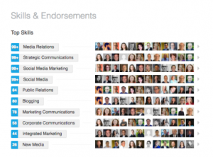
3. It doesn’t make information easier to understand.
The mark of an effective and persuasive infographic is its ability to make information easy to understand within a few seconds of viewing it. But many fall short of this goal by converting textual information into eye candy, and nothing more.

Take a look at the infographic above, for example. It actually does a disservice to the information by making it harder–not easier–to understand.
Takeaway: Don’t try to force your information into an infographic if it doesn’t have much to gain from being visualized.
4. It isn’t well designed.
This mistake is particularly common among those who venture into the uncharted territory of infographic design without the proper tools or knowledge to do it well.
When this happens, it is easy to make amateur mistakes that take the attention away from your message–rather than attract it. Among some of the most common mistakes that can result in an infographic fail are cluttered designs, the lack of contrast, unattractive color schemes and ill-chosen font combinations.
You can consult this comprehensive step-by-step visual guide for non-designers to avoid making these same mistakes with your infographics.
Takeaway: An effective infographic acts not just as eye candy but uses design principles to draw attention to key points.
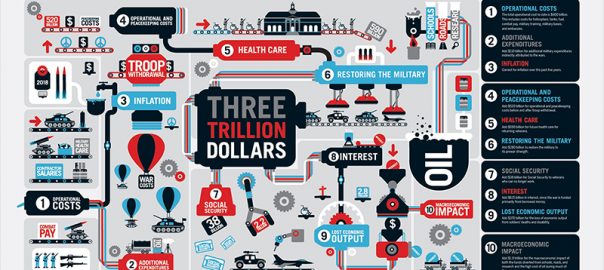
5. It doesn’t tell a story.

Other infographics may follow all the prescribed design rules but then fail to tie all the elements together with a narrative structure.
Instead of piling one data point on top of another, make your infographic more palatable by weaving it together with a storyline, like in the example above (click to view full infographic).
Takeaway: Stories sell. Implement a narrative structure to make your message easier to understand and remember.
6. It doesn’t empower your audience.
Some of the best infographics are the ones that help readers make better decisions, whether it be in the political arena, in their finances or their personal lives.
Make sure that your infographic empowers individuals by giving them the knowledge they need to make informed decisions.
Takeaway: Provide accurate and well-researched insights that help readers make better decisions.
7. The copy is not written for an infographic.
A very common amateur mistake is creating copy for an infographic as if it were a report or an article. This can render your infographic ineffective as it defeats the purpose of communicating with visuals, rather than with words.
Instead, create copy for your infographic as if it were a website: All textual messages should go hand in hand with their accompanying visual elements and never repeat their content but complement it.
Also, make sure to craft a catchy headline, as this is typically the first thing a reader looks at when they view an infographic.
Takeaway: When writing copy for your infographic, make it short and sweet.
8. The message is diluted.
Many infographics out there are so convoluted that they dilute the main message with unnecessary graphic elements and poor structure.
For every element in your infographic, whether it be textual or visual, always ask yourself: Do I really need this to communicate my main message? If the answer is no, then consider doing away with it.
Takeaway: Less is more. Eliminate unnecessary elements to make your key point stand out.
9. Influencers aren’t involved in the promotion process.
When the creation process is complete, many first-time infographic creators simply adopt a “publish and pray” mentality when it comes to promoting it.
But one of the keys to gaining traction online is to reach out to influencers who have written about your topic and ask them to check out your work. If they find it valuable enough, they’ll gladly share it with their audience.
Takeaway: Involve the right influencers in the creation process and then ask them to share with their followers.
10. Little time is spent on outreach efforts.
Once your infographic is complete, you can launch drip campaigns on social media channels to share the most interesting snippets from your visual.
Make sure to spend some time researching where your target audience hangs out and post to those specific discussion groups
Digital & Social Articles on Business 2 Community
Takeaway: Spend as much time promoting your infographic as you did creating it.
(123)