— November 16, 2018
If you generate a $ 200 million quarterly profit with an online product, your website’s user experience must be world class, right? Wrong.
Your homepage can still look like the one above, which is from one of the largest cryptocurrency exchanges in the world.
But terrible UX isn’t a shortcoming of the cryptocurrency industry—it’s common in every high-growth industry, including, perhaps, your own.
The inverted consumer motivations in high-growth industries
Seven factors typically affect purchasing decisions, with price the most influential:
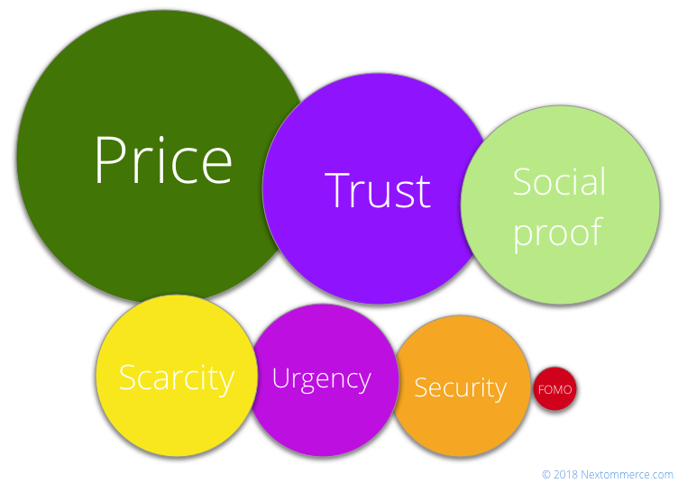
But in high-growth industries, the driving forces often reorder, and “fear of missing out” becomes the primary factor:
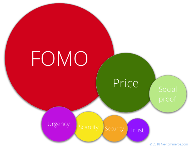
Eventually, markets cool—and all those “unimportant” UX factors become critical once again. But, in the interim, industries like cryptocurrency get away with atrocious UX.
The mistakes detailed below are a cautionary tale about potentially pernicious UX blind spots.
The UX mistakes in crypto (that you’re probably making, too)
Why bother looking at crypto sites? For one, to show the potential scale of “UX neglect” when your industry rakes in hundreds of millions each quarter. Second, to identify the common UX mistakes that plague three key areas of all online platforms:
- Homepage
- Registration
- Onboarding
For each section, I also include a non-crypto example that shows how to get things right.
1. Kraken: How to get the homepage wrong
This is the homepage of Kraken, a major cryptocurrency exchange:

If I told you about a website that had the slogan “Sail the high seas of success,” what would you guess it sold? Coaching sessions? Self-help books? Luxury cruises?
The tagline helps a little, if you notice it at all: “Buy, sell, & trade Bitcoin.” If you have a slogan and a tagline on your homepage, try switching them:

Isn’t that clearer? It still doesn’t tell the whole story (you can trade cryptocurrencies other than Bitcoin), but it’s much better.
What else is unclear? The very top yellow bar: “The improved trading engine is released. Some important details on our blog. Read more.”
While it’s gone now, It stayed there for six months. And it linked to a blog post telling you that the site was back online after “recent scheduled downtime.” Do you need to display that at the very top of your homepage?
I’ll go ahead and click on the “Sign up” button in the menu. (The two large “Sign up” buttons fight for attention; ideally, you have only one.) It takes me to the registration form:
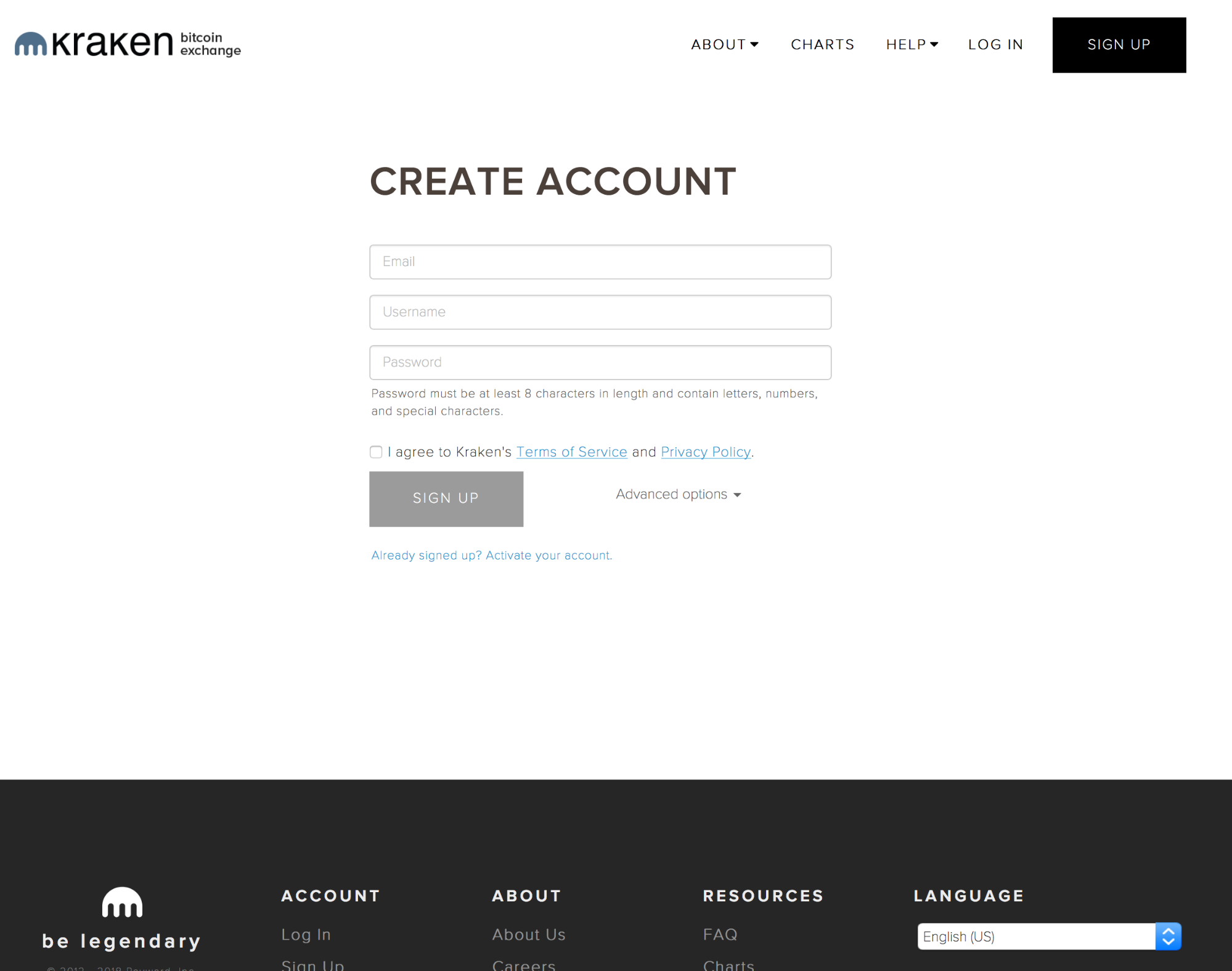
This is practically the same form as on the homepage, with a slight improvement: It tells me that the password “must be at least 8 characters in length and contain letters, numbers, and special characters.”
You could easily ditch the “Sign up” form via the menu button and add the password requirements to the form on the homepage.
Also, one unnecessary thing: Why do you even need a username? An email is a unique identifier.
Revolut: How to get the homepage right
Even if you’re unfamiliar with Revolut, you’ll know what they do just seconds after looking at their homepage:
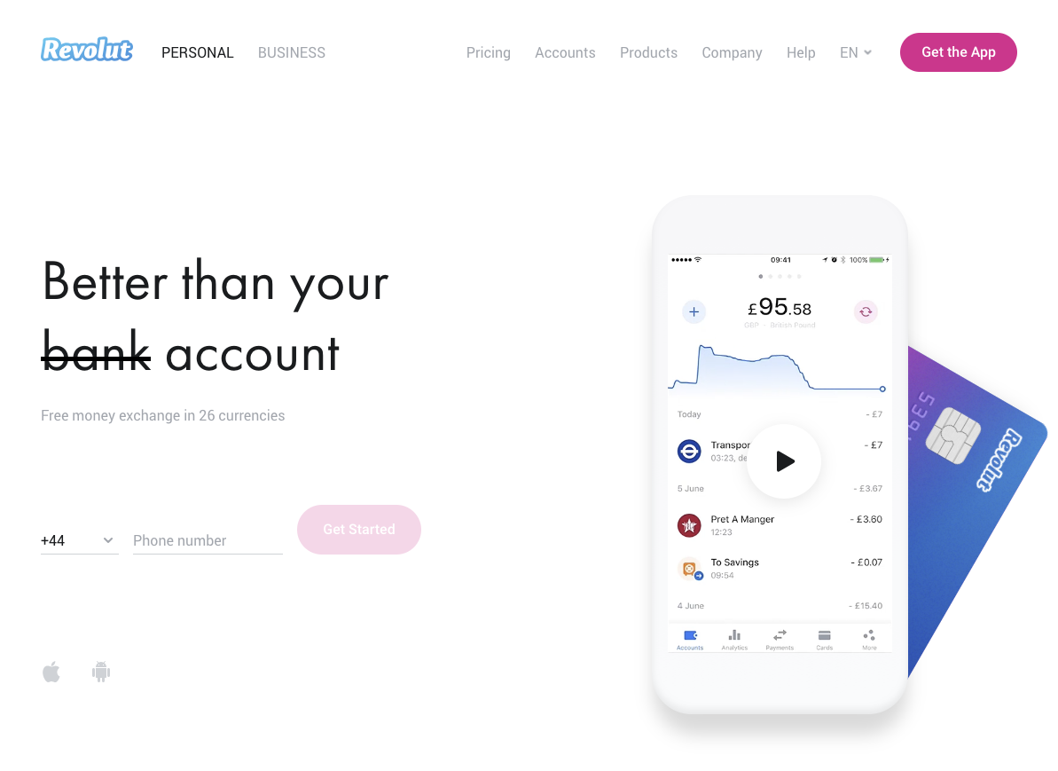
You can see that its goal is to replace a bank account, and that it gives you free money exchange in 26 currencies.
For those who need more details, the below-the-fold section lists a great benefit (“Spend abroad with no fees”) along with a photo of a physical card. You can see that it’s not only an app but also a card you can use offline:

There’s another great benefit-feature-visual combo. “Send money globally for free” is as straightforward as you can get, and it addresses a key problem for consumers:

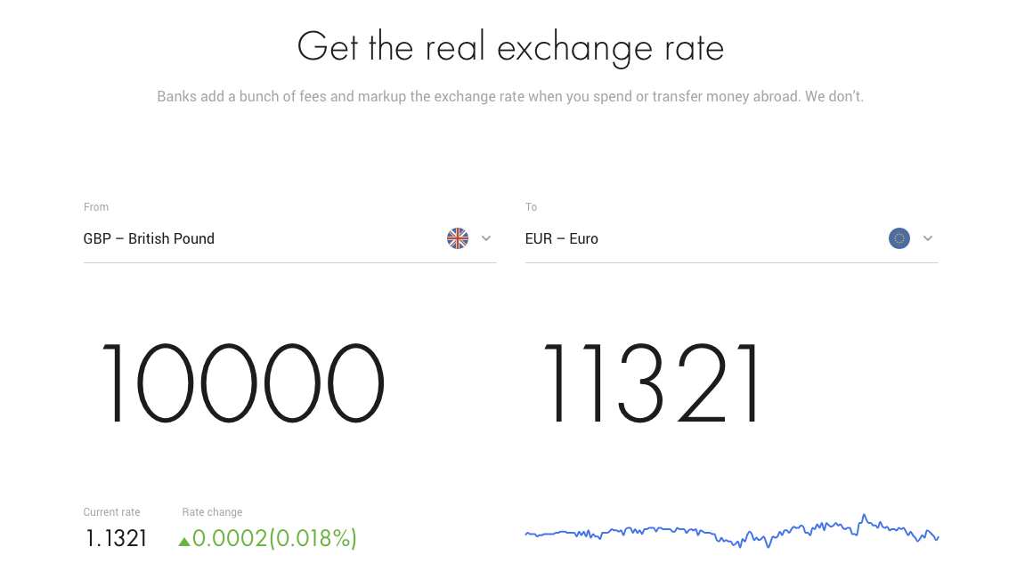
Revolut even has a nifty interactive exchange calculator at the bottom of the page. It shows both the feature (part of the money-sending process) and the benefit (clear savings):
2. Binance: How to get registration wrong
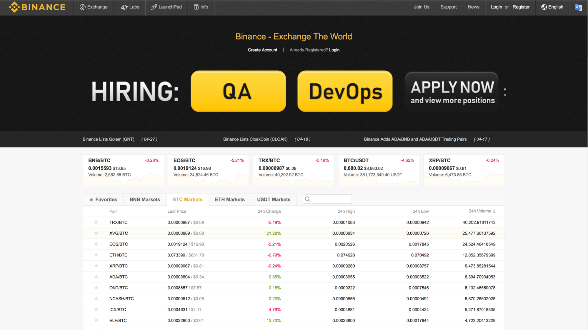
The first thing you see? Two humongous buttons and “HIRING.” Is it a cryptocurrency exchange or a job-search website?
- There’s no headline to help me understand what the site is about. (“Exchange The World” tells me nothing.)
- There are three calls to action, all of them related to job searches.
- The rest is confusing numbers and irrelevant snippets of news.
If I want to register, where do I click? “Exchange”? “Launchpad”? “Join Us”? None of those. I need to find the “Register” link in the top right corner.
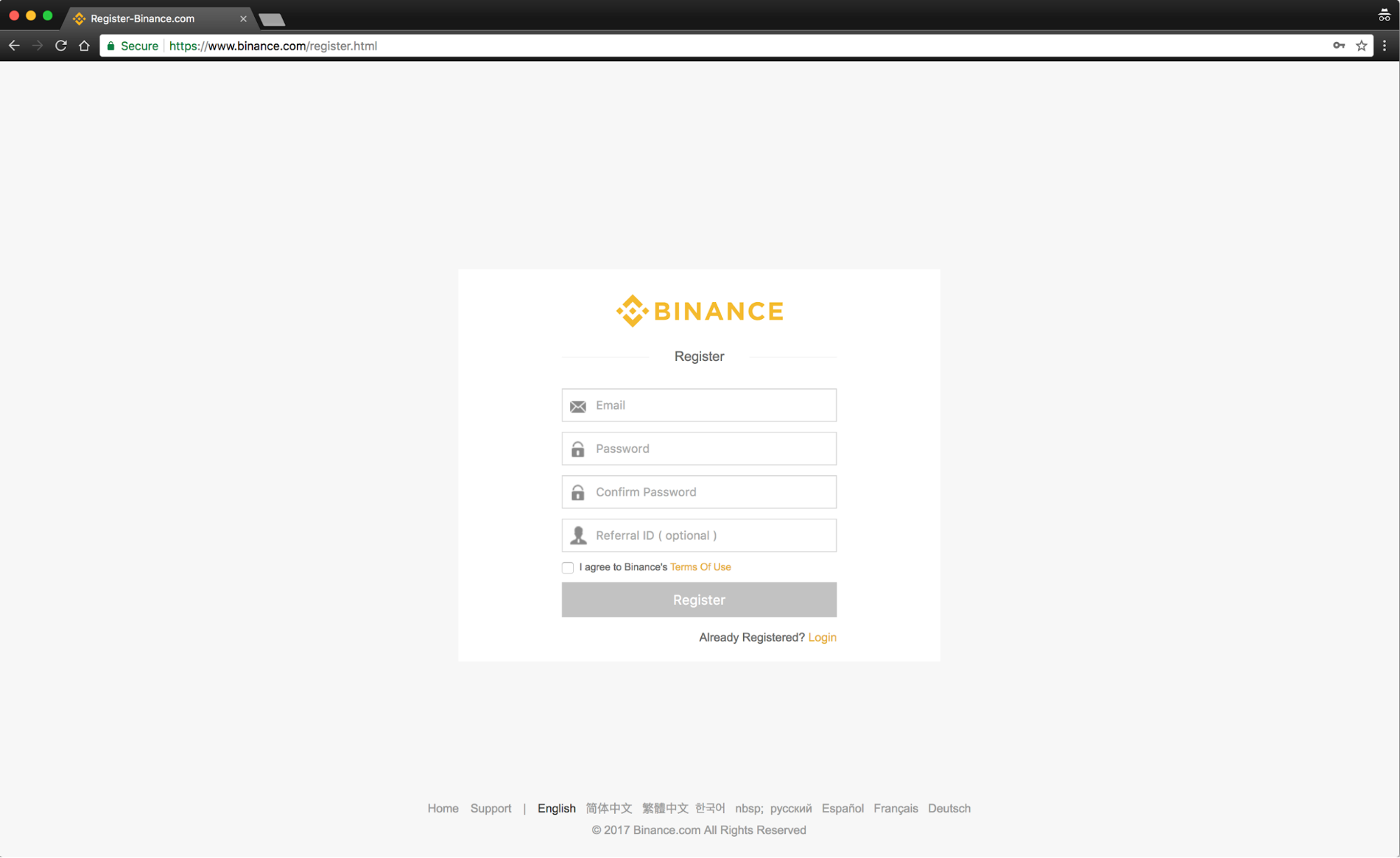
The email field is straightforward. As for the password, there’s no hint of the requirements. Only after I don’t follow their requirements does it say, “Password must be at least 8 characters with uppercase letters and numbers.” Why not tell me that upfront?
The “Referral ID” field is also unnecessary, but it’s probably there for affiliate reasons. (It’s easy to give affiliates the Referral ID and tell their customers to use it during the registration process. Easy for the affiliates, but not useful for end users.)
Okay, let’s hit “Register”:

Another security measure. Fine. But the English is a little off: “Please fit the puzzle piece carefully.” And why does it show Chinese text? Seeing something irrelevant is not reassuring—especially Chinese text when you’re not in China.
The next few steps are about email verification. They’re straightforward, and I won’t include screenshots here. But even with a few simple screens, Binance manages a couple of hiccups:
- The URL of one of the pages ends with “/EmailSended.html.”
- The text on one of the buttons is “Resent The Mail.”
I need to trust this site with my money. Every misstep decreases that trust. Finally, I’m inside and on the main dashboard:

What next? The page doesn’t help me. It gives me various security options to set up. It says I’m not verified. And it shows nothing about trading. I’m left to figure it out.
Shopify: How to get registration right
The registration process for exchanges is complicated due to regulatory requirements. For a fair comparison, I chose Shopify—the process from “I want to register” to “I’m now selling stuff online” is a long one, with many steps and legal requirements.
Shopify’s homepage is clear about what it wants you to do: “Get started.” That’s it.

After clicking “Get started”, the whole page is replaced with a registration form overlay. There’s nothing else to distract me—just three simple form fields. Even if I bail at some point during the rest of the registration process, Shopify has my email address to follow up.
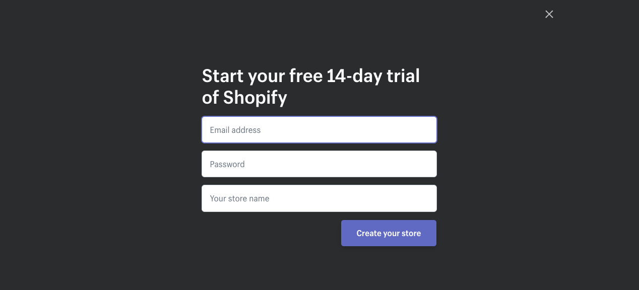
After I’ve entered my email, password, and store name, the segmentation starts:
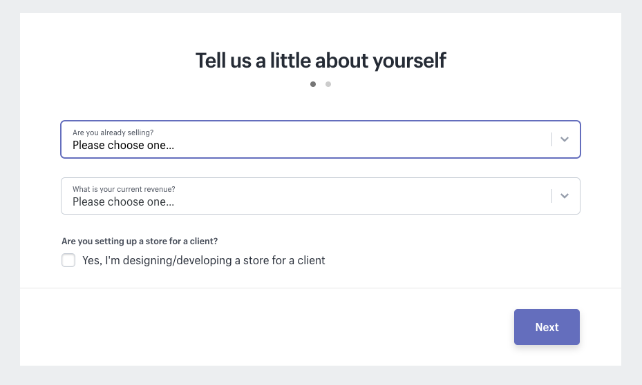
The “Are you already selling?” drop-down has four options:
- I sell with a different system
- I’m just playing around
- I’m selling, just not online
- I’m not selling products yet
This lets Shopify:
- Educate me on its features (if I’m selling with a different system).
- Show me how to start selling online (if I’m selling offline).
- Send me a tailored drip email campaign.
The second drop-down with “What is your current revenue?” makes segmentation even more relevant (and effective).
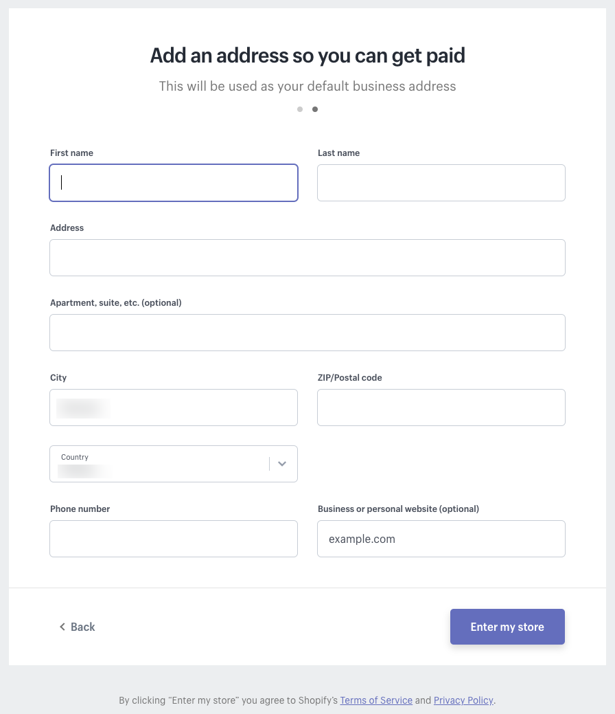
Step 3 has a more traditional registration form. After completing this step, I’m taken to my shop’s dashboard, and the onboarding process begins.
3. Bitfinex: How to get onboarding wrong

Bitfinex has a homepage with a clear headline call to action. I’m not sure about “the largest” claim, but other than that, there’s no room for misunderstanding.
The primary call to action (“Open account”) is front and center. And if you’re still in research mode and need to “see it to believe it,” there’s a secondary call to action to “View demo.”
Let’s open an account:

Username and email? Have one or the other, not both. No help with the password requirements, either. Timezone could also be determined automatically and is unnecessary during the registration process.
When I check the email and click the activation link, I’m taken to the login window. My frustration with the username and email was justified: You can log in with either.

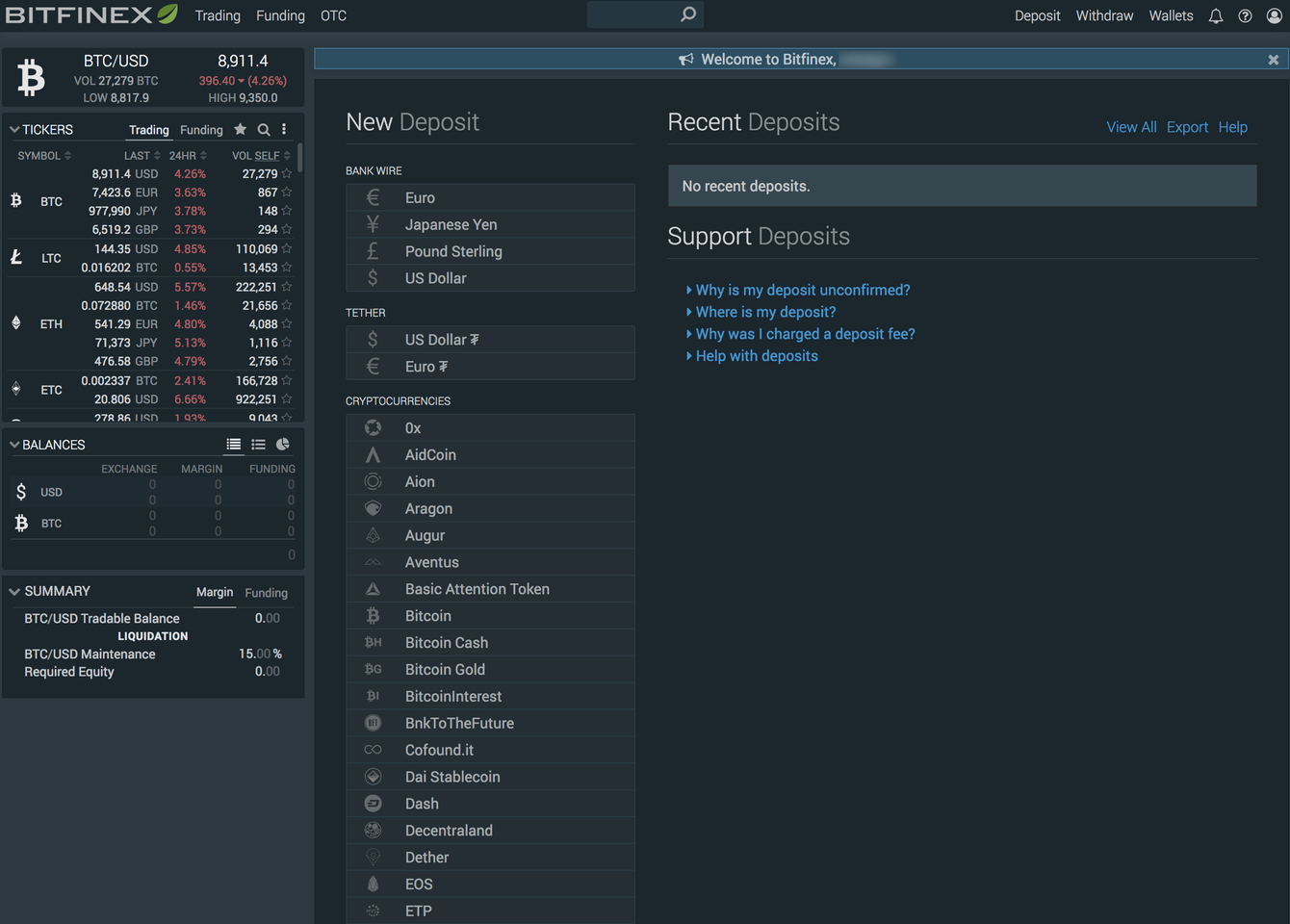
Ok, I’m registered, activated, and ready to start. And yet, there’s zero onboarding: I’m thrown into a room full of people, in the middle of a conversation, and left to figure out what’s going on:
Slack: How to get onboarding right
Slack is a near-perfect mix of utility, usefulness, simplicity, and personality.
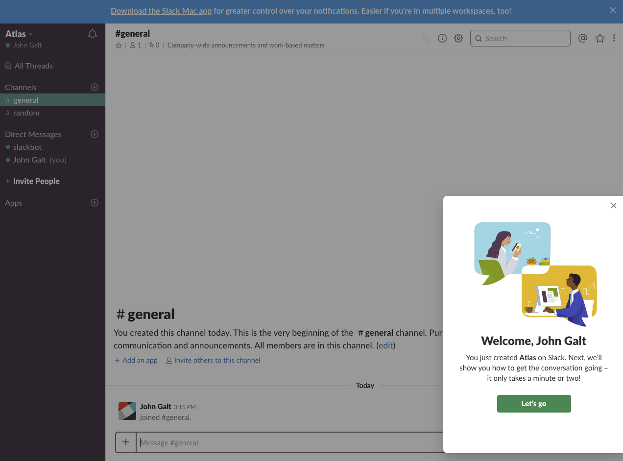
When I finish registration, a pop-up promises to “show you how to get the conversation going” and also sets expectations (“it only takes a minute or two”):
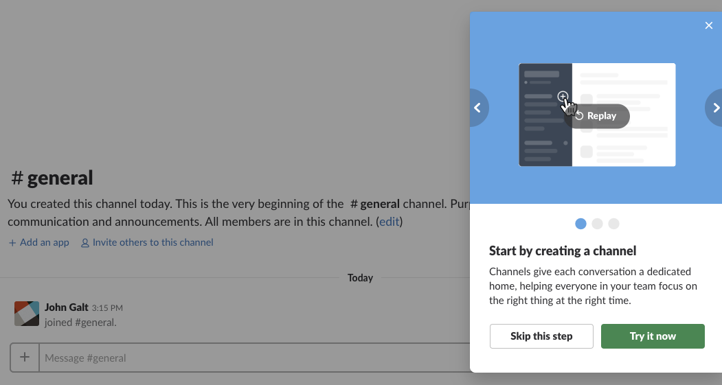
There are clear and short explanations, with easy-to-skip steps if anything is familiar:
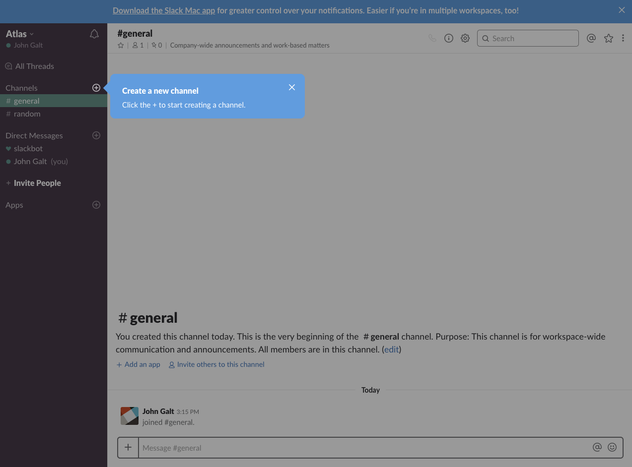
When more explanation is needed and I click “Try it now,” it tells me exactly what to do and where to click:
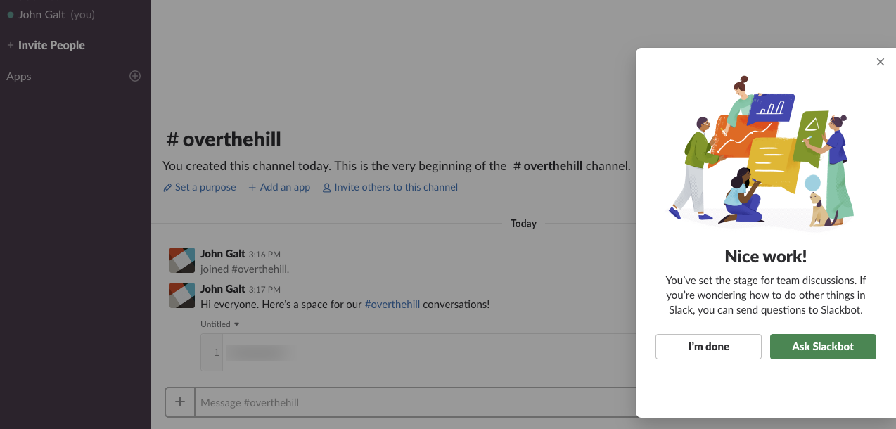
Once I’ve gone through all the steps, Slack congratulates me and gives me one more resource: a helpful Slackbot I can ask questions or treat as an FAQ search:
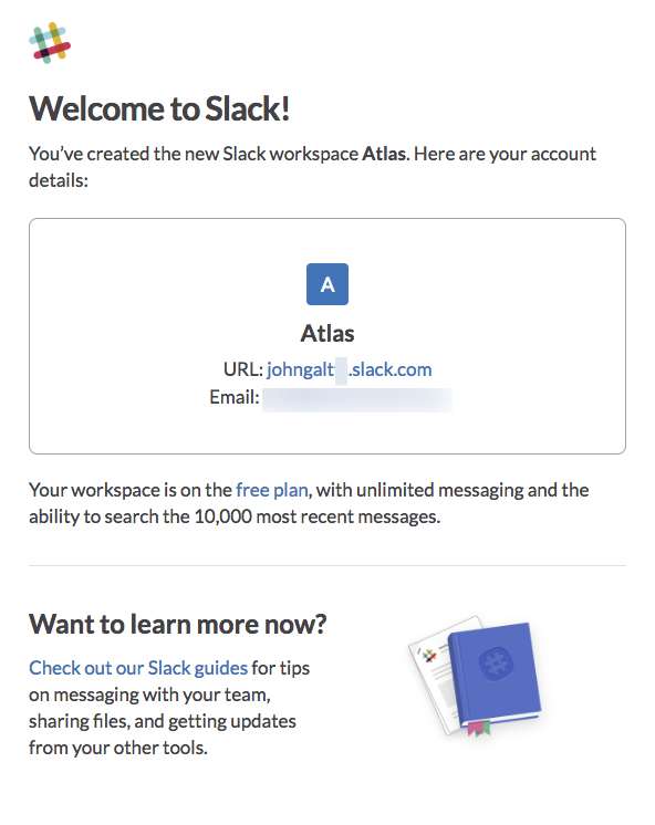
I also have an email in my inbox with where to log in, what email I used, product guides, etc.:
Coinbase: How to get it all right—before the bubble bursts
Of all the exchanges I reviewed, Coinbase is the only one that has invested its profits back into design and usability.
Let’s see how they’ve done it:
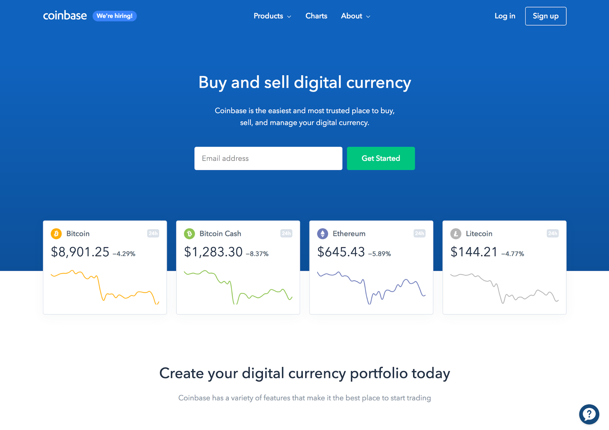
“Buy and sell digital currency.” You can’t get any simpler. The subhead makes it even clearer: “the easiest and most trusted place to buy, sell, and manage your digital currency.”
There’s a prominent and clear call to action, too: Enter your email and “Get Started.”
Additionally, Coinbase has nice cryptocurrency price charts under the call to action—not too distracting and useful to build anticipation about what’s inside.
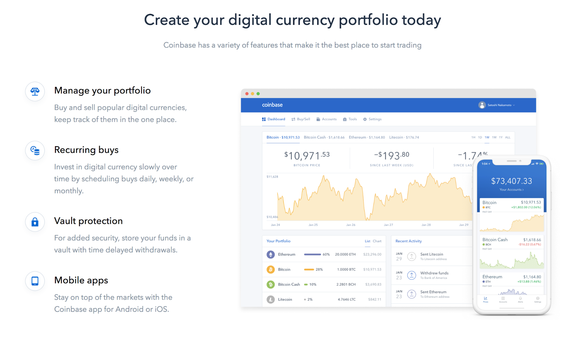
And what about the stuff below the fold? There’s a roundup of features, a dashboard, and a screenshot of the mobile app. Everything shows the visitor exactly what to expect:
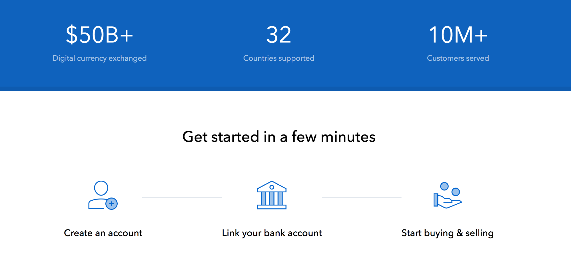
For the unconvinced, there are some pretty persuasive trust elements, too:
Let’s go ahead and sign up:
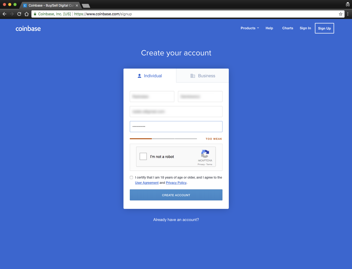
Everything’s crystal clear. First and last name. Email. Password. Not a robot.
There’s no explanation of the password requirements, but once you start typing, you get a bar with your password status: Too weak / OK / Excellent.
Once I submit it, I get clear info about what to do next:
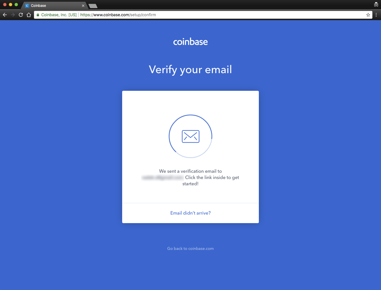
Note that on this page (and the next few as well) there’s no main menu, no footer, no links or elements to distract you.
After clicking the link from the verification email, I’m in:
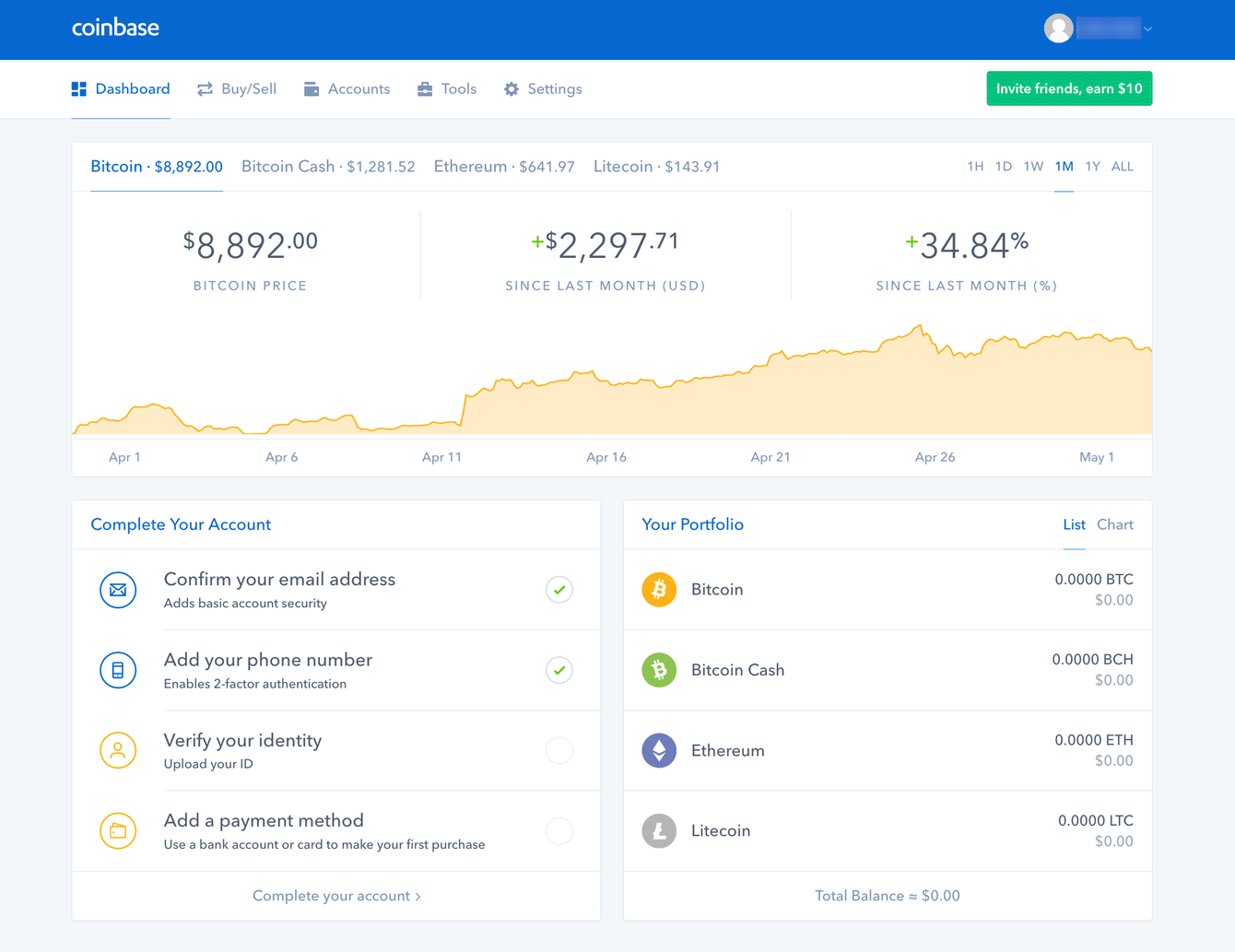
There’s basic information (current price, a nice chart) and a helpful list of tasks to complete my account. The first two tasks are done, so the logical next step is to click on the third one: “Verify your identity”:
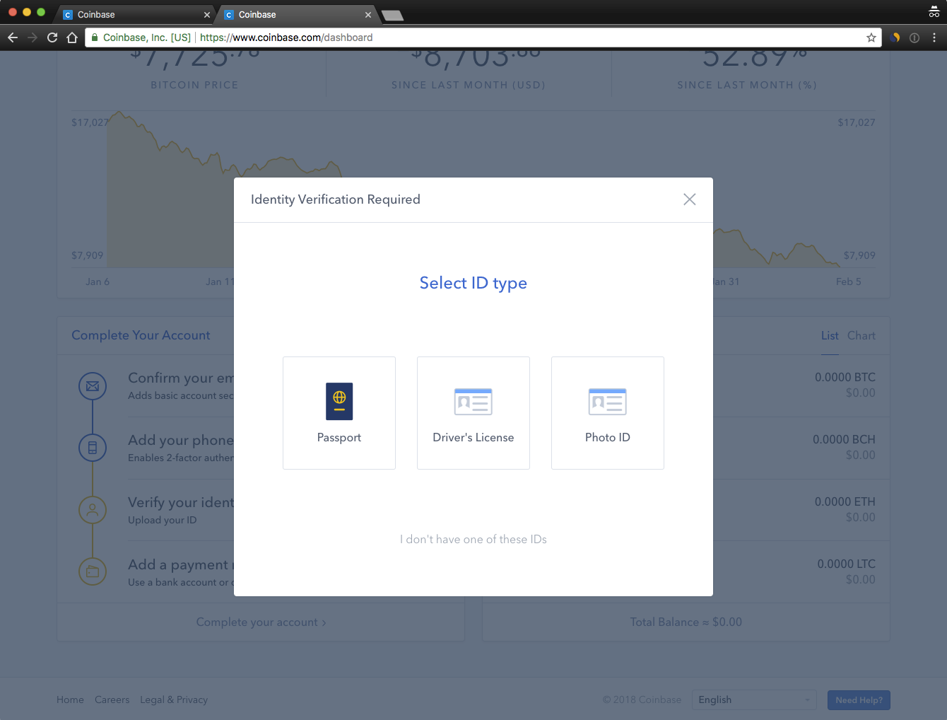
Only one thing to do here: Choose the type of ID. Based on this choice, the rest of this step is similarly straightforward.
The last step is to add a payment method:
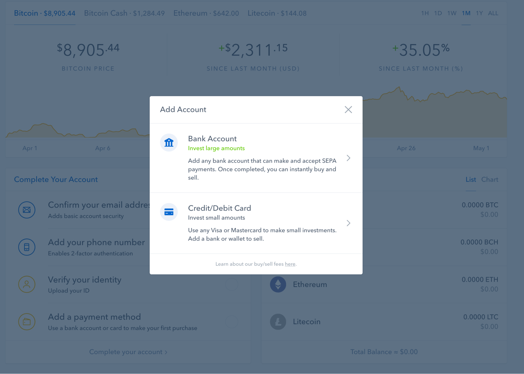
Even with these two options, Coinbase makes it easy—a bank account for investing large amounts, or a credit card for smaller amounts. Once I complete this step, I’m ready to trade.
An assisted tour of the platform could be nice, but I’m nitpicking here. They have a great mobile app too, where it’s all even clearer.
Conclusion
For ecommerce businesses, a great user experience is a competitive advantage. But for high-growth industries like cryptocurrency exchanges, it’s often an afterthought.
If companies in high-growth industries want to continue to grow after their market cools, they need to focus on the user—not just the technology.
If you’re wondering how your site compares, he’s a summary of what to avoid and what to do instead:
What to avoid
- Slogans or generalities. “Exchange The World” tells me nothing. “Buy and sell digital currency” tells me everything I need.
- Thinking. Every time a user has to think about what to do, you’ve lost them.
- Leaving customers for themselves. Hold their virtual hand and lead them where they want to go.
- Don’t focus only on acquisition. When “more customers” is your primary (or only) goal, you inevitably forget about retention.
What to do instead
- Manage expectations. Tell them what you’re going to do. Do it. Then tell them what you did. Avoid surprises.
- One thing to do. Each page or each screen should do one thing. And it should be immediately apparent, especially during registration or onboarding.
- Trust and social proof. Do anything you can to maximize both. That’s how you get people from “Maybe” to “Yes.”
- Focus on customer lifetime value (LTV). Homepage, registration process, onboarding—these elements should be built, optimized, and measured against their impact on LTV.
Digital & Social Articles on Business 2 Community
(73)


