When it comes to webpage design, far too many people are still interested in creating flashy landing pages.
Once marketers learn of the possibility to design & create a live landing page for their campaigns, they will often want to show off all of their skills, demonstrating all of the tricks that they have learned. Alternatively, when hiring landing page designers, they will want to feel as if they are getting their money’s worth.

The possibility to design and create landing pages on your own
For many, that entails getting the sort of ornate website that only a professional webpage designer could create. However, the marketers who have this mindset today are doing themselves a disservice. Plenty of professional webpage designers are going to end up telling them all about the importance of minimalism in today’s environment, and their clients should listen.
The Internet of Twenty Years Ago and Now
Websites that have a lot of flashy gimmicks and graphics on their landing pages are beginning to look distinctly old-fashioned and outdated. People are increasingly associating them with websites from the 1990s. The Internet landscape has changed dramatically since the 1990s, so it isn’t surprising that styles that were considered normal at the time have become antiquated today. This same level of dramatic change has happened all across many other fields. The Internet landscape changes quickly enough that it may seem like it has happened faster in this field, specifically.
Most people are on the Internet today. As such, those who are designing websites need to be able to appeal to a huge swath of the population. In the 1990s, the Internet was highly niche. It made sense that the hobbyists who browsed through different websites would find the flashier websites of old appealing, but the culture of the Internet has broadened now. In the 1990s, websites were also new. The graphics, images, and buttons that people would litter their landing pages with were just as new and impressive. Today, the novelty of these sorts of visual tricks has long worn off, and visitors would prefer to have websites that are functional.
Mobile Users and Websites
Of course, one of the biggest differences between the Internet culture of the 1990s and the Internet culture of today is the simple fact that so many people browse the Internet on their mobile devices. Mobile devices, while they have been around for longer, are really a product of 2010s culture, and appealing to mobile users is essential today.
Pulling out a mobile device in order to access the Internet is very much something that can be done casually. The people who are performing this task on their mobile phones are going to be using one finger in the process, and it needs to be the sort of thing that a person can do with one finger. It can also be done anywhere. Visitors are much more restricted when it comes to using their laptop computers to access the Internet. Desktop computers are even more restrictive. People are going to use their mobile devices to access the Internet more frequently just due to the convenience of the process.
There’s a need to devise webpages that are going to be convenient to access on mobile devices. Typing on mobile devices is still more difficult than typing on a fully featured computer, regardless of the skill level of the mobile user in question. As such, visitors should be able to reach a page and browse through it using as few fingers as possible. It is also going to need to look good on the narrow screen of a mobile device. Mastering this sort of appropriately minimalist design should fortunately be easy for most people.
Understanding & Applying Minimalist Design
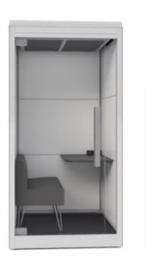
When a design is minimalist, it will only contain the characteristics that it needs. A minimalist chair, for instance, will have a seat, a back, and (maybe also) armrests, but it won’t have any fancy or ornate features. The seat, back, and armrests of this minimalist chair will be plain-looking. Those familiar with the very artistic designs of many antique chairs, with their wood carvings and curved features, will be able to notice the difference immediately.
 A functional chair you could sit on
Minimalist designs have become popular throughout the modern era in general. Modern architecture is more minimalist than the architecture of old, and “Less is more” – is the motto of famous 20th century architect Ludwig Mies van der Rohe. Modern clothing is simple and straightforward compared to what people wore only a century ago. Webpage design is moving along the same trajectory.
When creating a minimalist webpage, the question that needs to be asked is: what the page needs in order to work. Then, they should design their website to include those features and only those features. Most of the people who are accessing their website are only going to care about those features, and aren’t likely to actively respond to any redundant ornaments. Breaking webpages down to the parts that really matter can help designers create landing pages that will focus on purpose & functionality and are likely to increase their conversion rate.
Minimalist Design and Color
Color is an important part of any webpage design, and it is an element that people still misuse today. It is important to take into consideration the fact that having less visual information sweating to seize the visitor’s attention, on a minimalist design, color palettes suddenly become more noticeable and will be more influential in a landing page’s potential impact.
Yes, of course there’s the element of personal taste to it, but still, you shouldn’t ignore the color theory, based upon countless studies and optimization tests.
Minimalist Design and Navigation
Being able to easily navigate through a landing page is extremely important. Visitors should instantly be able to figure out where they need to go in order to learn more about a particular offer. They should be able to look at a landing page and immediately grasp its subject. They should be able to reach all of its existing parts easily and effectively.

Navigation on minimalist landing pages must be effortless.
A common option for easy & intuitive navigation for your landing page could be to use anchor links to “jump” to the different sections it consists of. The graphics used during the navigation process ought to be just as simple and straightforward.
Minimalism engages the senses but it does not challenge them. Visitors should be able to go through what a landing page has to offer almost without thinking about it. Navigation on minimalist landing pages must be intuitive. Effortless.
Features to Reduce In Minimalist Webpage Design
Many people feel the need to put a lot of images on their landing pages, but that’s often a mistake today. One subdued image is usually going to suffice. When people use mobile devices, they could be more limited in terms of bandwidth (growing less and less common, but still..). The page may lag when someone tries to access it for the first time if there are too many images. We sometimes hear that images sell, but you should know that it makes sense to use them on specific pages. Using too many of them on the landing page could potentially cause a loss of conversions and increase your bounce rate.
Trends in minimalist e-Commerce design
Minimalism and Professionalism
The fact that minimalist landing pages appear to be better organized also means that they appear to be more professional. Creators of business landing pages of any kind will need to pursue minimalism in their design, or they are going to create the wrong impression. Professionals need to be aware of trends, and minimalist landing pages are considered modern landing pages. The flashy webpages of old appear to be those of hobbyists who are out of touch with the times, and that is never an impression any business is going to want to create.
Check out this minimalist design on the Smarthalo landing page. Most of it is dark and grey colors, so the slightest color variation is accentuated and sticks out, like that blue ‘I Want One’ CTA button, for example.

The landing page’s minimalist design speaks the same language as the actual product
A landing page that has a lot of graphics, complicated navigation, too many images, and a lot of sound effects is going to be literally exhausting. There is so much more for the brain to process when visiting landing pages like that.
The point I’m obviously trying to make here is that applying minimalism on your landing page’s characterization & design is something we should nowadays strive for, and not just for the sake of proclaiming you do. It is equally important to keep your landing page’s main target in mind – which should always be: helping your visitors quickly understand what is your offer all about, and what they need to do to grab it.
Learn more how to create a landing page design that can help you convert your visitors into paying customers by checking this eBook guide.
Digital & Social Articles on Business 2 Community(179)