— July 26, 2017

“Best practices” tends to be used as a catch-all phrase often thrown around in the world of web design. When uttered, it’s almost as if design decisions are blessed with the ultimate guarantee of success— though this can prove to be a false truth in some situations, as Creative Market recently found out.
Creative Market is a large online marketplace for design and digital assets. Its community of 21,000+ digital creatives sells a multitude of assets—like fonts, website templates, WordPress themes, stock photos, and many other creative goods—through their respective stores. The site has more than 1 million users and boasts over a million design assets.
Their VP of Growth and Marketing, Paul Ghio, and its 30-strong team believe in moving quickly, strategically and scrappily. Usually, they validate each new product or growth decision by running thorough experiments first on Optimizely’s platform. For a business like Creative Market, making design decisions is especially critical when you consider that its store owners’ livelihoods are directly impacted by a rise or fall in site conversions.
Despite having made many validated design decisions in the past which boosted its product experience and bottom line, the made the decision to utilize web-design “best practices” instead for its Credits Purchase page redesign, with a resulting surprise outcome from performance testing.
Hypothesis
Creative Market’s redesign started with a strong hypothesis, as all good redesigns should. They believed that repositioning the credits checkout process above the fold would produce a conversion lift on the Credits Purchase page, where a successful conversion equals a purchase of a credits package. The basis for this belief was the reality that many people visit Creative Market on devices smaller than your traditional desktop, thereby being forced to scroll down before they can advance to the next step.
Paul Ghio notes: “we had a hypothesis that moving the credits checkout process above the fold would increase conversions on that page. A significant number of people are visiting Creative Market via a 13? laptop or smaller desktop device and on these smaller devices, a user is forced to scroll before they can uncover the next step. We believed that this extra step, a scroll, was causing friction and a drop off in conversions.”
Of course, searching online for ‘best practices’ related to CTA positioning or the placement of web forms on landing pages returns thousands of results that confirm above-the-fold placement is the way to go. Naturally, the team went ahead and implemented the change.
In addition, they also embedded the purchase button directly on to the individual credits package cards instead of keeping the placement just underneath the form—again based on best practice insights. This time, it was thought that eliminating an additional step (read: an extra click) would reduce friction for the user and therefore lift conversions.
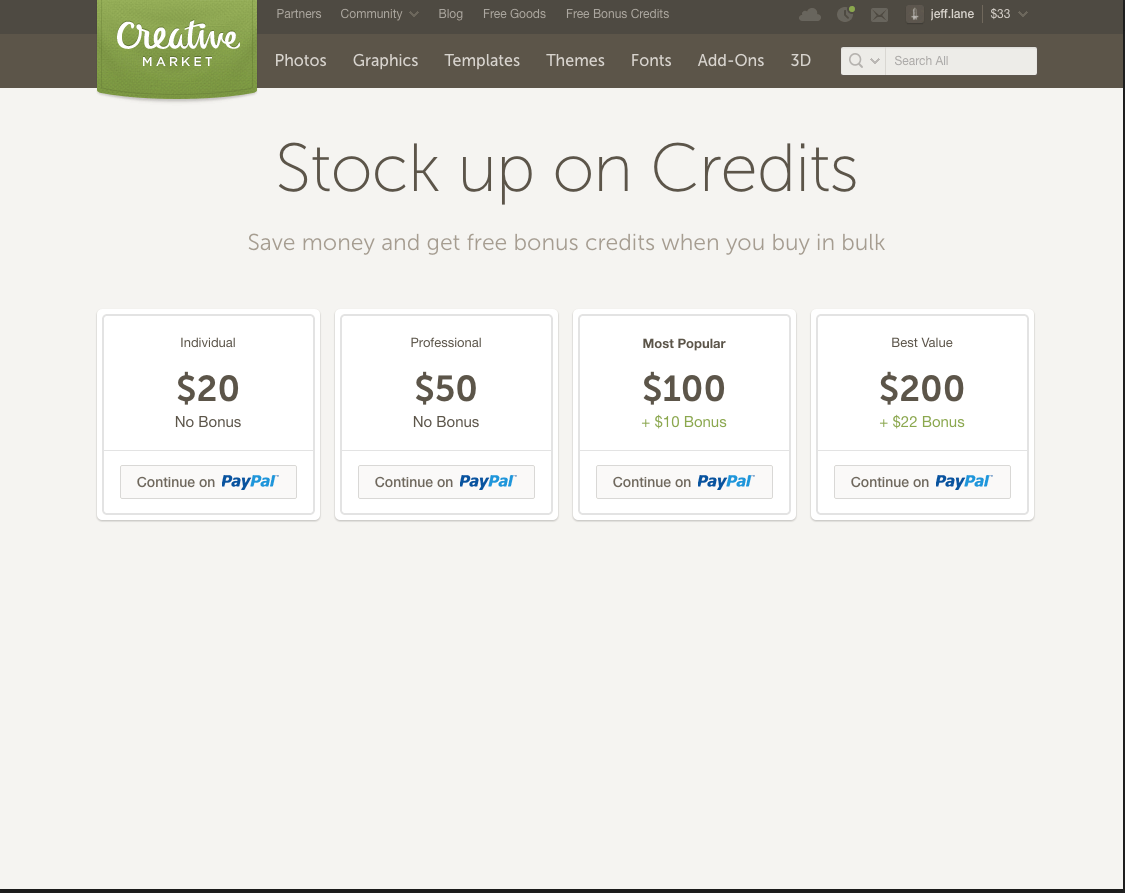
Credits page incorporating e-commerce best practices
The team went ahead with this redesign before testing their hypothesis, usually done by A/B-testing any variations of the original page against the original.
The Results
When Creative Market eventually used Optimizely to perform an A/B test on the different page variations a few days after committing to the redesign, they were surprised to discover that it had completely failed. In spite of all the best practices gleaned from conducting usability and UX research on the web, changing the location of the call to action and basing it on above-the-fold sensibilities didn’t work for their users or the UX.
The redesign created a drop-off in conversions on the Credits Purchase page and an accompanying decrease in overall revenue.
Specifically, while there wasn’t a significant difference in the total credits bought, the original design still outperformed the redesign in terms of total revenue generated. Over a four-day period:
- The original design brought in approximately $ 45,000
- The redesign brought in just under $ 40,000
Understandably, when the Creative Market team looked over these results, they were in disbelief. Could tried and true best practices really have let them down? Should such best practices be really more of a guideline instead of a hard-and-fast rule? The results confirmed that they were essentially compromising performance for a perceived increase in the level of user experience quality, which is why they decided to revert back to the original design.
Moreover, buyers were much less likely to purchase the more expensive $ 100 option on the redesigned page compared to the original. The difference was that the redesigned page did away with the green border and check mark (visual cues) that highlighted the $ 100 option as the default option, thus creating a design where almost equal visual weighting was given to all purchasing options.
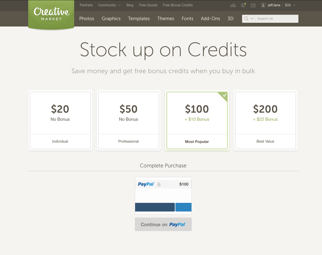
Final credits page design after implementing learnings from A/B test
Key Takeaways
Creative Market believe that you can learn just as much from your fails as you can from your wins—perhaps even more. Unexpected failures like this have impacted their company culture. Whereas before they were more open to being influenced by design best practices from web research, now they approach things with their users’ UX in mind first and foremost; Creative Market user behavior steadfastly informs page redesigns and product improvements site-wide.
The team’s goal is to create their own version of Creative Market best practices (and not rely on generic and once-size-fits-all ‘best practices’) that are based on the sound science of their own A/B testing and actual user behavior.
Anything less could feasibly lead to an unnecessary drop-off in conversions and revenue—and no business wants that.
Business & Finance Articles on Business 2 Community
(55)


