Louis Foong November 15, 2014
When someone comes to your home page or a landing page on your website, you literally have only seconds to convince that person to stay and interact with your site. This week’s infographic from Kissmetrics shows us what makes people leave a website. Are you guilty of doing any of the items below on your website? If so pay attention to the tips on how to fix it which we have set out below for you both in text as as the infographic..
1. Bad Navigation
A website that is difficult to navigate makes people feel frustrated, helpless, confused or angry. Here are some things you should avoid:
- Don’t provide visual elements that aren’t clear in defining where the user is and what they’re supposed to do next
- Don’t scatter your main navigation links all over your site
- Don’t bury your main navigation links in your body text
- Don’t make your link text hard to understand. For example “Other links” is not the ideal way to describe the link
To fix bad navigation, ensure it is logical, intuitive and easy to understand. Try grouping your navigation in a central area.
2. Too Many Ads
Can you think of a site that you immediately left because all you saw were ads? Here is is what Kissmetrics suggests:
- Ads should not be the first thing visitors see when they come to your website
- Try not to cover up the content that attracted your visitors in the first place with ads
- Avoid ads that take up more real estate than 5 minutes to read it your content
- Do be tasteful and discreet i your approach to displaying ads
3. Bad Content Structure
This is what can really destroy your conversion and retention rates. Did you know that it is estimated that 50% of sales are lost because potential customers can’t find what they are looking for on your website?
- Do not complicate things by distributing your content across multiple pages that can easily be communicated on one page
- Do not forget to include introductory content
- Do not have visitors spend time fishing around for the content they are looking for
- Group similar content in a clear and concise manner
- Use bold headings to highlight keywords that visitors may be searching for
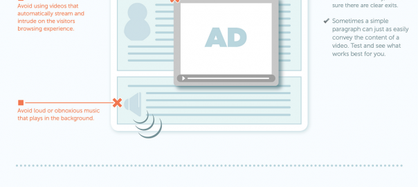
4. Obtrusive Use of Audio and Video
- Avoid using videos that automatically stream when you arrive on the page
- Avoid loud or obnoxious music that plays in the background
- Do give users the option of viewing your video or audio content but don’t force them to do it
- If you do have a video or audio that plays automatically, ensure you have a clear way for the user to exit it
- Sometimes a paragraph of text will do – you don’t always need to use a video
5. The Registration Requirement
We all want to grow our email lists but having a forced-registration without providing enough value can ultimately cause your visitors to go elsewhere.
- Avoid excessive use of pop-ups that require visitors to register before they can even view the content
- Avoid putting up barriers between you and your visitors
- If you do want to require registration to use the site, give your visitors of preview or a taste of what they are signing up for. Maybe a preview or a demo.
6. Boring Content, Boring Design
Did you know that there is data which indicates 40% of visitors fail to return to a website after having a negative experience? Do everything you can to make a killer first impression.
- Don’t intentionally make your website as bland and as useless as possible (yes, it happens!)
- A minimalistic website can be effective and beautiful but it must be done correctly. Always ensure your design maintains utility and that your visitors have no trouble finding what they need
- Consider ways to enhance the interactivity with your visitors. For example, blogs, forums and special features that are regularly updated
7. Poor Legibility
This includes bad typography, abrasive colours and excessive typos which all create a very poor user experience:
- Don’t use typefaces that are unnecessarily elaborate, pixelated or have poor contrast
- For most websites, excessive use of bright, fluorescent colours can be distracting and abrasive
- Do retain a professional designer to help you set the right colour palette, typeface and general tone of your website
8. Lack of Frequency
Fresh, new content is what ultimate keeps people coming back over and over again to your website:
- Do not forget to update your content frequently
- Do not use the “under construction” cliche
- Keep your content current and fresh – perhaps add a blog!
Social Articles | Business 2 Community
(331)