Whether you use a do-it-yourself website builder or work directly with a designer, check out the following list of website eyesores that should be avoided at all costs. Does your website have any of these inadvertent eyesores?
1. Anything that Blinks
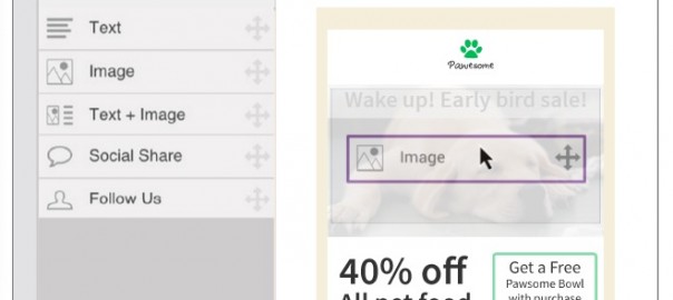
We’ve all been to those sites where either a text or image is blinking at us just begging for attention. It can be very annoying and distracting. Just don’t do it. Instead, if you need to illustrate how something works, try using an animated GIF image to show it like we do with our email creation tool in the example below:

2. Busy Backgrounds
A background holds the entire theme of a website. Try to pick a color or pattern that complements your text and imagery. Avoid distracting backgrounds that make it hard to read your text. In the example below, the background color and pattern is very distracting and you can barely read the text on the page.

3. Too Many Fonts and Colors
You want your site to project an image of professionalism and credibility. Pick fonts and colors that complement your brand. Quantity does not necessarily indicate quality with fonts and colors on a site. Best practice is the have two to three fonts and colors per page, maximum. See this post for some advice on the psychology of color and how it can impact your site.
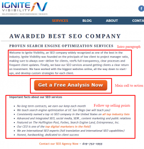
4. No Clear Focal Point or Call to Action
Not having one or having too many focal points on your website will confuse your site visitors. A focal point is the most important part of the page or the part of the page that is the most dominant and should focus your visitor on taking an intended action. Whether it’s buying something, downloading content or calling to schedule an appointment, make sure your focal point is tied to a clear call to action on your site.
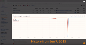
The page example below is clearly overloaded with too many calls to action. As a site visitor, what action are you supposed to take? By the way, this page also has 4 blinking images on it (then again, it is a UFO site!)

5. Text Annoyances
Text annoyances can include text that’s too small, too large, in all caps, bold, italic, or underlined text that’s not linked. It’s especially bad if all of these styles appear in one paragraph or page together. Balance how you treat text so that it’s easily readable. In this case, less is more.
6. Not Mobile Friendly
Your website should look great on any device your visitor is using, whether it’s a desktop computer, tablet or smartphone. Visitors are less likely to stay on your site if it’s not mobile friendly. It’s important to make your business website mobile friendly not only for visitors, but for search engines as well.
7. Outdated Content
Make sure to update your website on a regular basis. Creating and launching your website for the first time is only the beginning. Not only do search engines like sites that are updated on a regular basis, your visitors will too. Get rid of that reference to a 2012 promotion. Customers want the latest and greatest information about your products, services and company news. Need some inspiration, read about 4 quick fixes to reboot your website.
8. Hiding Your Contact Information
Finding your phone number, address and hours of operation should not be a game of hide and seek on your site. It’s one of the primary pieces of information that a visitor will look for. Make sure it’s in a prominent, easy-to-find location.
9. Cluttered Pages
Having white space (where a space is intentionally left blank so there is no text or images) is actually a good thing on a website. White space can make a page more readable. An overly busy website can be overwhelming to a visitor and will drive them to quickly leave your site. De-cluttering your site and adding white space helps you create an enjoyable experience as well as creating that all-important focal point.
Below is a clear example of how a cluttered website could use a little more white space.

Here’s how white space should be used:

10. Stop the Music
No music should start automatically playing when someone visits your website. If you absolutely want some mood music playing, make sure it’s consistent across every page and give your visitor the option to pause it when they want.
Check your website against this list of the top ten website eyesores. If you’re in violation of anything on the list, take some time to think about how your website can be more appealing to your visitors so they will come back again and again.
What other website eyesores would you add to our list? Please share in the comments section below.
(291)