According to a recent post in Litmus, the 10 most popular email clients have been listed for 2015. As an email developer, I can understand and respect the results of this study. It’s no surprise that four out of the top five clients allow for a great mobile experience when viewing emails.
More emails each year are being opened on the mobile platform, and the numbers don’t lie. A whopping 68% of emails are being opened on mobile devices according to Marketing Land study, while only 35% are being opened on desktops. If the majority of email opens are taking place on mobile devices, then as a developer, I want and need to make sure I give my users the best experience possible when viewing their emails, and that means have email optimized for mobile with responsive design.
Now this next bit of information may be hard to believe, but it is true. Currently, there are only two email clients that truly support responsive email design, a practice that enables the design to “attractively acclimate to any screen resolution,” according to 2016 post in The Next Web. These are Apple Mail and iPhone iOS 7/iPad. In this article, I will go over the top five email clients and what to expect as a developer.
iPhone:
With almost double the support of Gmail, iPhone leads the way in this list at 33%, and will continue to lead the way as long as the other email clients continue to play hardball. The iPhone uses the Webkit rendering engine under the hood, which is the same rendering engine that’s used for the iPad and Apple Mail. Its standard support is excellent, and all emails display as the designer intended. No need to be concerned about media queries limitations because there are none. However, there are a few things to consider:
- The traditional media queries i.e 320px will not be sufficient enough for the new screen sizes of the iPhone 6 and 6 Plus. There is no longer a “one media query to rule them all” for iPhones. At the very least, your new media queries need to start at 414 pixels.
- With the recent release of iOS 9 there is now better support for responsive images in email using the HTML srcset attribute. This allows designers to reference multiple images for an email campaign and automatically display the appropriate image for a specific device size.
Gmail:
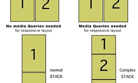
It’s more popular than the default mail app on Android, but Gmail doesn’t support media queries, which we traditionally rely on to resize and reformat our emails for small screens. Without support for media queries, consumers are starting to act out on their frustration with the Gmail app by turning back to the native Android mail app. But not to worry, there are a few approaches that email designers can take to ensure that their emails will conform nicely to mobile devices. One of the best approaches is called the “Mobile First” approach or what I like to call the “Gmail First” approach. See diagram below:
 I use this term “Gmail First” because as an email developer, I need to design my emails with the limitations of Gmail in mind. By doing this, I can design a one, two, or three column email templates that will naturally adapt to the mobile devices without being dependent upon media queries. Then, if I wanted to tidy things up a little bit for my iPhone/iPad users, and other clients that may support responsive design, I can just set those parameters within the media queries. Now everybody is happy.
Google Android:
The native Android mail app along with other Android email apps has mixed support for responsive design. This means that the experience on mobile may differ based on the email app and or software version. So how do we know where to start with such unpredictability? There two charts that I like to reference from time to time when I’m designing emails, and those are: Media Query Support Chart from Litmus, and the CSS Support Chart from Campaign Monitor. Both of these are great to help lock down a consistent look across the Android email apps. As a fallback, it is still best to make sure that the framework of your email was designed using the Mobile First approach.
Apple iPad:
With the exact same rendering engine as the iPhone, designers can really take advantage of the large, vivid color screen of the iPad. The built-in email client on the iPad has a massive (approximately 700 x 580px) preview pane. This is huge compared to desktop email clients like Outlook. Users are going to see much more of your email at a glance. The iPad’s design is more for casual use. This is big. Recipients of your emails aren’t stressed out at their desk and racing through a pile of emails. They’re in a relaxed environment where they are ready to read, browse and digest your content. Even if they are on the go, the larger display will make for a much higher level of engagement. Finally, your beautiful images are displayed by default, and on top of that, there is great support for video. HTML email is going to look better than ever before.
Apple Mail:
Like its cousins the ‘iPhone’ and the ‘iPad’, Apple Mail uses the same rendering engine to render your emails. That means, your email looks exactly the way you designed them to look without any wonky layout glitches i.e added space, or reduced margins. Just like the iPad and iPhone, your viewers can enjoy the experience of embedded video, something that’s beginning to surface more and more, largely in part to the Webkit rendering engine. With so many more pros than there are cons, it’s easy to see why all of Apples email clients are in the top five of the ratings.
Email design is beginning to reach a state where the same user experience we have on the web, must be the same on our mobile device. Make sure that you are ready and prepared for the design transitions along the way. Responsive design is no longer a nice to have, with the numbers of buyers on mobile devices, it’s a must-have.
Digital & Social Articles on Business 2 Community(72)