
Let me give you a hypothetical situation…
Say you’re walking down the street and a well-dressed, attractive young lady (or gent) walks up, smiling. They ask if they can have a second of your time and you nod, not in any rush to get anywhere.
They start talking about this new restaurant they’ve just started. It sounds awesome: affordable, delicious Moroccan food served in a converted warehouse. They tell you it’s open now, give you a card, and tell you that you can have 50% off your first meal there. They shake your hand and you rush off to take advantage of the discount and the promise of a meal.
Except when you get to the address on the card they gave you the place is boarded up.
And not just that, it’s also in a terrible neighborhood, is falling apart, and there’s an odd smell coming from somewhere.
What I’ve just described is exactly what it’s like to promote your business with outbound or inbound marketing without a website optimized to receive the traffic you’re generating.
Why spend all that money making your brand appear well-dressed, attractive, smiling and confident… Why push the value of your product, the affordable, delicious service you provide in an awesome environment, if your website doesn’t actually deliver on that promise?
This article will get into how you can make your website a conversion machine. I’ll give you the four main strategies you need to be implementing to maximize the chance of someone who visits your site actually converting on it.
#1. Design your Website with Conversion in Mind
Design is a huge part of making a good first impression.
If you were running a restaurant or brick-and-mortar business you would paint the walls, clean the floor, and lay the furniture out in an appealing way, right? You wouldn’t let rats run across your carpet or leave holes in the drywall, would you?
So why do we believe that a website should be any less professional?
Here are the three most essential and powerful design elements to keep in mind when optimizing for conversion:
Design Element #1: Contrast
The human eye is very good at seeing contrast, so it’s one of the most influential design factors when you’re trying to attract attention (crucial when optimizing your website for conversion).
And there’s a good reason for that:
25,000 years ago we were all hanging out on the fields of Africa. This was arguably the most crucial period of evolutionary change for humans. Most of our environment was grassland, so (like meerkats) we spent a lot of time looking around for predators. We’d have a few people on lookout while the rest of us ate fruit or bugs or whatever.
We were looking for contrast: something different from what it should be; something that stands out from the norm.
Contrast means danger, and we’re hyper-aware of it.
For example…
It’s easy for us to notice the contrast within the set of shapes on the left, but can you see the two contrasting shapes on the right side?

This is the power of contrast. We’re super good at it: the slightest change to shade (bottom circle, second from the right) or irregularity in a circle (middle circle, third from the left) and we can tell.
How to use it to increase conversions on your website:
Anywhere you want to draw attention (value proposition, a great customer testimonial, your call-to-action button), you should be contrasting color and layout:
- Add orange accent colors to a dark blue page
- Use large, white text on a dark background
- Use a colorful background for your landing page’s form
Design Element #2: Encapsulation
In 1992, Dr Stephen Palmer published a few studies looking at the power of what he called “common region.” Essentially, his argument that the best way to group design elements wasn’t proximity, similarity or color, but rather “common region” – perhaps better understood at encapsulation.
For example, below are three groupings. What is the primary way you associate them?

Most people group these shapes based on the border around them rather than by their actual similarities.
Here’s an example of form encapsulation implementation in one of Wishpond’s landing page templates

How to use it to increase conversions on your website:
- Encapsulate ideas, messages, testimonials, etc which you want your visitors to associate.
- To get your form field to stand out within your landing page, encapsulate it with a border (see above).
Design Element #3: Continuation
Rather than poorly paraphrase myself, I’ll just quote my Guide to the Psychology of Conversion Optimization regarding continuation as a conversion mechanism:
“Think of continuation like momentum. It’s the idea that once you’ve started to move in a particular direction, you will continue to move in that direction until the world tells you otherwise.
Equally, once your eye starts moving in a direction it will continue to do so until it sees something significant enough for it to stop and dwell on that thing (and that’s the element which is a psychological factor which affects online conversion).
With continuation, you can direct the eye of your website visitors towards a point of focus (increasing the chance of them really ‘seeing” that focus point and engaging with it).”
Here’s an example from Renaissance painter Paolo Uccello’s “The Presentation of the Virgin:”

There are five distinct directional cues in this image, all telling your eye to move towards the central point (circled in yellow).
Site design is no different. Continuation allows you to tell your site visitor’s eye where to go (and is super effective at determining focus points).
How to use it to increase conversions on your website:
- Use eye direction as a directional cue/continuation. The direction someone is looking is just as effective as a line or arrow pointing towards that thing.
- Add linear design to your site which aim towards your call to action, unique selling point or headline.
- Do not use blatant arrows, as this psychological factor is more effective when your visitor doesn’t notice it’s occurring. People will often intentionally avoid responding to blatant continuation.
For more on this subject, check out My Guide to Designing for Conversion.
#2. Use Psychology to Boost Conversions
We’re irrational creatures who make irrational decisions for irrational reasons.
Don’t believe me? Why do you think every call-to-action you see on the internet is orange or red? Why do you think every flight you’re about to buy is “Only 2 seats left!” or “Get this price until 11:02am!”
But it gets more complicated than just the psychology of color or urgency.
In fact, psychology plays a huge role in how we absorb information, focus our attention or add subjective value to that pair of shoes we didn’t really need.
Here one of the most important examples…
Information Overwhelm:
Have you ever arrived on a great blog article (this one, perhaps) and done a quick scroll before starting to read? You want to get a better idea of what you’re in for before you start.
And sometimes you’ll see paragraph after paragraph and decide, “well, maybe I didn’t need to know about how to run Facebook Ads anyway…”
This, my friends, is “information overwhelm”…
Information overwhelm is the concept that people have a limit to the amount of information they can absorb at any given time.
It doesn’t matter if every word on your website is gold, if you have too much of it people won’t be able to see the big picture and will bounce.
The primary way that we fight against information overwhelm is with “progressive disclosure.”
Progressive disclosure, an idea originally uncovered by IBM in the 80s, is a design/usability strategy in which information is given to a site visitor over time and in small doses.
The team at IBM “found that hiding advanced functionality early on led to an increased success of its use later on. The approach [was also] dubbed “training wheels.””
In layman’s terms, progressive disclosure is the functionality in which people have control over how much information they see at any given time. This allows your site to look simple and un-intimidating while also having all the information your visitor might need to convert.
How to use it to increase conversions on your website:
- Add “learn more” links to your homepage beneath individual products, allowing people to see more detail about something they’re interested in.
- Add an expanding control (such as a plus symbol or chevron (several arrows)) which shows additional information. Make sure there is an option to reduce as well.
- A short video or gif which shows, rather than tells (see below).
For more on this subject, check out The Ultimate Guide to the Psychology of Conversion Optimization – 12 chapters, totally free (doesn’t even need an email address).
#3. Create Campaign-Specific Landing Pages to Maximize the Value of Your Traffic
If you’re running any kind of online advertisement, congratulations, you’re halfway there.
Unfortunately, there’s no point in spending a single dollar on driving traffic if the place you’re driving it to isn’t ready for it.
It’s like telling people to head over to your house for a party this Friday and then going on vacation Thursday night.
Creating an optimized landing page for each of your Google Adwords or Facebook Ad campaigns is essential to maximizing the ROI of that campaign.
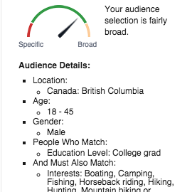
Example: Campaign-Specific Landing Page
Let’s take a look at a combination of a Facebook Ad and landing page for a company selling men’s weekend getaway packages…
The This is an example of the limitation of Facebook Ad audience you see on the right there targets guys between the age of 18 and 45 (the primary “men’s weekend getaway” market). The hypothetical product we’re promoting here is a relatively expensive one, so I’ve targeted college graduates. I’ve also targeted by people who have expressed interest in the outdoors, either based on Pages they’ve liked, places they’ve “checked in” or even statuses they’ve posted.
The result of this targeting is an audience of about 130,000. With a $ 20 daily budget we’ll see about 6,000 impressions (combining Facebook and Instagram) and 40 or so clickthroughs to our landing page daily.
And here’s the landing page which people would arrive on after clicking that Facebook Ad:

Landing Page Elements Specific to that Ad Audience:
- Text: The tone of your landing page needs to keep in mind the people it’s targeting. In this case, I’ve thrown in language like “We’re f*ckin good at it,” and “craft beer included” to appeal to that demographic.
- Testimonials: If you’re implementing customer testimonials/reviews in your landing pages, remember that they need to feature people very similar to your target audience. In this case I’ve included reviews from a sales associate and a CMO who are (roughly) the same age as prospective customers. We’re far more likely to listen to the opinions of people like us than we are to people we don’t relate to.
- Design: There are other design characteristics here as well (such as the color scheme and image) which correlate directly with the target audience. Black and green correlate both to the outdoors and men. The background image of a young guy in the outdoors inspires page visitors to make that experience happen to them as well.
#4. Use Popups to Reduce Bounce Rates and Slim Down your Sales Funnel
This is actually the strategy which has had the biggest effect on our own blog conversions.
In the past six months we’ve added click and scroll popups to the Wishpond Blog, and seen huge returns (like 100% improvement on the rate of readers signing up).
But we’ve also added exit popups to several of our product and pricing pages within our website itself, and had big wins there as well (to the tune of 15% increases on pricing pages).
Why do popups work, and aren’t they super annoying?
Popups work because they put the possibility of engagement right up front.
They cut out the possibility of being lazy. You have to actively say “no” to a pitch, rather than simply not acting (as you do without a popup).
Think about it this way, how much easier is it to not have an ice cream cone if nobody offers you one than it is if someone walks up to you on the street and says “hey I’m selling delicious ice cream cones half off right now. Do you want one?
Make sense?
The difficulty is that blatantly putting the possibility of engagement into your visitors lap can be annoying, and this why you need to follow a few popup best practices:
- Make it obvious how viewers can exit the popup – either by making the background of the popup exit it or display an “X” prominently in the top corner.
- Ensure you’re utilizing cookies and tracking software (ideally a third party popup tool) so you don’t show subscriber or lead prompts to people who have already converted.
- Keep your popup appearance volume limited. Many of our popups only show once a week to visitors. Much more can make for an unpleasant experience.
- Ensure your popup is relevant to the page it’s on. If on a blog, make it focused on the blog article’s subject. If on a product, make it focused on the value of that product. If on pricing, make it communicate added value or a discount.
Wrapping it Up
Hopefully that’s given you a better idea of how you can turn your website into a conversion machine.
Here are a few more things to keep in mind:
- A professional design is half the battle. Invest (either your own time or your own resources) to making your site look modern, clean and visually appealing. This is the same as putting on a nice suit when interviewing. Nobody hires the kid with dirty jeans around his ankles and flip flops.
- Keep your sales funnel tight. Don’t force things on visitors too early (form fields or aggressive entry popups on the first touchpoint) but equally don’t make your funnel so long that people drop off halfway through.
- There’s as much point of driving ad traffic to a website not optimized to receive it as there is to generate leads without a strategy in place to turn them into sales. Take a look at creating a drip email campaign to nurture leads
(63)