I think it’s safe to say that we’ve all visited a website at one point or another and had a frustrating experience. Why won’t this site load on mobile? Which form fields are actually mandatory? Who thought 8pt type in yellow was easy to read?!? While the average user may find these design oversights annoying, to a disabled or impaired individual, they can make a website virtually unusable.
There’s a misconception in web design that accessibility is just a “nice-to-have”, rather than a priority. It’s easy to look at a list of accessibility guidelines and excuse them as barriers to the cool design you’ve dreamt up. However, with usability in mind, these guidelines actually present ways to improve. No, upping your colour contrast or increasing your type size won’t make your website “ugly”, as much as it will make it more user-friendly.
Getting started
So what exactly does accessible design mean? To put it plainly, it refers to how easily a person can use your website. While the focus is put on those with impaired vision, hearing, or movement, accessible design actually makes a website easier for everyone to navigate and use.
While there are many areas to consider when designing an accessible website, there are 4 main principles you should strive toward:
Perceivable – Content on your site can be consumed and presented in different ways (Alt text on an image or closed captioning on a video, for example)
Operable – Users can navigate your site easily without confusion or without the use of a mouse
Understandable – Users can understand the functionality of your site and the content on it
Robust – Your site is compatible and understandable by different assistive tools and devices
I won’t sugarcoat it – making designs fully accessible can be a huge undertaking. But there are some easy, actionable first steps you can take to put yourself on the path towards having a more accessible site.
Typography & Colour
Hierarchy<
Like all designs with text, there should be a clear and logical type hierarchy on your site. This means designing distinguishable H1, H2, H3, etc. styles and using them consistently. Keeping your text styles consistent not only makes the site easier to visually navigate, but also makes things easier for those using assistive devices like screen readers.
Beyond communicating the order in which things should be read, hierarchy also introduces the user to new sections of the site. While the visual appearance of these sections is important, the content itself should also be considered. Making headings descriptive helps not only your website’s SEO, but also provides further context to those with visual impairments.
Presentation
Large blocks of text can be difficult to read and just plain intimidating to most users. Keeping text blocks narrower–WCAG recommends keeping lines of text to 80 characters max–makes content easier to consume. Justified text should also be avoided, as the uneven spaces can result in some words being too far apart while others are too close to distinguish as separate words.
Colour Contrast
Colour contrast is typically one of the first areas a designer will look at when creating a website with accessibility in mind. Ensuring good distinctions between text colour and background colour is an easy way to make content on your site legible. For this, tools like Accessible Colors are available to evaluate your level of contrast and score your design based on WCAG guidelines. If your site falls short, you’ll be given recommendations on what needs to be done to meet AA or AAA compliance. Along with making your site more usable by those with visual impairments or colour deficiencies, proper colour contrast also improves the look and quality of your design overall.

Images & Assets
Alt-text
An easy way to make images on your site more accessible is through the use of alt-text. While this is the text that appears when you hover over an image, it’s also what is read to those using a screen reader. While you can just use 1 or 2 words for alt-text, the best practice is to make the text as descriptive as possible. Essentially, all users should be able to gain a clear understanding of the image and what it depicts without actually having to see it. Text within images should also be avoided at all costs. Instead, opt for live text that can easily be read aloud by assistive tools and devices.
ARIA labels
ARIA labels (Accessible Rich Internet Applications) should also be used to map out landmark items like forms, sections, and navigation on your site. Not only does this allow users to more easily navigate your site without a mouse, but it also enables those using screen readers to navigate elements that aren’t otherwise organized or identified by on-screen text. While this may be more of a developer-side task, it’s something designers should be aware of and bring attention to when a site moves into production. Teamwork makes the dream work!
Navigation & UI Elements
Keep it consistent
Much like text styles, elements like buttons, forms, and navigation should be designed and function consistently throughout the site. Essentially, accessible design should be predictable—a user shouldn’t have to guess how to use your site or be surprised by how a page functions.
Focus states
Keep in mind that not all users will navigate your site with a mouse. Focus states clearly communicate what element of the site you have selected and are intended for those who use ‘tab’ to navigate. Elements like buttons, form fields and anything else interactive should have clear focus states so they are easily navigable.

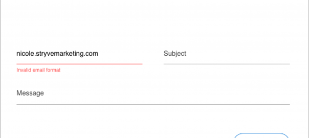
Error states
Even a well-designed form can be difficult to fill out if the effort to put in proper error states hasn’t been made. A good first step to take in indicating a form error is to use colour—most often, red— to draw attention. However, this shouldn’t be the only step taken. Text warnings such as “The email address entered is invalid” provide context for the error and give an actionable statement for the user to correct. Confirmation screens or text are also helpful for once a form has been submitted so that the user knows their information or inquiry has gone through successfully.

Accessibility isn’t a barrier, it’s an opportunity
The ultimate goal for a website is to attract users and make it possible for them to find the information they need effectively and efficiently. Designing with accessibility in mind just makes it so that all people can visit your website without difficulty. Going forward, try to treat accessibility guidelines as just another part of the brief – you’ll be a better designer for it.
Digital & Social Articles on Business 2 Community
(55)