Want to imbue an air of refinement with a single brushstroke? Rikard Rodin, who blogs at Zeven Design, put together a handy little infographic on how designers can use lines to set the mood, drawing from the “mood lines” in the book Landscape Architecture by John Ormsbee Simonds.

In graphic design, lines can be used to establish a certain sensibility, whether with fonts, the arrangement of different colors, or the composition of a photo.
Mood lines are especially easy to spot in movie posters, which—let’s face it—can be a little unoriginal in their design. Is your movie about noble aspiration? Great! Design it around a vertical line, like this poster from Interstellar. Want to convey that a character is flamboyant? Add a sharp, wavy line (preferably in the form of crazy hair).
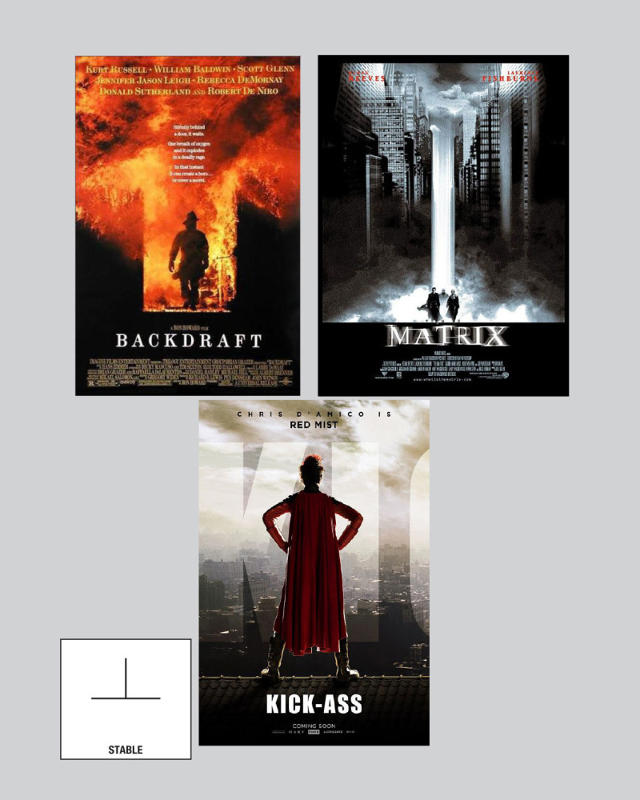
Naturally, the infographic is a just a set of guidelines. These rules don’t apply in every case. Not every design is going to feel pessimistic if the font slopes downward. But in general, will your work look a little more “active” if it’s in a sort of lightning bolt shape? Sure.
Rodin’s full post is worth a read. Go here.
[via Design Taxi]
[Images: via Zeven Design]

(1117)