One of the things that consistently amazes me about writing is that it can be a little like magic. The right combination of words on a page (or screen) can accomplish incredible things; it can change lives, create a legacy that lasts generations, even topple nations. Exactly how we arrive at this magical combination of words is a mysterious, almost alchemical process, which further adds to its allure.

Calls to action can be thought of in a similar way. In marketing, the call to action (or CTA) is the part of your ad or landing page that asks the visitor to take the next step. It’s usually just a few words, often appearing on a button. The right CTA can make people do things in a way that even the most persuasive long-form copy cannot. A strong CTA is far more than a combination of words that hopefully compels people to click on a button – it’s a powerful statement of intent, a rallying cry to our tribe, the crescendo of a rousing speech that leaves the audience exhilarated, clenched fists raised triumphantly to the sky.
Well, that’s the idea, anyway.
Like writing copy, crafting a compelling call to action is part art, part science. In today’s post, we’ll be concerning ourselves with the science part by examining seven ideas for creating more compelling CTAs based on the results of real A/B tests.
1. Change ‘Your’ to ‘My’
The word “Your” is a popular choice for many CTAs. For one, it explicitly implies that whatever you’re asking users to do or sign up for is theirs. This can be highly effective in certain situations, such as webinar registrations. Asking visitors to “Secure your seat” can be highly motivational, and create a sense of exclusivity. However, it doesn’t always work, as Oli Gardner of Unbounce discovered.
Oli created a CTA for a client that was at the very end of the conversion process, meaning that every click had a financial impact for the client. Oli was confident that the possessive determiner “Your” would prove to be more effective than “My” in the button’s copy. As such, Oli set up an A/B test to see which of the two buttons would result in more conversions for his client.
To his surprise, the treatment button (that used “Your” instead of “My”) performed poorly compared to the control – almost 25% worse:

Oli was undeterred by his experiment. Although the test had proved that his hypothesis was wrong, Oli saw this as an opportunity for further tests – could using “My” instead of “Your” have that big an impact? Turns out it could.
Oli changed the phrasing of several CTAs to reflect the results of his earlier experiment, and found that the inclusion of the determiner “My” had a positive impact on conversion rates in several similar tests. With that in mind, Unbounce changed the phrasing of a CTA on a PPC landing page, which resulted in a 90% increase in click-through rate.
If your CTAs feature “Your,” try switching it up and using “My” instead.
2. Include CTA Buttons on Banners
Many marketers will give a great deal of thought to the placement of CTA buttons on perennial pages such as Product or Pricing pages, but completely ignore their potential impact on time-sensitive or seasonal campaigns. This is a huge wasted opportunity.
Visual Website Optimizer client Susty Party, a vendor of sustainable party goods based in Brooklyn, was running a campaign to promote a time-sensitive range of environmentally friendly tableware to coincide with the St. Patrick’s Day celebrations. The company placed a large, visually appealing banner at the top of their homepage to promote this range of products, but was disappointed by the low click-through rate of the banner.
Using VWO, Susty Party ran an A/B test to determine the impact that the inclusion of a CTA button on the banner would have on their conversion rates. Here’s an image of the page before and after the addition of the button (the variation is on the left, and the control is on the right):

The result? Adding the CTA button to the banner increased conversion rates from the homepage by 250%! Obviously, other changes were made to the homepage in the variant, but the bold CTA button featured on the banner had an immense impact on conversion rates, highlighting the value of including CTAs in temporary campaigns as well as your evergreen pages.
Are you running time-sensitive campaigns to promote seasonal goods? Try adding further CTAs to these site materials to see if you can move the needle as much as Susty Party did.
3. Test Your Trust Signals
Ordinarily, the inclusion of trust signals such as security emblems, privacy assurances, and other measures designed to alleviate anxiety about using a product or service is a good idea. After all, data security and privacy have never been more relevant than they are today, which makes the inclusion of relevant trust signals an apparent slam-dunk for marketers.
However, trust signals like this might actually be hurting your conversion rates.
In another surprising test by Unbounce, Oli Gardner discovered that the addition of a privacy policy to a CTA actually had a negative impact. Working for an online betting site, Oli tested the inclusion of an assurance that the client would never spam users – a common sight on landing pages and forms across the Web:

As with his earlier test, Oli firmly believed that the inclusion of this promise to respect users’ contact information would result in an uptick in sign-ups. Once again, the data told Oli a different story.
The inclusion of this trust signal actually resulted in a decrease in conversions of almost 19%. In this case, a measure intended to reduce hesitation and alleviate privacy concerns had actually had the completely opposite effect.
If your forms or landing pages have similar language or symbols, consider testing whether excluding this information will have a positive impact on your conversion rates. Oftentimes, users won’t even consider the security or privacy of their data unless their attention is specifically drawn to the issue. This aspect is also easy to overlook in favor of more commonly tested elements, such as CTA button copy or color.
4. Offer Information, Not ‘Quotes’
Ever shopped online for something like car insurance? Then you’re almost undoubtedly familiar with what a huge pain in the ass the process can be – and how the word “quote” can inspire apprehension and dread in even the most fearless bargain hunter.
People visiting your website may indeed be looking for a quote, but that doesn’t mean that using the word “Quote” in your CTAs is a good idea. In fact, the word “quote” can have negative connotations, and conjure images of lengthy web forms, convoluted processes, and significantly more hassle in general. Remember – people don’t want a quote, they want to know what they’ll be expected to pay for your services, and they want to get their hands on this information as quickly and painlessly as possible.
A prime example of this principle in action is this A/B test from Veeam Software, a virtualization software company. The only element Veeam changed in this example is the phrasing of a CTA, which it changed from “Request a Quote” to “Request Pricing,” as we can see in the images below:

A CTA link featuring the word “Quote”…

And the same link with phrasing changed from “Quote” to “Pricing”
This simple change resulted in an increase in CTR of almost 162%, indicating that visitors responded much more positively to a CTA for pricing information that they did for a quote.
Now, I’d argue that there are some more urgent problems with regard to this example. Firstly, this link-style CTA isn’t particularly effective. It’s not immediately obvious what the visitor should do if they decide they want more information, nor does it make it apparent why they should request pricing information over either downloading whatever it is they can download, or why they should “Buy now and save.” It’s confusing, and relies a great deal upon the diligence and determination of the prospect. Secondly, if Veeam were more transparent with their pricing, they could arguably generate more qualified leads by asking for information from prospective buyers who’ve already decided that the product pricing aligns with their budget.
However, this example does prove that the phrasing of your CTAs – whether buttons or links – can have a huge impact, and that “quotes” aren’t particularly appealing to many users. If you’re offering quotes to prospective customers, consider testing alternate phrasing to see if you can make your offer more tempting.
If you absolutely have to use the word “quote,” make it abundantly clear that there’s no pressure or time commitment. Logistics company Open Mile accomplished this to great effect by using the following CTA button on one of its landing pages:

Sure, the CTA button copy reads “Get a Quote”, but also explains that it’s free and takes just five seconds, preemptively overcoming two of the most common objections to the quote process, namely financial burden and time commitment. This variant outperformed the original (below) by 232%, proving how dramatic an impact this can have on conversion rates:

5. Use Language That Appeals to Your Ideal Customer
We’ve already established that language and choice of phrasing are vitally important to conversion rates, but phrasing your CTAs in language that appeals to your ideal customer is one of the most effective tools at your disposal for making your CTAs irresistible.
Take the example below from men’s grooming products company Manpacks, a service that allows customers to create individualized care packages containing a wide range of hygiene and grooming products:

This example is superb, and demonstrates perfectly how your choice of language can impact conversion rates. Not only does the inclusion of the word “build” – a very active verb – appeal to Manpacks’ target audience, it also creates excitement and a sense of engagement. Think of how different the intent and allure of this CTA would be if Manpacks had used words such as “Get” or “Order.”
This principle can be leveraged to great effect in other ways, too. The example below, from bookkeeping software company Less Accounting, uses inclusive language to convey a sense of teamwork, solidarity, and collaboration to make its accounting software more appealing:

Unless you’re that rare breed of person who enjoys bookkeeping, the chances are pretty good that you’re in need of a little help if you’re looking at a software package like Less Accounting. That’s what makes this CTA so effective – this phrasing makes bookkeeping less intimidating, and creates excitement about a typically dry topic such as accounting through the inclusion of an exclamation mark.
Think about what your prospects really want from you – help, advice, excitement – and tailor the phrasing of your CTAs to appeal to these needs.
6. Focus on the Benefits
In an attempt to preemptively overcome one of the most common and powerful objections to converting – price – many marketers focus exclusively on the free or no-obligation elements of their offers. While this can be effective in some situations, if you’re trying to increase your conversion rates, try focusing on the benefits, rather than risk-aversion tactics.
This example, from wedding website building service Wedbuddy, shows its old sign-up page. As you can see, the copy and CTA focus exclusively on the risk-free elements of the service, namely the 14-day free trial and the fact that users don’t need a credit card to sign up for the service:

However, when Wedbuddy tested benefits-driven copy, they increased their conversion rates dramatically. In the example below, Wedbuddy reworked its copy to focus on the benefits of the service, and used more exciting, animated language (and an exclamation mark) to generate more enthusiasm with its CTA button:

The site also shortened the length of the page considerably, removing a long list of features that was suspected to be overwhelming visitors with information.
As a result, Wedbuddy increased the number of sign-up first-action clicks by 139% and the number of completed free trial sign-ups by 73%.
Attempting to combat risk-aversion is usually a good idea, but sometimes, letting your product or service speak for itself can be more effective. If your landing pages or site feature this kind of language, consider testing whether it would be more effective to focus on the benefits of your offering rather than how little prospects have to lose by trying it out.
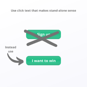
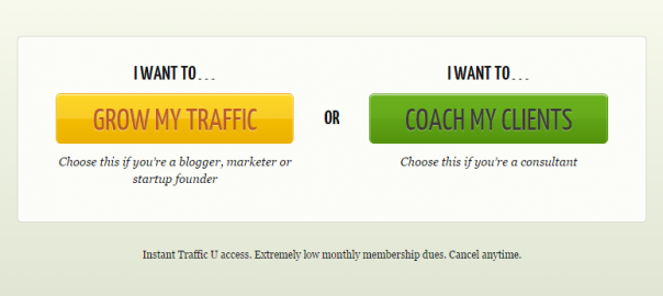
7. Apply the ‘I Want To…’ Principle
The second example from Wedbuddy above actually includes the phrase “I want to…” in its CTA copy, but you can achieve a similarly compelling result without explicitly using these words in your copy by applying the “I want to…” principle to your CTA buttons.
Simply put, this technique involves writing CTA copy that could be prefaced with the words “I want to…” For example, the two CTAs below (from website optimization service CrazyEgg) both make use of this principle, even if they do actually include the “I want to…” copy itself:

These CTAs would arguably be just as compelling if they didn’t include “I want to…” above them. This is what they’d look like without the supporting copy:

Both are still very compelling, feature active verbs (“Grow” and “Coach”), and are clearly differentiated based on audience/user intent, separating one service into two separate tiers depending on the user’s needs.
This principle can be applied to virtually any type of CTA, from a sign-up prompt to a free download offer. If your conversion rates are stagnating, try applying this technique to your CTA copy to see if it makes your offer more compelling.
A Brief Note on CTA ‘Best Practices’
One thing that may have occurred to you in all of the above examples is that these strategies will not work for every business in every scenario. In fact, while putting together this post, I found contradictory evidence and test results that proved that the opposite of every scenario was true. This highlights one of the immutable truths of A/B testing, which is that no case study can substitute a real test under real conditions for your business.
Hopefully these examples have given you some ideas on how you can improve the conversion rates of your CTAs, but they should not – under any circumstances – be taken as irrefutable proof that a change or adjustment will work for your site. Only data gleaned from a rigorous, statistically significant A/B test based on the behavior of your customers should inform your decisions. If in doubt, test – then test again.
Digital & Social Articles on Business 2 Community(121)