Designing a product page that sells can be thought of as an art form. For any given product, there are certain characteristics that must appeal to the intended audience to invoke a reaction. In terms of ecommerce, those characteristics need to convince the potential customer to buy the item or service.
Users choose or reject certain products based on the information they are given and how it is presented to them.
With so many ecommerce websites pushing products and brand messaging on the web, most consumers have no problem moving onto the next vendor if you don’t give them virtually everything they want, including information on how the product is made, the price they’re willing to pay for it, and the support they need post purchase.
Let’s talk about four essential factors that make up top-notch product pages on a retail site…
1. A Well-Defined Buyer Persona
Imagine you are the potential customer. When you look into a product, what matters most to you and how should it be presented?
A buyer persona is basically the ideal/imaginary consumer in which you are marketing your brand towards. It is a broad interpretation of your target audience. Keep in mind, though, there are vast differences in the way certain demographics consume content.

For instance, millennials view brand content on mobile devices much more frequently than baby boomers. A good inference to make is that the younger age group tends to consume more material while on-the-go whereas the baby boomers spend more time on desktop. If your brand primarily markets to a millennial audience, information should be quick, to-the-point, and easy to digest.
Then there is the question of visualization. The brain processes images 60,000 times faster than text. Therefore, it’s safe to assume aesthetic product listings would be more likely to appeal to customers.
Take a look at Hollister:

Their clothing line is marketed to a younger audience. The product listings on their website consist of mainly images and graphics with reduced amounts of text that get straight to the main idea.
Overall, you need to have your buyer persona down to a tee. Know what makes them laugh, cry, gasp, and eventually, buy. Know whether, on each particular visit, their intent is to have a leisurely look-around or make a couple of quick purchases. Having a clear-cut definition of your target will enable you to create customer-centric product pages that convert.
2. Descriptions that Answer the Most Important Questions
Your website should be an intuitive, one-stop resource for every single bit of information the customer might need, and answer any and every question that might come up.
Put yourself in the shoes of the most inquisitive customer you can possibly imagine. What kinds of questions might they have about you and your product or service? The listings should answer every one of them in your unique brand voice.
For example, Firmoo is an online store for eyeglasses. Generally speaking, eyeglasses appear to be one of those items where it seems like a better idea to go into a store and physically try on the product. For instance, you might know your exact prescription but it’s hard to know whether a given frame will fit you (and more importantly, suit you!) or not. Firmoo probably realizes this and ensures the customer has minimal questions left after viewing the item:

Here, they have measurements clearly shown down to the millimeter so the customer is 100% sure they will fit before buying. Should a shopper have any additional questions, there is a very simple contact option available at hand, clearly labeled “HELP.”
It all comes down to understanding the purchase cycle. What are the biggest issues and concerns? With each product listing, do the best you can to address every single one of them.
3. Reviews
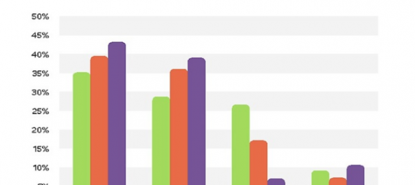
Unless you’ve been living under a rock for the last decade, you probably know that customer reviews are extremely vital when it comes to online shopping. In fact, in a survey of 1,000 U.S. consumers, over two-thirds indicated that their buying decisions are influenced by online reviews:

This sort of social proof is incredibly valuable as it comes from a third party with nothing to gain from exhibiting sales tactics.
While reviews are essential, they should not be front and center on your listings. A good strategy is to put the average rating above the fold so the customer can get just a subtle hint of what people think of the product:

Then, if the user wants to read reviews more in-depth, they can see the relevant information when they scroll down or click through. Most online retail giants, including Amazon and Best Buy, follow this strategy.
If your shop is built on a customizable ecommerce platform such as Shopify, you will most likely have control over what kinds of reviews to showcase. Remember, having negative reviews is not always a bad thing. In reality, if you show nothing but positive reviews, customers might get skeptical and think they are not authentic. For negative reviews, be sure to exhibit that you have made a conscientious effort to correct any error or problem the customer might have.
At the end of the day, reviews are crucial for both the buyer and the seller. They can play a major role in whether or not the customer buys so do not take them lightly.
4. Easy Checkout Options
Finally, and most importantly, the part where the customer (ideally) leaves the product page – the checkout option is what everything your store is built for. Regardless of how much the customer loves your brand or product, confusing checkout options can be the death of your business.
The name of the game here is simplicity. This stage of the buying process is where second thoughts and remorse are typically at their peak.
There are many ways to improve conversion rates with your checkout page. A great strategy that a lot of brands use is allowing the customer to make a purchase without creating an account. In fact, a much-cited eConsultancy survey of over 2,000 shoppers found that 25% of them abandoned purchases because just because they were compelled to create an account on the site. This might well be due to the fact that creating an account on a new site (most of the time) means spam emails and annoying retargeting.
Keep your checkout options conversion-friendly and make account creation optional, like Target does:

Over to You
Product listings are the life and blood of an ecommerce site. Your design and copy should always aim to educate your customers while inspiring them to buy. The trick is not so much catching their attention, but making sure they don’t leave. Usability is everything. An intuitive shopping experience is a win for everyone.
Digital & Social Articles on Business 2 Community(102)