 Bill Faeth
Are Your Readers Able to Actually Read Your Digital Content?
 U.S. Internet users spend 52 percent of their time online consuming media on mobile applications, reports a 2014 white paper by comScore. Mobile web and apps combine to represent 60 percent of all Internet time.
Conversion rates are nearly six times higher on websites with blogs than those without one, according to Kapost. Meanwhile a Nielsen Norman Group study found that when customers were asked to stay connected with a company, 90 percent opted for email newsletters versus only 10 percent who chose Facebook updates.
Companies with comprehensive content and email marketing strategies are lapping competitors in their respective industries. But, failure to optimize your channels for mobile devices can negate your hard work due to poor navigation and long load times. Therefore, the following three tips will enhance the mobile experience for your customers.
Create a Website App
Ten years ago, notebooks achieved a milestone by outselling desktop computers for the first time. But those high-tech 15-inch screens of yesteryear are now an endangered species in lieu of 4.7-inch retina displays on iPhones and 8.5-inch tablet screens.
Most WordPress blog themes are now mobile-ready without you having to take any additional steps. You can install simple plugins for themes that automatically detect mobile browsers and display your content accordingly.
Cloud-based building software, such as Appery.io, provides technical novices a simple drag-and-drop platform to create mobile apps for their blogs in a matter of minutes. Como, another mobile-app builder, is free to start and also requires no coding experience. Shoutem and AppMakr are a couple more options to consider.
Shopping Cart Improvements
Blog entries and newsletters typically help with customer engagement, retention and search engine optimization. But, sometimes a call to action can be included to provoke immediate conversions.
Data compiled by the U.K.-based Baymard Institute found that online shopping carts are abandoned 68 percent of the time before the sale is completed. Although unexpected costs was the primary reason for customers leaving before buying, safety, navigation, crashing and long processing times also played significant roles.
To help usher customers through the buy process, consider using mobile-ready, customizable shopping platforms like XCart or Volusion. Make sure that editing the cart (i.e. adding and removing items) is simple so customers can easily fix mistakes. Plus, perks such as free shipping can also increase sales. A 2014 Deloitte study found that 69 percent of customers prefer retailers that foot the shipping bill to those who don’t.
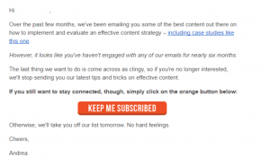
Responsive Email
The mobile web revolution grew so fast that many email clients are still trying to catch up. Email is one of the most common activities on smartphones, but also one of the most tedious due to tiny buttons and the need to resize the text or attachments. This means that many smartphone users may abandon newsletters out of frustration if they were obviously meant to be viewed on a larger screen.
To make email newsletters more effective, use single column newsletter templates. They are easier on the eyes and simple to navigate. Furthermore, keep your newsletters short and to the point to keep your readers’s attention. Companies like Zurb and Email on Acid provide responsive email templates that automatically resize the display once it detects the screen’s width.
Great content is instantly rendered mediocre because of a poor mobile experience, so make sure your website is optimized for 2015.
(210)