By Brian Collins
Every few months, a good number of well-educated adults in the design world will spend a part of their day breathlessly finger-stabbing their screens to point out that they have just seen a thing, and that it is not the first time they have seen that thing. This happened recently, when design agency Koto unveiled a new logo and identity program for the checkout technology company Bolt.
It didn’t take long for shouts of “trope!,” “cliche!,” and, worse, “ripoff!” to ricochet across Twitter. The design industry could not believe it, astonished that once again a sect of its members were unable to comprehend the need for due diligence. Aren’t Google searches supposed to be easy?
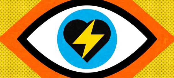
So, what the hell happened with this rebrand? Koto, a respected design firm, took Bolt’s original lightning symbol and cleverly tucked it inside a new wordmark. As it turns out, that decision was not a first. Other designers have made the very same move.
A lighting bolt is a simple, instantly understood symbol. It has been used for centuries to represent speed, energy, and power. Many contemporary brands, from Gatorade to Harry Potter, have integrated lightning into the typography of their identities to embody these attributes in their own brands. The Bolt brand is no exception.
The history of identity design is, in fact, impossible to document without these recognizable tropes. Wings, hearts, arrows, eyes—these are all tiresome clichés. But in the hands of gifted designers, they can beautifully crystallize ideas of achievement (Nike), invitation (I Love New York), reassurance (FedEx), and anticipation (CBS).
Sometimes a new logo doesn’t need to be never-ever-seen-before. Sometimes it can just be a better version of what it was before. That’s what Koto and Bolt aimed for here. It’s sharp. But we can also acknowledge that, yes, the new Bolt logo comes uncomfortably close to some other recent identity work. OK, maybe the designers could have avoided that.
Personally, I like it. But that doesn’t matter. The truth is, whether or not Bolt’s new brand identity turns out to be good or right isn’t up to any of my peers tweeting about it. And it certainly isn’t up to me. It’s up to pressure and time and execution. Bolt needs to continue creating unique value for the community it serves, support its customers, and behave like a great company for the new brand identity to have a chance to be great, too. So, let’s wait and see.
In the meantime, we can talk about the more interesting conversation this noise has resurfaced. Let’s talk about originality.

The power of unoriginality
When I was two years old, President Kennedy pointed America to the moon and launched the nation into the Space Age—a pivotal era in 20th-century design history.
Growing up, I was glued to the TV watching the Jetsons and Star Trek. My family made tea in a flying saucer-shaped tea kettle. My dad’s car looked like a rocket ship. 1960s McDonald’s, car washes, coffee shops, and airports appeared as if they could launch into orbit at any moment. We were being steeped in an intergalactic future.
Incredibly, the design of that future—we coined it Galaxy Moderne—had been constructed for us long before JFK’s speech in 1962. While NASA engineers were hard at work at their drawing boards getting us to the moon, American designers in television, film, fashion, homewares, and architecture had already been busy orienting our culture towards the stars.
Their brief was daunting: Design a world around us where moon landings and space travel are not only possible, but inevitable. Their answers were dazzling.
The funny part? Their answers were also unoriginal. The previously inconceivable, stunning new future we suddenly found ourselves in was chock-full, packed-to-the-brim, and bursting-at-the seams with . . . tropes.
NASA space suits copied the shiny 1940s space suits of Flash Gordon. Neil Armstrong was portrayed in the heroic portrait style of 1500s European explorers in search of the New World. Outer space itself was rebranded as “The New Frontier,” reworking 19th-century myths of the pioneering American West. My favorite TV show, Lost in Space, was a futuristic copy of the famous “strangers in a strange land” stories of Swiss Family Robinson, which itself was a copy of Robinson Crusoe. The list goes on.
Needless to say, all those tropes were deployed to devastating effect. With the collective, cultural thrust they provided, Armstrong and Aldrin reached the moon within a decade.
The reality is, we need tropes. Especially when introducing an idea that is new, it helps to leverage an idea that’s familiar. Tropes are our shared language—story-making building blocks that help us transmit ideas and accelerate desired change. When used imaginatively, tropes can help designers craft ideas to be universally grasped, stand the test of time and deliver the promise of new, better futures.
So, the next time we see a trope rolled out like Bolt’s, we might be better served to hold back a bit. And let time be the judge, too.
(26)