How many blog posts do you write in a given week? In a month? In a year?
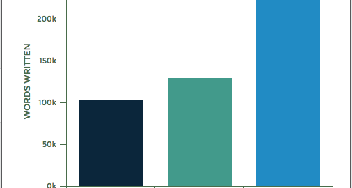
Last year I wrote over 150 articles, and on average those articles were about 1,500 words each. That means I wrote over 234,000 words of content in one year, and that’s a pretty low output compared to some other marketers I know.
To put into perspective just how many words that is, it’s like writing the complete Lord of the Rings: Return of The King as well as To Kill a Mockingbird.

Naturally, writing so many words can leave one wondering:
“What do I write next?”
It’s not easy to constantly produce 234,000 words of unique content every year. Sometimes, you need to find a way to repurpose those words into new types of content.
Like an infographic, which is what I sometimes do.
If you’re like me, you struggle to produce newer and better content on a consistent basis. I highly recommend that you, too, attempt to repurpose your blog posts as infographics. I’m going to walk you through the process of exactly how to do that in this post.
How to repurpose blog content as visuals
Step 1: Trim the fat and create an outline
If you’ve written a 1,500 word article, it probably goes without saying that you can’t possibly include all of that text in an infographic. After all, infographics are concise and data-driven versions of long-form content.
So, you need to trim the fat.
Start by going through your article and extracting the “heavy hitters.” These are statements, facts, or numbers that quickly and effectively get your message across. Remove any flowery language that isn’t necessary.
Here is an example using an intro excerpt from a recent article by Sean Bestor of SumoMe:
“What do you want from your content?
Pardon the italics. I’m not hissing at you like Professor Snape. I’m just curious, because the answer differs from person to person:
“I definitely want more shares from my content. More shares = more potential readers = more potential customers.”
“My number one goal in content is to get more engagement. More views, more comments, the whole thing.”
“Forget about shares and all that. I just want a bigger email list.”
Any of those sound like you? They’re the most common answers to that question. But there’s one flaw with these answers…
They all focus on the outcome.
And focusing on the outcome – or what you hope to achieve with your content – is silly. That’s like being a baseball player, stepping up to the plate saying “Time to get a hit.”
You can’t control that outcome (especially if you’re a Minnesota Twins player).
I see this happen 162 games a year.
What you can control is your approach, your swing, the pitch you choose to hit, etc.
Those are elements of the process, and they’re within your control. Mastering the process leads to a hit. You can’t master an outcome.
Content is the same. Saying you want more customers, traffic, and shares won’t get you more of those things. You don’t control the outcome.
You control the process.”
Now here’s an example of what an intro should look like in your infographic:

It’s two sentences.
Naturally, Sean’s entire intro will not fit into two sentences. So let’s take a second look and try to figure out what it is exactly that Sean is trying to say. I’ll remove that flowery language and just leave the statements that stand out most as pertaining to the overall message:
“What do you want from your content?
Pardon the italics. I’m not hissing at you like Professor Snape. I’m just curious, because the answer differs from person to person:
“I definitely want more shares from my content. More shares = more potential readers = more potential customers.”
“My number one goal in content is to get more engagement. More views, more comments, the whole thing.”
“Forget about shares and all that. I just want a bigger email list.”
Any of those sound like you? They’re the most common answers to that question. But there’s one flaw with these answers…
They all focus on the outcome.
And focusing on the outcome – or what you hope to achieve with your content – is silly. That’s like being a baseball player, stepping up to the plate saying “Time to get a hit.”
You can’t control that outcome (especially if you’re a Minnesota Twins player).
I see this happen 162 games a year.
What you can control is your approach, your swing, the pitch you choose to hit, etc.
Those are elements of the process, and they’re within your control. Mastering the process leads to a hit. You can’t master an outcome.
Content is the same. Saying you want more customers, traffic, and shares won’t get you more of those things. You don’t control the outcome.
You control the process.”
Great. Now we’re left with this:
“What do you want from your content?
“I definitely want more shares from my content. More shares = more potential readers = more potential customers.”
“My number one goal in content is to get more engagement. More views, more comments, the whole thing.”
“Forget about shares and all that. I just want a bigger email list.”
They all focus on the outcome.
And focusing on the outcome – or what you hope to achieve with your content – is silly. You can’t control that outcome (especially if you’re a Minnesota Twins player).
What you can control is your approach,
Those are elements of the process, and they’re within your control. Content is the same. Saying you want more customers, traffic, and shares won’t get you more of those things. You don’t control the outcome.
You control the process.”
It’s shorter, yes, but it can still use some trimming.
Let’s think about this.
Sean’s article is titled: The 3 Irrefutable Cornerstones Behind Writing Content That Matters. He’s essentially talking about the three things you need in order to write better content.
So let’s go over it again with this new knowledge top of mind.
“What do you want from your content?
“I definitely want more shares from my content. More shares = more potential readers = more potential customers.”
“My number one goal in content is to get more engagement. More views, more comments, the whole thing.”
“Forget about shares and all that. I just want a bigger email list.”
They all focus on the outcome.
And focusing on the outcome – or what you hope to achieve with your content – is silly. You can’t control that outcome (especially if you’re a Minnesota Twins player).
What you can control is your approach,
Those are elements of the process, and they’re within your control. Content is the same. Saying you want more customers, traffic, and shares won’t get you more of those things. You don’t control the outcome.
You control the process.”
Now take the remaining phrases and bits of sentence that remain and reword it so it flows better.
What you may get is something like this:
“Saying you want more customers, traffic, and shares won’t get you more of those things. You can’t control the outcome of your content. But you can control the approach. The approach includes elements of the process, which is within your control. Content is the same.”
That statement will fit much better into an infographic and still gets the overall message across. If you want to write better content, you need to focus on the approach and not the outcome. Done!
In order to trim the fat of your blog content, you need to go through it at least twice, each time cutting out more of the language that simply isn’t required.
When you can do this with your entire blog post, you’ll have yourself a concise and practical outline for your infographic. Essentially what you are doing is finding the cornerstone content within your content (I know, it’s really meta).
Once you have your outline in place, it’s time to pick a template and structure what your infographic will look like.
Step 2: Structure your template
This is the easy part, because you don’t need to be an infographic design wiz in order to produce a solid infographic template.
Start out by choosing your favorite infographic generator. In this case, I naturally recommend Venngage, because I’m biased.
Once you sign up, choose a template that fits the overall theme and structure of your blog post.

What do I mean by that? Well if you take a closer look at the above image, you’ll notice that there are various kinds of infographic layouts that exist.

Most blog posts are either, informational infographics or process infographics.
An Informational infographic informs the reader of a specific concept or topic. Usually blog post’s that fall into the “How to” category or the “What” category make great informational infographics.
Process infographics are usually list-based articles or sometimes even case-studies. They follow an order and there is a natural step-by-step progression. For instance, this article would make a great process infographic.
But of course, not all blog posts fall into these categories. There are different types of infographics that exist, and it’s up to you to figure out which style is the best fit for your content.
Once you’ve identified and created your template, it’s time to populate the template with your outline.
Most infographic makers allow you to just copy and paste the data, making the design process really easy.
Step 3: Outreach and repurpose
After you’ve completed your infographic, it’s time to repurpose it.
If you contribute to a lot of different blogs, this will be a piece of cake. Many popular blogs like HubSpot, MarketingProfs, and Search Engine Journal love infographics. Usually, they only require you to write about 400 words of original text to accompany your visual as well.
But, you also have the option of reaching out to writers at different publications and asking them to publish the infographic for you. You can use a tool like Mention to find specific writers who may be interested in the content outline in your infographic and reach out to them that way.
In my opinion, the best method when it comes to repurposing content is to reach out to influencers you already have a personal relationship with. Ask them if they would be able to publish your infographic on their sites.
If you’re not sure how to network with such influencers, here’s a great resource by the Content Marketing Institute on how to connect with influencers at a conference.
But meeting people IRL is difficult. Other options include joining relevant Facebook groups or participating in Twitter chats to communicate directly with other marketers or professionals in your niche. Here’s a Facebook group specifically geared towards Women in Content Marketing.
The point is, you now have one piece of content that you can republish a thousand times. You can’t do this with a blog post because by republishing it too many times, your SEO could take a hit. But an infographic is an image can be used over and over again with little to no consequences.
Conclusion
As a marketer, blogger, or agency, you probably produce a lot of blog posts in a given year. Considering just how much time you spend on each individual piece of content, and how much work goes into your writing, why not make the most of it?
By repurposing a blog post into an infographic, you exponentially increase the reach potential of that article and the click through rate. After all, infographics are 30 times more likely to be read than a text-based article, so you might as well create one.
Digital & Social Articles on Business 2 Community(59)