 Zach Heller — March 21, 2019
 — March 21, 2019

Buttons are everywhere online, having replaced text links in most places as new technology has shifted consumers from clicking our mice to tapping our fingers.
Buttons are the go-to link. And they are critical for marketers to get right.
Why? Because buttons act as your calls to action and navigation. They are the tools that people use to get where they want to go, as well as the tools we use to get people where we want them to go.
A button exists to be clicked. But not all buttons will be clicked with the same frequency. Which is why we created this crash course on buttons. By the time you finish reading this, you will be prepared to create better buttons (buttons that get more clicks).
There are five critical elements of every button:
- Color
- Size
- Text
- Design
- Action
Button Color
When it comes to choosing a color for your buttons, there is no right answer. However, there are many wrong answers.
Many designers choose the color in one of two ways: they either stick with one of their brand colors or they choose something that stands out as unique. Both are valid options, as the color of a button interacts with the color of the rest of the page, and should call attention to itself as a part of the larger design.
But the research says there are some colors that are just more likely to get clicked than others. Bright, bold colors are more likely to draw a user’s attention. Oranges, blues and greens tend get clicked on the most, in that order.
Choose a color that stands out from the rest of the design, and one that makes reading the text on your button simple, and you can’t go wrong.
Button Size
A button that is too small is too hard to hit with a finger. A button that is too big looks ridiculous as it takes up such a large portion of one’s screen.
Believe it or not, there is a ‘correct’ button size. Here we look to Apple, who recommends a minimum button size of 44 pixels wide by 44 pixels tall. The key here is minimum. Not every button will be a perfect square, nor does every design call for the same size button.
But in designing your buttons, you will want to stick to the 44-pixel minimum on the smallest side, otherwise you will be left with buttons that are difficult to tap.
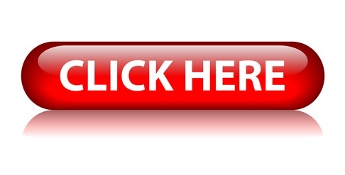
Button Text
The most common button text is “Click Here”. It’s also the worst.
Studies continually show that more descriptive text works better than generic actions. Instead of “Click Here”, yours might say “Learn More”, or “Get Started”. It might say “Claim Offer” on a sales page. Or “View Now” on a product description.
Use the text to explain to the user what they are going to get if they click, rather than simply using it as a way of telling them what you’d like them to do.
Button Design
Your buttons need to look like buttons. That might sound obvious, yet too many websites include buttons that look like flat squares. If you can’t tell the difference, you are in trouble.
There are a number of ways to make buttons look more like buttons. Many designers have taken to rounding corners – even if just slightly. Others opt for pill-style buttons, which take rounded corners to the extreme, creating an oval shape.
One can also use shading to ‘elevate’ your button, setting it apart from other elements on the page.
A final way to prove to users that your button is a button is to identify it as clickable. And you can do this with actions.
Button Action
A button action is a visual clue that a button is clickable. This is often done with a hover effect. A button may change color – becoming slightly darker or lighter – when a user hovers over it. It might shift position ever so slightly – growing larger or smaller – with bolder text.
And when clicked, the button can be given the action that looks like it is being pressed, just like one would expect with a button in the physical world.
Digital & Social Articles on Business 2 Community
(130)