Subtle language cues and the structure of landing pages can play a huge part in boosting conversion rates. Every inch of landing page copy should be optimised to give the visitor the right information in the right way, and ultimately convert them to a lead. A recent post from Lead Pages is indicative of how much research has been put into understand the role of language cues in conversion.
Little research has been done however into the effect of colour on conversion, and whether a carefully tailored colour palette really can encourage a user to take a specific action. There has however been significant research done into brand colouring, and the emotions they attempt to evoke. By looking into some of this in a little more detail, we might be able to extract some lessons for marketers attempting to improve their conversion rates.
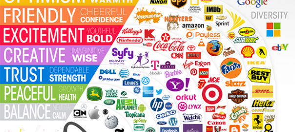
Most of us have come across similar visuals like the one below that generalise and categorise brands and emotions into fairly distinct colour groups.

[Image source: Silkweb]
Almost immediately, a couple of brands jump out at me as misplaced.
- Monster Energy Drinks – Although in a ‘peace/growth/health/’ based colour, Monster as a brand instantly makes me think of something hyper-active, youthful, and not particularly healthy. ‘Radioactive’ even springs to mind!
- SYFY – The channel for all things Sci-Fi. Although I do somewhat agree with the ‘creative/imaginative/wise’ description, the colour purple doesn’t quite have that connotation for me, making the logo feel odd and a little confusing. Purple and silver may have been the colours of the millennium, but now feel dated.
The truth is, that when it comes to brands, our own experiences, preferences, cultures and even upbringing can play a huge role in our association. Less than a hundred years ago for example, the colours pink and blue were still very much interchangeable for boys and girls. Our more recent interpretation of assigned colours didn’t take hold until the latter part of the 20th century.
Colours can also prompt entirely different responses depending on the part of the world you’re in. Red in the West for example, symbolises energy, excitement, danger, passion, a warning, anger or even Christmas! Far Eastern countries tend to associate it with weddings, good fortune, prosperity, joy, vitality or luck.
So ‘Colour Psychology’, as it is known, is too broad a church to determine and evoke specific feelings, despite many attempts to prove otherwise.
Interestingly though, there are some ways in which colour can affect branding and purchases in a more general way. A 2006 paper titled ‘The Impact of Colour on Marketing’ found that up to 90% of snap judgements about a product could be based on colour alone (with some dependence on the type of product).
There’s also a great infographic from Kissmetrics with some great stats around colour, branding and purchase intent.
Being ‘Colour Appropriate’
Other studies have found the relationship between brands and their colours can depend heavily on whether the colour ‘fits’ what is being sold. Brands that were perceived to be colour appropriate tended to be more successful.
In essence, the ‘fit’ of the colour to the product, or in an inbound setting, the piece of content, could prove far more important that the colour itself.
Let’s take Apple, one of the most successful re-branding and marketing efforts of the last twenty-five years. Apple today uses an almost entirely white/silver/black colour scheme in its hardware to evoke a sense of futuristic simplicity, sharpness, and high quality. It also contrasts heavily with the colour and depth of the experience on one of their devices.
Now, if we take those same colours and design choices, and imagine them in a different context – say a small child’s play-set – we can see the monochromatic style might be far less effective.
Applying lessons in colour to conversion
So if context is the most important element to consider, perhaps we can extrapolate that to apply to content as well.
It’s likely your company branding will be fairly locked-in, but most organisations have a host of brand colours that they can use in various contexts. It’s worth first exploring the options available to you within your current palette.
Next, consider your offer. Are you trying to get people to sign up to a highly authoritative webinar? It may make sense to use more assured, confident colours, to convince people this is something worth attending.
Are you running a multimedia competition in an effort to engage and activate your existing audience? Using a more vibrant colour scheme could flip the creative switch in a visitor’s head, giving them the extra incentive to take part.
One of the few tests on the effects of colour on conversion came from Performable (now a part of HubSpot). They tested green against red on an identical landing page promoting Performable’s software. All of their hypotheses and research pointed towards green yielding a higher conversion.

[Source: HubSpot]
…So naturally the red button outperformed the green by 21%. Certainly there are no hard and fast rules, and the ultimate arbiter of your efforts will be your audience.
Not always so scientific
If you’re feeling a little overwhelmed with all the possibility around colour, it’s worth remembering that some of the most famous colour choices have been made just as much for pragmatic reasons as for marketing ones. Facebook’s distinct blue branding? A product of Mark Zuckerberg’s red/green colour blindness. Blues were the richest for him, and an obvious choice for the branding of Facebook.
And have you ever wondered why Hyperlinks are blue by default? Tim Berners-Lee chose it due to the enforced grey background on web pages using the Moasic browser. It offered the darkest, high-contrast colour experience for distinguishing links from regular text.
Test, test…and test again.
It’s clear that colour choice can be a conscious process for many brands, and one that requires a great deal of thought and process to get right. For others, sometimes stumbling into an effective colour strategy can be as much through a lack of options as anything else.
Whilst we understand the world of colour psychology to some extent, we still don’t fully understand how to best use that knowledge in the world of marketing, to drive users towards conversion.
Marketers already use A/B testing to optimise landing pages by alternating imagery, structure and language. Why not do the same with colour schemes?
Every type of audience, not to mention every customer, will be different, and just like when optimising conversion in other ways, there likely won’t be any one best way for your organisation.
As more research continues to be done into ‘Colour Psychology’ we’ll be watching closely for anything that might give marketers clues for better conversion, in what remains an exciting field.
You can learn how to streamline your marketing-sales processes and generate more leads when interruptive methods no longer work with our Essential Guide to Online Lead Generation.
Digital & Social Articles on Business 2 Community
(459)